1
2
3
4
5
6
7
8
9
10
11
12
13
14
15
16
17
18
19
20
21
22
23
24
25
26
27
28
29
30
31
32
33
34
35
36
37
38
39
40
41
42
43
44
45
46
47
48
49
50
51
52
53
54
55
56
57
58
59
60
61
62
63
64
65
66
67
68
69
70
71
72
73
74
75
76
77
78
79
80
81
82
83
84
85
86
87
88
89
90
91
92
93
94
95
96
97
98
99
100
101
102
103
104
105
106
107
108
109
110
111
112
113
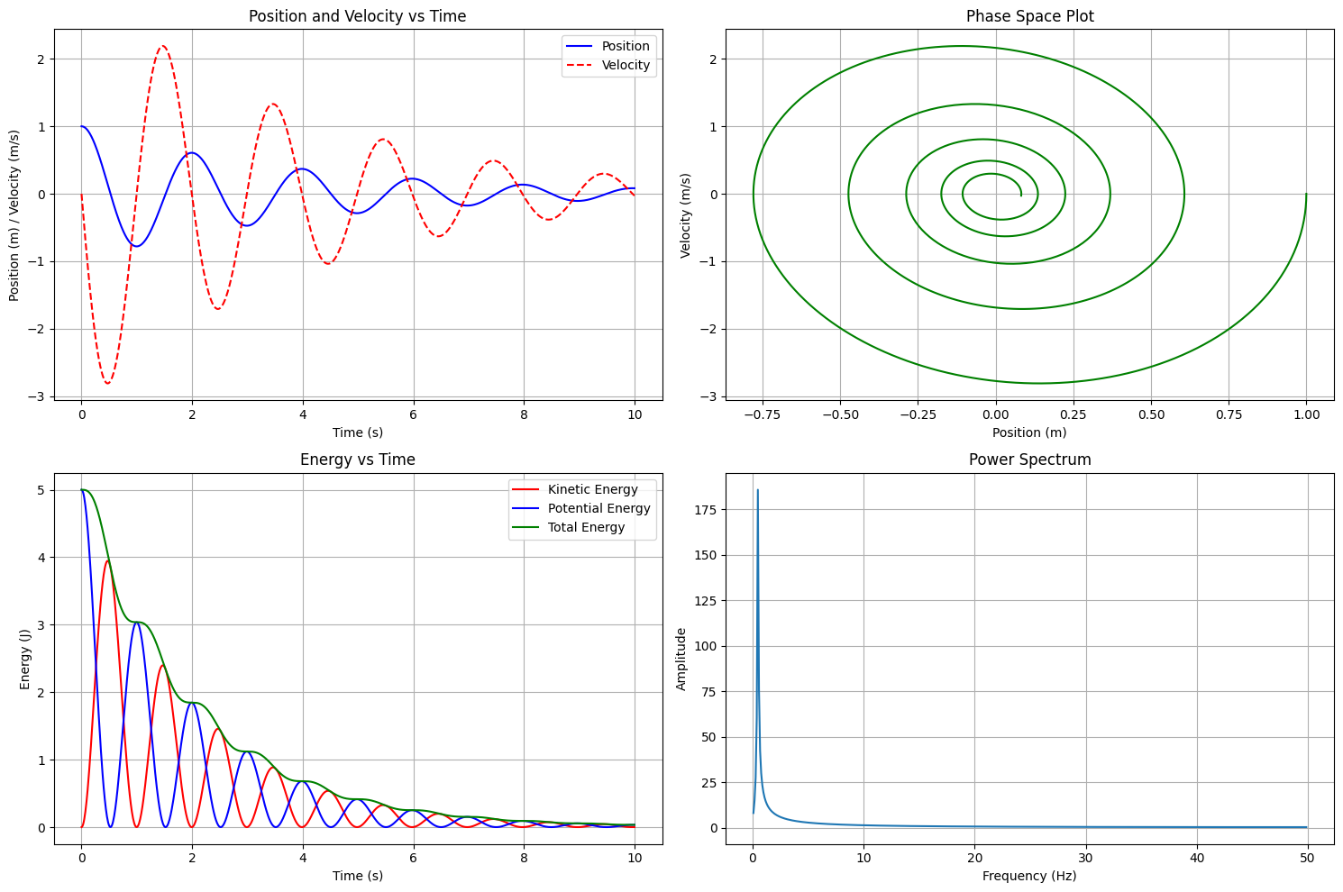
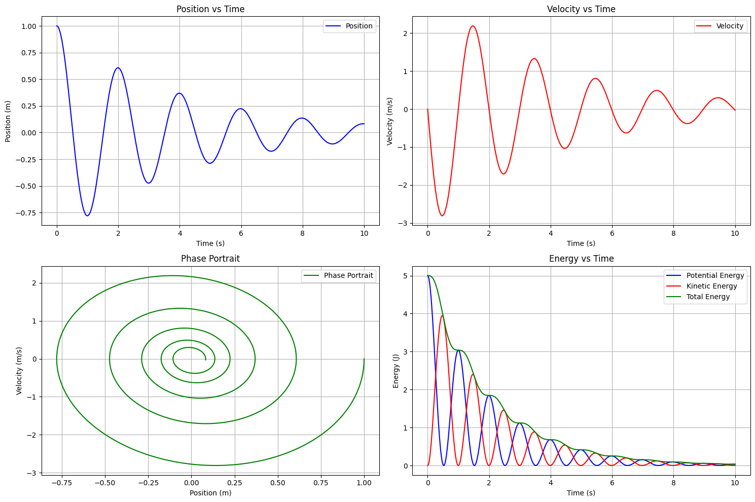
| import numpy as np
from scipy.integrate import odeint
import matplotlib.pyplot as plt
class HarmonicOscillator:
def __init__(self, mass=1.0, spring_constant=10.0, damping=0.5):
"""
Initialize harmonic oscillator parameters
mass: mass of the object (kg)
spring_constant: spring constant k (N/m)
damping: damping coefficient c (Ns/m)
"""
self.m = mass
self.k = spring_constant
self.c = damping
self.omega0 = np.sqrt(self.k / self.m)
self.gamma = self.c / (2 * self.m)
def equations_of_motion(self, state, t):
"""
Define the system of differential equations
state[0] = x (position)
state[1] = v (velocity)
"""
x, v = state
dx_dt = v
dv_dt = (-self.k * x - self.c * v) / self.m
return [dx_dt, dv_dt]
def simulate(self, t_span, initial_conditions):
"""
Simulate the oscillator motion
t_span: time points for simulation
initial_conditions: [x0, v0] initial position and velocity
"""
solution = odeint(self.equations_of_motion, initial_conditions, t_span)
return solution
def calculate_energy(self, x, v):
"""Calculate kinetic and potential energy"""
KE = 0.5 * self.m * v**2
PE = 0.5 * self.k * x**2
return KE, PE
oscillator = HarmonicOscillator(mass=1.0, spring_constant=10.0, damping=0.5)
t_span = np.linspace(0, 10, 1000)
initial_conditions = [1.0, 0.0]
solution = oscillator.simulate(t_span, initial_conditions)
x = solution[:, 0]
v = solution[:, 1]
KE, PE = oscillator.calculate_energy(x, v)
total_energy = KE + PE
plt.figure(figsize=(15, 10))
plt.subplot(2, 2, 1)
plt.plot(t_span, x, 'b-', label='Position')
plt.plot(t_span, v, 'r--', label='Velocity')
plt.xlabel('Time (s)')
plt.ylabel('Position (m) / Velocity (m/s)')
plt.title('Position and Velocity vs Time')
plt.grid(True)
plt.legend()
plt.subplot(2, 2, 2)
plt.plot(x, v, 'g-')
plt.xlabel('Position (m)')
plt.ylabel('Velocity (m/s)')
plt.title('Phase Space Plot')
plt.grid(True)
plt.subplot(2, 2, 3)
plt.plot(t_span, KE, 'r-', label='Kinetic Energy')
plt.plot(t_span, PE, 'b-', label='Potential Energy')
plt.plot(t_span, total_energy, 'g-', label='Total Energy')
plt.xlabel('Time (s)')
plt.ylabel('Energy (J)')
plt.title('Energy vs Time')
plt.grid(True)
plt.legend()
plt.subplot(2, 2, 4)
freq = np.fft.fftfreq(t_span.size, t_span[1] - t_span[0])
x_fft = np.fft.fft(x)
plt.plot(freq[freq > 0], np.abs(x_fft)[freq > 0])
plt.xlabel('Frequency (Hz)')
plt.ylabel('Amplitude')
plt.title('Power Spectrum')
plt.grid(True)
plt.tight_layout()
plt.show()
print(f"System Parameters:")
print(f"Mass: {oscillator.m} kg")
print(f"Spring Constant: {oscillator.k} N/m")
print(f"Damping Coefficient: {oscillator.c} Ns/m")
print(f"Natural Frequency: {oscillator.omega0:.2f} rad/s")
print(f"Damping Ratio: {oscillator.gamma:.2f}")
|