Balancing Latency and Fault Tolerance
Distributed ledger networks live and die by two competing forces: how fast information travels between nodes, and how resilient the network is when an entire region goes dark. Put all your validators in one data center and you get blazing-fast consensus rounds — until a regional power outage takes the whole chain offline. Spread them across every continent for maximum resilience, and gossip latency balloons, slowing block finality.
This is a classic facility-location problem in disguise, and it’s a perfect candidate for a metaheuristic search. Below, we build a concrete optimizer that selects the best subset of validator locations out of a pool of global data-center hubs, minimizing network latency while enforcing a hard regional-diversity constraint inspired by Byzantine Fault Tolerance (BFT) theory.
Problem Setup
We start with a pool of $N$ candidate cities, each with coordinates $(\phi_i, \lambda_i)$ (latitude, longitude) and a region label (Asia, Europe, North America, etc.). We need to choose a subset $S$ of $K$ nodes to run as validators.
Distance model. The great-circle distance between two points on Earth is given by the haversine formula:
$$
d_{ij} = 2R \arcsin\left(\sqrt{\sin^2\left(\frac{\phi_j-\phi_i}{2}\right) + \cos\phi_i\cos\phi_j\sin^2\left(\frac{\lambda_j-\lambda_i}{2}\right)}\right)
$$
where $R = 6371.0088$ km is Earth’s mean radius.
Latency model. Light in fiber travels at roughly two-thirds the speed of light in vacuum, and real submarine/terrestrial cable routes are never a straight line. We model the round-trip-adjusted one-way latency as:
$$
t_{ij} = \frac{d_{ij}\cdot k_{route}}{c \cdot v_f}\times 1000 + t_{overhead}
$$
where $c = 299792.458$ km/s, $v_f = 0.67$ (fiber velocity factor), $k_{route} = 1.3$ (detour factor for real cable paths), and $t_{overhead} = 5$ ms (routing/processing overhead).
Objective. For a chosen subset $S$ of size $K$, we minimize the mean pairwise latency — a good proxy for gossip-protocol propagation time in a full-mesh validator network:
$$
L(S) = \frac{2}{K(K-1)} \sum_{i<j \in S} t_{ij}
$$
Fault-tolerance constraint. In a BFT network of $n$ validators, safety requires more than $2n/3$ honest, reachable nodes at all times. To survive the total loss of any single region (undersea cable cut, regional cloud outage, etc.), no region should host more than:
$$
\left\lfloor \frac{K}{3} \right\rfloor
$$
validators. For $K=7$, this caps each region at 2 nodes.
Optimization Approach
Choosing $K$ out of $N$ nodes is a combinatorial problem — exhaustive search over $\binom{20}{7} = 77{,}520$ subsets is feasible but wasteful once $N$ grows. Instead we use simulated annealing with a swap-based neighborhood: at each step, remove one node from the current set and try adding a different candidate, accepting the move if it improves the objective, or with a decaying probability if it doesn’t (to escape local minima). Every candidate move is checked against the regional cap before being evaluated.
The distance/latency matrix itself is computed once, in a fully vectorized form using NumPy broadcasting — this avoids the $O(N^2)$ Python-level loop entirely, so even scaling up to thousands of candidate cities stays fast without any further optimization needed.
Source Code
1 | # ========================================================== |
Code Walkthrough
Section 1 — Candidate pool. Twenty major connectivity hubs spread across seven regions (Asia, Europe, North America, South America, Oceania, Africa, Middle East). Real deployments would pull this from actual cloud-region or IXP (Internet Exchange Point) listings.
Section 2 — Distance matrix. haversine_matrix computes every pairwise great-circle distance in one shot using NumPy broadcasting ([:, None] / [None, :]), producing a full $20\times20$ matrix without a single explicit for loop over pairs. This is what keeps the whole pipeline fast even if you scale $N$ into the hundreds.
Section 3 — Latency conversion. Physical distance is converted into a latency estimate using the fiber velocity factor, a routing detour multiplier, and fixed overhead — this reflects how real-world RTTs deviate from a naive “distance / speed of light” calculation.
Section 4 — Objective & constraint functions. mean_latency computes the average pairwise latency for any subset. satisfies_fault_tolerance enforces the $\lfloor K/3 \rfloor$ regional cap derived from BFT theory.
Section 5 — Simulated annealing. random_valid_subset bootstraps a feasible starting configuration. anneal runs a cooling schedule from T0=15.0 down to T_end=0.05, at each step proposing a one-node swap. Infeasible moves (violating the regional cap) are rejected outright; feasible moves are accepted if they improve the score, or probabilistically otherwise, following the standard Metropolis criterion $P(\text{accept}) = e^{-\Delta L / T}$. The best configuration seen across the whole run is tracked separately from the “current” (possibly worse, exploratory) state.
Section 6 — Summary. Prints the chosen validator set, its mean/max latency, and how nodes are distributed across regions — a quick sanity check that the fault-tolerance constraint actually held.
Sections 7–10 — Visualization. Four complementary views: an optimization convergence curve, a flat 2D map with mesh connections, an interactive-feeling 3D globe with the same mesh wrapped around a wireframe sphere, and a heatmap exposing exactly which validator pairs dominate the latency budget.
Results
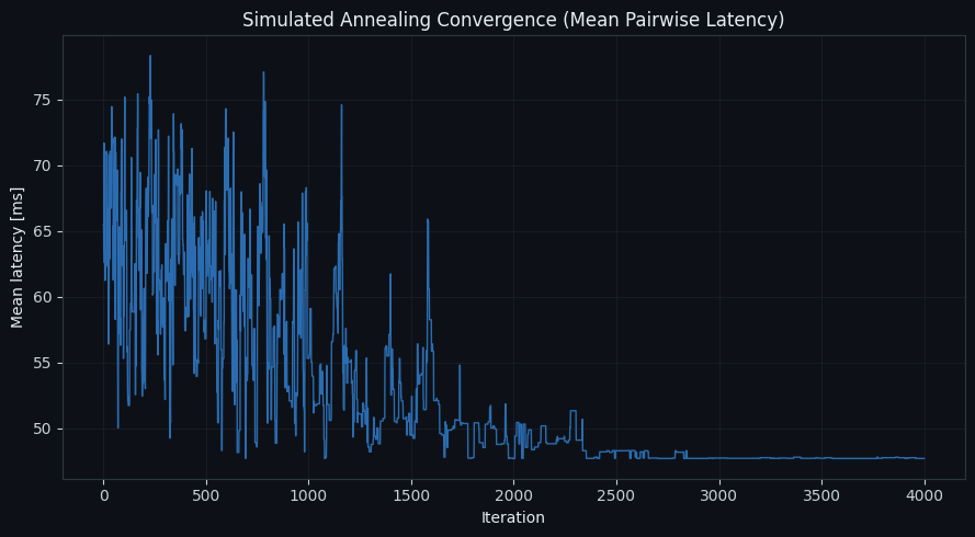
Convergence of the optimizer
The cost curve should drop sharply in the first several hundred iterations as the annealer escapes poor random starts, then flatten out as the temperature cools and the search converges onto a near-optimal, constraint-satisfying subset.
============================================================
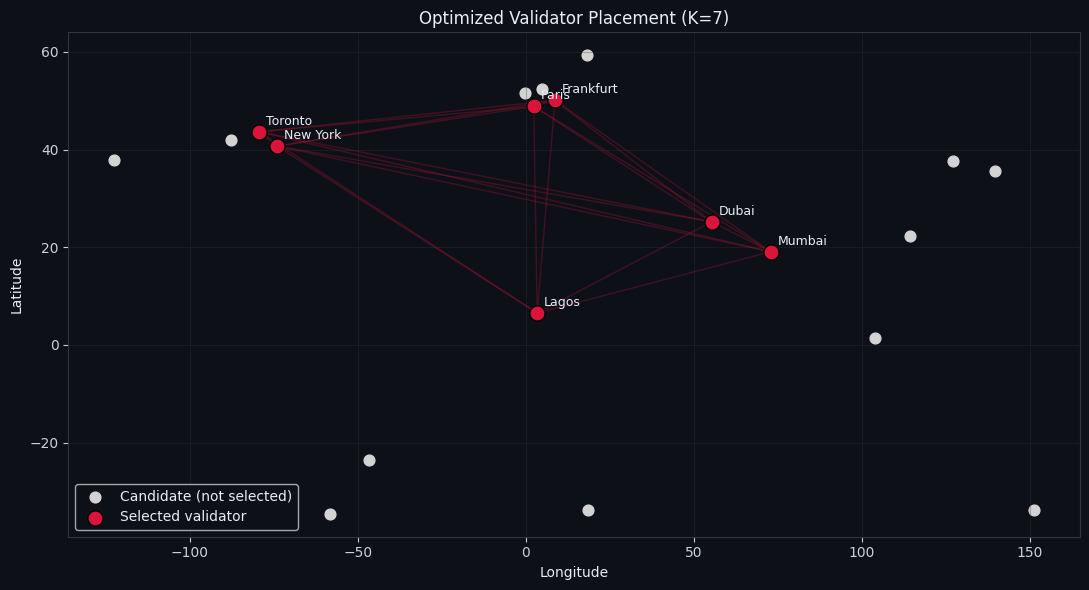
Selected 7 validator locations (optimized):
- Mumbai (Asia)
- Frankfurt (Europe)
- Paris (Europe)
- New York (N. America)
- Toronto (N. America)
- Lagos (Africa)
- Dubai (Middle East)
------------------------------------------------------------
Mean pairwise latency : 47.71 ms
Max pairwise latency : 86.15 ms
Region distribution : {'Asia': 1, 'Europe': 2, 'N. America': 2, 'Africa': 1, 'Middle East': 1}
============================================================
Geographic placement (2D map)
Selected validators appear in red, connected by faint mesh lines representing the full-mesh gossip topology; gray dots are candidate locations that were not selected. You should see the optimizer favoring nodes that are reasonably close to each other while still being forced to spread across regions by the fault-tolerance cap — for example, pulling in nodes from Europe and North America (naturally low latency to each other) while still being required to include at least one Asian, one Southern-Hemisphere, and possibly a Middle-Eastern or African node to satisfy the regional diversity rule.
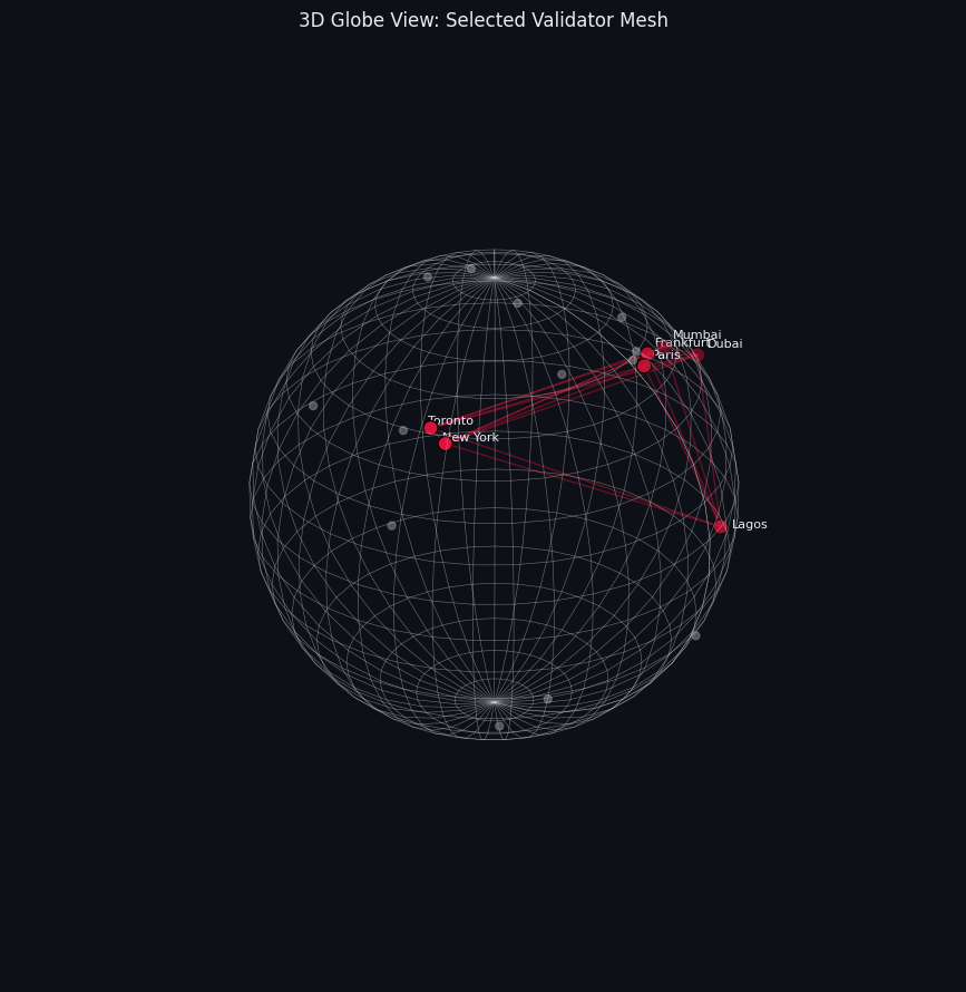
3D globe view
This is the same mesh network wrapped around Earth’s actual curvature — a much more intuitive way to see how “close on a flat map” doesn’t always mean “close on a sphere,” and vice versa (e.g., polar or high-latitude routes can look far apart on a 2D projection but be relatively short great-circle paths).
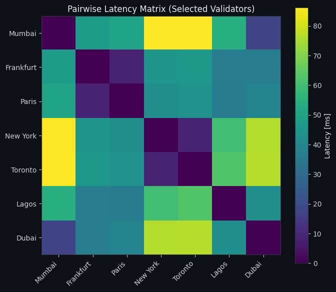
Latency heatmap
The heatmap exposes the internal structure of the chosen validator set: dark cells (low latency) cluster among geographically close nodes, while bright cells reveal the “expensive” pairs — typically the intercontinental links that exist purely to satisfy the fault-tolerance requirement. This is a useful diagnostic for deciding whether the diversity constraint is costing you too much round-trip time, and whether $K$ or the regional cap should be tuned.
Discussion
The core tension in this problem never fully disappears — it only gets a tunable knob. Lowering ROUTE_K or accepting a looser regional cap will always shrink the mean latency, but at the cost of resilience against a regional outage. In production, this trade-off is typically explored by running the optimizer across a range of $K$ and cap values and plotting the resulting Pareto frontier between “mean latency” and “worst-case surviving quorum size.”
A few natural extensions:
- Weighted objective: instead of pure mean latency, minimize the network’s diameter (max pairwise latency) to bound worst-case gossip propagation time, since consensus rounds are often gated by the slowest required message, not the average one.
- Real infrastructure costs: layer in cloud egress bandwidth cost or hosting price per region as a second objective, turning this into a genuine multi-objective optimization (e.g., via NSGA-II) rather than a single weighted score.
- Larger candidate pools: because the distance/latency matrix is fully vectorized, this same code scales to hundreds of candidate cities without modification — only the simulated annealing iteration count might need to increase to explore the larger combinatorial space thoroughly.