エルミート多項式
エルミート多項式は、次の微分方程式を満たす多項式です:
$$
\frac{d^2 H_n(x)}{dx^2} - 2x \frac{dH_n(x)}{dx} + 2n H_n(x) = 0
$$
この微分方程式をPythonで解き、グラフ化するために、SciPyのodeint関数を使用します。
以下は、このタスクを実行するPythonコードです。
1 | import numpy as np |
このコードは、エルミート多項式を計算し、$n=0,1,2,3$に対する結果をグラフ化します。
グラフの$x軸$は$-5$から$5$の範囲で、$y軸$はエルミート多項式 $(H_n(x))$の値です。
[実行結果]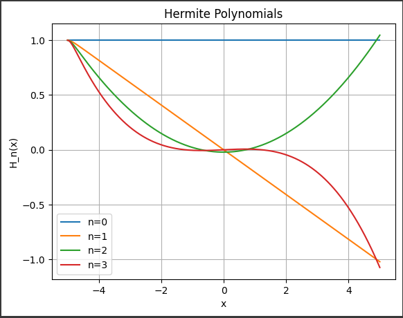
ソースコード解説
以下にコードの詳細な説明を示します。
1. ライブラリのインポート:
1 | import numpy as np |
numpyは数値計算用のライブラリであり、配列操作や数値計算機能を提供します。scipy.integrate.odeintは常微分方程式の数値積分を行う関数です。matplotlib.pyplotはグラフの描画を行うためのライブラリです。
2. エルミート多項式の微分方程式の定義:
1 | def hermite_eq(y, x, n): |
hermite_eq関数はエルミート多項式の微分方程式を定義しています。
この微分方程式は2階の常微分方程式です。
3. 初期条件と解く範囲の設定:
1 | x = np.linspace(-5, 5, 1000) # xの範囲 |
xはグラフの描画範囲であり、$-5$から$5$の範囲を$1000$等分して設定されています。y0は微分方程式の初期条件です。
ここでは、$ (H_0(x) = 1) $と$ (H_0’(x) = 0) $を設定しています。
4. エルミート多項式の計算とグラフ化:
1 | n_values = [0, 1, 2, 3] # nの値 |
n_valuesはエルミート多項式の次数$ (n) $の値のリストです。
ここでは、$0$から$3$までの整数が設定されています。odeint関数を用いて微分方程式を解き、エルミート多項式の値を計算しています。
結果は変数yに格納されます。plt.plot()関数を用いて、計算されたエルミート多項式のグラフを描画します。
ラベルにはnの値が表示されます。
5. グラフの装飾:
1 | plt.title("Hermite Polynomials") |
- グラフのタイトル、$x軸$ラベル、$y軸$ラベルを設定します。
plt.legend()で凡例を表示し、plt.grid(True)でグリッドを表示します。- 最後に
plt.show()でグラフを表示します。
これにより、エルミート多項式を微分方程式を解いて計算し、それらをグラフ化する完全なプログラムが得られます。
結果解説
[実行結果]
このプログラムは、エルミート多項式$ (H_n(x)) $を計算し、その結果をグラフ化しています。
以下はグラフに表示される内容の詳細です:
1. x軸の範囲:
$-5$から$5$の間で$1000$個の等間隔の点が生成されます。
これはグラフの横軸に対応します。
2. y軸の値:
エルミート多項式 $ (H_n(x)) $の値が計算され、それぞれの$n$に対して異なる線がプロットされます。
各線は異なる色で表されます。
3. nの値:
$n$はエルミート多項式の次数を表します。
プログラムでは、$n$が$0$から$3$までの$4$つの値を取ります。
これにより、それぞれのエルミート多項式が表示されます。
4. グラフのタイトル:
グラフのタイトルには「Hermite Polynomials」と表示されます。
5. x軸とy軸のラベル:
x軸とy軸にはそれぞれ「x」と「H_n(x)」というラベルが付けられます。
6. 凡例:
各線の凡例には、対応する$n$の値が表示されます。
これにより、各線がどのエルミート多項式に対応しているかがわかります。
7. グリッド線:
グラフにはグリッド線が表示され、視覚的な参照を提供します。