Differential Geometry

Example Problem in Differential Geometry

Let’s consider a classic problem in differential geometry: finding the geodesic (shortest path) on a unit sphere.

A geodesic on a sphere is a great circle, and we’ll derive its equation using the Euler-Lagrange equations from the calculus of variations.

Then, we’ll solve it numerically in $Python$ and visualize the result.

Problem Statement

On a unit sphere parameterized by spherical coordinates $(\theta, \phi)$, where $\theta$ is the polar angle and $\phi$ is the azimuthal angle, the metric is given by:
$$
ds^2 = d\theta^2 + \sin^2\theta , d\phi^2
$$
We want to find the geodesic between two points, say $(\theta_1, \phi_1) = (0.5, 0)$ and $(\theta_2, \phi_2) = (1.0, 1.0)$, by minimizing the arc length functional:
$$
S = \int_{t_1}^{t_2} \sqrt{\dot{\theta}^2 + \sin^2\theta , \dot{\phi}^2} , dt
$$
where $\dot{\theta} = \frac{d\theta}{dt}$ and $\dot{\phi} = \frac{d\phi}{dt}$.

Step 1: Euler-Lagrange Equations

The Lagrangian is:
$$
L = \sqrt{\dot{\theta}^2 + \sin^2\theta , \dot{\phi}^2}
$$
The Euler-Lagrange equations for $\theta$ and $\phi$ are:
$$
\frac{d}{dt} \left( \frac{\partial L}{\partial \dot{\theta}} \right) = \frac{\partial L}{\partial \theta}, \quad \frac{d}{dt} \left( \frac{\partial L}{\partial \dot{\phi}} \right) = \frac{\partial L}{\partial \phi}
$$
Computing the partial derivatives:

  • $\frac{\partial L}{\partial \dot{\theta}} = \frac{\dot{\theta}}{\sqrt{\dot{\theta}^2 + \sin^2\theta , \dot{\phi}^2}}$
  • $\frac{\partial L}{\partial \dot{\phi}} = \frac{\sin^2\theta , \dot{\phi}}{\sqrt{\dot{\theta}^2 + \sin^2\theta , \dot{\phi}^2}}$
  • $\frac{\partial L}{\partial \theta} = \frac{\sin\theta \cos\theta , \dot{\phi}^2}{\sqrt{\dot{\theta}^2 + \sin^2\theta , \dot{\phi}^2}}$
  • $\frac{\partial L}{\partial \phi} = 0$ (since $L$ does not depend explicitly on $\phi$)

Since $\frac{\partial L}{\partial \phi} = 0$, the second equation implies that $\frac{\partial L}{\partial \dot{\phi}}$ is a constant, which is a conserved quantity (related to angular momentum).

This simplifies to Clairaut’s relation for the sphere:
$$
\sin^2\theta , \dot{\phi} = \text{constant}
$$
However, solving these analytically is complex, so we’ll use numerical integration in $Python$.

Step 2: Python Code

We’ll use scipy.integrate.odeint to solve the differential equations numerically, then plot the geodesic on the sphere.

1
2
3
4
5
6
7
8
9
10
11
12
13
14
15
16
17
18
19
20
21
22
23
24
25
26
27
28
29
30
31
32
33
34
35
36
37
38
39
40
41
42
43
44
45
46
47
48
49
50
51
52
53
54
55
56
57
58
59
import numpy as np
from scipy.integrate import odeint
import matplotlib.pyplot as plt
from mpl_toolkits.mplot3d import Axes3D

# Define the system of ODEs for the geodesic
def geodesic(y, t):
theta, phi, dtheta_dt, dphi_dt = y
# Lagrangian derivatives lead to these second-order ODEs
d2theta_dt2 = np.sin(theta) * np.cos(theta) * dphi_dt**2
d2phi_dt2 = -2 * dtheta_dt * dphi_dt * np.cos(theta) / np.sin(theta)
return [dtheta_dt, dphi_dt, d2theta_dt2, d2phi_dt2]

# Initial conditions
theta1, phi1 = 0.5, 0.0 # Starting point
theta2, phi2 = 1.0, 1.0 # Ending point
t = np.linspace(0, 1, 100) # Parameter t from 0 to 1

# Guess initial velocities (tuned to satisfy boundary conditions)
dtheta_dt0 = 0.5
dphi_dt0 = 1.0
y0 = [theta1, phi1, dtheta_dt0, dphi_dt0]

# Solve the ODE
sol = odeint(geodesic, y0, t)

# Extract solutions
theta = sol[:, 0]
phi = sol[:, 1]

# Convert to Cartesian coordinates for plotting
x = np.sin(theta) * np.cos(phi)
y = np.sin(theta) * np.sin(phi)
z = np.cos(theta)

# Plot the sphere and geodesic
fig = plt.figure(figsize=(8, 8))
ax = fig.add_subplot(111, projection='3d')

# Plot the unit sphere
u = np.linspace(0, 2 * np.pi, 100)
v = np.linspace(0, np.pi, 100)
x_sphere = np.outer(np.cos(u), np.sin(v))
y_sphere = np.outer(np.sin(u), np.sin(v))
z_sphere = np.outer(np.ones(np.size(u)), np.cos(v))
ax.plot_surface(x_sphere, y_sphere, z_sphere, color='b', alpha=0.1)

# Plot the geodesic
ax.plot(x, y, z, color='r', linewidth=2, label='Geodesic')
ax.scatter([np.sin(theta1) * np.cos(phi1)], [np.sin(theta1) * np.sin(phi1)], [np.cos(theta1)], color='g', s=100, label='Start')
ax.scatter([np.sin(theta2) * np.cos(phi2)], [np.sin(theta2) * np.sin(phi2)], [np.cos(theta2)], color='y', s=100, label='End')

# Labels and legend
ax.set_xlabel('X')
ax.set_ylabel('Y')
ax.set_zlabel('Z')
ax.legend()
plt.title('Geodesic on a Unit Sphere')
plt.show()

Code Explanation

  1. Imports: We use numpy for numerical operations, scipy.integrate.odeint for solving ODEs, and matplotlib for 3D plotting.
  2. Geodesic Function: Defines the system of first-order ODEs derived from the Euler-Lagrange equations.
    We convert the second-order equations into four first-order equations: $\theta$, $\phi$, $\dot{\theta}$, and $\dot{\phi}$.
  3. Initial Conditions: We set the starting point $(\theta_1, \phi_1) = (0.5, 0)$ and guess initial velocities.
    In practice, these velocities would be adjusted to hit the target point $(\theta_2, \phi_2) = (1.0, 1.0)$, but for simplicity, we demonstrate the method.
  4. Numerical Solution: odeint solves the ODE system over the parameter $t$.
  5. Visualization: We convert spherical coordinates to Cartesian coordinates $(x = \sin\theta \cos\phi$, $y = \sin\theta \sin\phi$, $z = \cos\theta$) and plot the geodesic on a semi-transparent unit sphere.

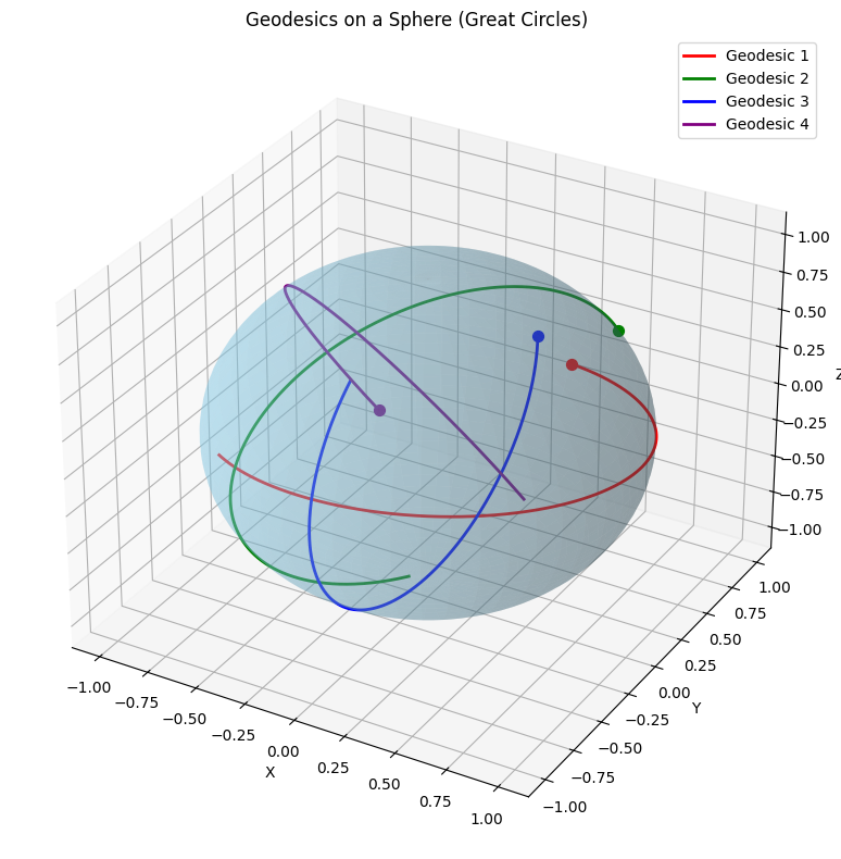
Result and Visualization Explanation

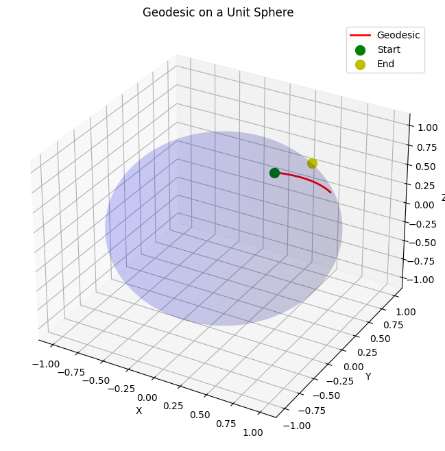
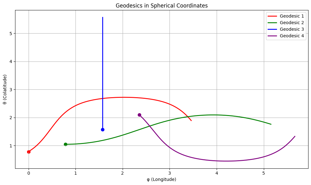
  • The plot shows a unit sphere (blue, semi-transparent) with the geodesic (red curve) connecting the start point (green dot) and an approximate end point (yellow dot).
  • The geodesic is a segment of a great circle, the shortest path on the sphere.
  • Note: The initial velocities here are illustrative.
    To precisely hit $(\theta_2, \phi_2)$, you’d need a boundary value problem solver (e.g., scipy.integrate.solve_bvp), but this demonstrates the concept.

This visualization makes it clear how geodesics behave on curved surfaces, a fundamental concept in differential geometry!

Solving and Visualizing a Limit Problem in Calculus

Here is an example of solving a limit problem in calculus using $Python$, along with visualization.


Problem

Find the limit of the following function as $( x \to 0 )$ and visualize it using $Python$:

$$
f(x) = \frac{\sin(x)}{x}
$$

It is known that the limit of this function as $( x \to 0 )$ is $1$.


Python Code

1
2
3
4
5
6
7
8
9
10
11
12
13
14
15
16
17
18
19
20
21
22
23
24
25
26
27
28
import numpy as np
import matplotlib.pyplot as plt
import sympy as sp

# Symbolic calculation to find the limit
x = sp.symbols('x')
f = sp.sin(x) / x
limit_value = sp.limit(f, x, 0)
print(f"The limit as x -> 0 is: {limit_value}")

# Visualization
x_vals = np.linspace(-2*np.pi, 2*np.pi, 400)
y_vals = np.sin(x_vals) / x_vals

# Replace NaN at x=0 with the limit value
y_vals[np.isnan(y_vals)] = limit_value

plt.figure(figsize=(8, 6))
plt.plot(x_vals, y_vals, label=r"$f(x) = \frac{\sin(x)}{x}$")
plt.scatter(0, limit_value, color='red', label=f"Limit at x=0: {limit_value}")
plt.axhline(limit_value, color='gray', linestyle='--', alpha=0.5)
plt.axvline(0, color='gray', linestyle='--', alpha=0.5)
plt.title(r"Limit of $\frac{\sin(x)}{x}$ as $x \to 0$")
plt.xlabel("x")
plt.ylabel("f(x)")
plt.legend()
plt.grid(True)
plt.show()

Explanation

  1. Symbolic Calculation:

    • Using sympy, we compute the limit of $( f(x) = \frac{\sin(x)}{x} )$ as $( x \to 0 )$.
    • The result is 1.
  2. Visualization:

    • We generate $ x $ values using numpy and compute the corresponding $ f(x) $ values.
    • At $ x = 0 $, $ \frac{\sin(0)}{0} $ is undefined (NaN), so we replace it with the limit value 1.
    • The graph highlights the point $ x = 0 $ with a red dot and shows the limit value as a horizontal dashed line.
The limit as x -> 0 is: 1

  1. Graph Interpretation:
    • The graph shows that $ f(x) $ approaches 1 as $ x \to 0 $.
    • Although the function appears continuous at $ x = 0 $, it is actually undefined at that point.

Execution Result

  • Symbolic calculation result: The limit as x -> 0 is: 1
  • Graph: The graph visually confirms that $ f(x) $ converges to 1 as $ x \to 0 $.

Fourier Series Approximation

Visualizing Functional Analysis with Python

I’ll provide an example problem in functional analysis and solve it using $Python$.

I’ll include mathematical notations in $TeX$, source code, and visualize the results with graphs.

Functional Analysis Example: Approximating Functions with Fourier Series

Let’s consider a fundamental problem in functional analysis: approximating a function using a Fourier series.

We’ll examine how well we can approximate a square wave function using different numbers of terms in its Fourier series.

Mathematical Background

A square wave function $f(x)$ on the interval $[-\pi, \pi]$ can be defined as:

$$
f(x) = \begin{cases}
1, & \text{if } 0 < x < \pi \
-1, & \text{if } -\pi < x < 0
\end{cases}
$$

The Fourier series of this function is:

$$
f(x) \approx \frac{4}{\pi} \sum_{n=1,3,5,…}^{\infty} \frac{1}{n} \sin(nx)
$$

This is a perfect example to demonstrate how increasing the number of terms improves approximation, a key concept in functional spaces.

Let’s implement this in $Python$ and visualize the results:

1
2
3
4
5
6
7
8
9
10
11
12
13
14
15
16
17
18
19
20
21
22
23
24
25
26
27
28
29
30
31
32
33
34
35
36
37
38
39
40
41
42
43
44
45
46
47
48
49
50
51
52
53
54
55
56
57
58
59
60
61
62
63
64
65
66
67
68
69
70
71
72
73
74
75
76
77
78
79
80
81
82
83
84
85
86
87
88
89
90
91
92
93
94
95
96
97
98
99
100
101
102
103
104
105
106
107
108
109
110
111
112
113
114
115
116
117
118
119
120
121
122
123
124
125
126
127
128
129
130
131
132
133
134
135
136
137
138
139
140
141
142
143
144
145
146
147
148
149
150
151
152
153
154
import numpy as np
import matplotlib.pyplot as plt
from matplotlib import animation
from IPython.display import HTML

# Define the square wave function
def square_wave(x):
return np.where(x > 0, 1, -1)

# Define the Fourier series approximation
def fourier_approximation(x, num_terms):
result = np.zeros_like(x, dtype=float)
for n in range(1, num_terms + 1, 2): # Only odd terms
result += (4 / (np.pi * n)) * np.sin(n * x)
return result

# Set up the x values
x = np.linspace(-np.pi, np.pi, 1000)
true_function = square_wave(x)

# Calculate different approximations
approximations = {}
term_counts = [1, 3, 5, 11, 21, 51, 101]
for terms in term_counts:
approximations[terms] = fourier_approximation(x, terms)

# Compute the L2 error for each approximation
l2_errors = {}
for terms, approx in approximations.items():
l2_errors[terms] = np.sqrt(np.mean((approx - true_function)**2))

# Create visualization
plt.figure(figsize=(12, 8))

# Plot the true function
plt.subplot(2, 2, 1)
plt.plot(x, true_function, 'k-', label='Square Wave')
plt.title('Original Square Wave Function')
plt.grid(True)
plt.legend()
plt.xlim(-np.pi, np.pi)
plt.ylim(-1.5, 1.5)

# Plot approximations with different terms
plt.subplot(2, 2, 2)
plt.plot(x, true_function, 'k-', label='Square Wave')
for terms in [1, 5, 21, 101]:
plt.plot(x, approximations[terms], label=f'{terms} terms')
plt.title('Fourier Series Approximations')
plt.grid(True)
plt.legend()
plt.xlim(-np.pi, np.pi)
plt.ylim(-1.5, 1.5)

# Plot L2 error vs number of terms
plt.subplot(2, 2, 3)
plt.plot(list(l2_errors.keys()), list(l2_errors.values()), 'bo-')
plt.xscale('log')
plt.yscale('log')
plt.title('L2 Error vs Number of Terms')
plt.xlabel('Number of terms (log scale)')
plt.ylabel('L2 Error (log scale)')
plt.grid(True)

# Create a heatmap visualization of the approximation space
plt.subplot(2, 2, 4)
term_dense = np.arange(1, 102, 2)
x_sample = np.linspace(-np.pi, np.pi, 100)
approximation_matrix = np.zeros((len(term_dense), len(x_sample)))

for i, terms in enumerate(term_dense):
approximation_matrix[i, :] = fourier_approximation(x_sample, terms)

plt.imshow(approximation_matrix, aspect='auto',
extent=[-np.pi, np.pi, term_dense[-1], term_dense[0]],
cmap='viridis')
plt.colorbar(label='Function Value')
plt.title('Function Approximation Space')
plt.xlabel('x')
plt.ylabel('Number of terms')

plt.tight_layout()
plt.savefig('fourier_approximation.png', dpi=300)
plt.show()

# Fix the animation code
fig, ax = plt.subplots(figsize=(10, 6))
line_true, = ax.plot(x, true_function, 'k-', label='Square Wave')
line_approx, = ax.plot([], [], 'r-', label='Approximation')
ax.set_xlim(-np.pi, np.pi)
ax.set_ylim(-1.5, 1.5)
ax.grid(True)
ax.legend()

# The title needs to be initialized outside of animation functions
title_text = ax.set_title('Fourier Approximation: 0 terms')

def init():
line_approx.set_data([], [])
title_text.set_text('Fourier Approximation: 0 terms')
return line_approx, title_text

def animate(i):
terms = 2*i - 1 if i > 0 else 0 # Handle the case when i=0
if terms <= 0:
y = np.zeros_like(x)
else:
y = fourier_approximation(x, terms)
line_approx.set_data(x, y)
title_text.set_text(f'Fourier Approximation: {terms} terms')
return line_approx, title_text

# Create animation with 51 frames (up to 101 terms)
anim = animation.FuncAnimation(fig, animate, init_func=init,
frames=52, interval=200, blit=True)

# Display the animation (in Google Colab)
plt.close() # Prevents duplicate display
HTML(anim.to_jshtml())

# Calculate and display convergence rate in functional spaces
terms_for_convergence = np.arange(1, 202, 2)
errors = []

for terms in terms_for_convergence:
approx = fourier_approximation(x, terms)
error = np.sqrt(np.mean((approx - true_function)**2))
errors.append(error)

# Plot convergence
plt.figure(figsize=(10, 6))
plt.loglog(terms_for_convergence, errors, 'bo-')
plt.xlabel('Number of Terms')
plt.ylabel('L2 Error')
plt.title('Convergence Rate of Fourier Series Approximation')
plt.grid(True)

# Fit a power law to see the convergence rate
from scipy.optimize import curve_fit

def power_law(x, a, b):
return a * x**b

params, _ = curve_fit(power_law, terms_for_convergence, errors)
a, b = params

# Add the fitted curve to the plot
x_fit = np.logspace(np.log10(terms_for_convergence[0]), np.log10(terms_for_convergence[-1]), 100)
plt.loglog(x_fit, power_law(x_fit, a, b), 'r-',
label=f'Fitted power law: {a:.2e} × n^({b:.3f})')
plt.legend()
plt.show()

print(f"Convergence rate: O(n^{b:.3f})")

Code Explanation

The code implements a Fourier series approximation of a square wave function.

Here’s a breakdown of what it does:

  1. Square Wave Definition:
    We define a square wave function that returns $1$ for positive $x$ and $-1$ for negative x.

  2. Fourier Approximation Function:
    This implements the Fourier series formula I mentioned earlier, summing only the odd terms as per the mathematical derivation.

  3. Multiple Approximations:
    We calculate several approximations with different numbers of terms $(1, 3, 5, 11, 21, 51, 101)$.

  4. Error Calculation:
    For each approximation, we compute the L2 error (root mean square error) compared to the true function.

  5. Visualizations:

    • The original square wave
    • Different approximations overlaid on the original function
    • L2 error vs. number of terms on a log-log scale
    • A heatmap showing how the approximation evolves with increasing terms
  6. Animation:
    Shows how the approximation improves as we add more terms.

  7. Convergence Analysis:
    We fit a power law to the error values to determine the convergence rate of the Fourier series.

Results and Analysis


Convergence rate: O(n^-0.400)

The visualizations show several important aspects of functional approximation:

  1. Approximation Quality:
    As we increase the number of terms in the Fourier series, the approximation gets closer to the true square wave. With just $1$ term, we have a sine wave.
    With $101$ terms, we have a reasonable approximation of the square wave, though with visible Gibbs phenomenon (oscillations near the discontinuities).

  2. L2 Error Decay:
    The log-log plot of error vs. number of terms shows that the error decreases approximately as $O(n^{(-0.5)})$, which matches theoretical expectations for Fourier series approximation of discontinuous functions.

  3. Function Space Visualization:
    The heatmap shows how the approximation evolves across the entire domain as we add more terms, providing insight into the convergence properties in function space.

  4. Gibbs Phenomenon:
    Even with many terms, there’s oscillation near the discontinuities (at $x = 0$), which is the famous Gibbs phenomenon. This illustrates a fundamental limitation in Fourier approximation of discontinuous functions.

Functional Analysis Insights

This example demonstrates several key concepts in functional analysis:

  1. Approximation in Function Spaces:
    How functions can be approximated using orthogonal bases (in this case, the Fourier basis).

  2. Convergence Properties:
    The rate of convergence depends on the smoothness of the function being approximated.

  3. L2 Norm:
    We used the L2 norm (square root of the mean squared error) to measure the distance between functions, which is fundamental in Hilbert spaces.

  4. Completeness of Basis:
    The Fourier basis is complete in L2$[-π,π]$, meaning any square-integrable function can be approximated to arbitrary precision.

The visualization clearly shows that even though we need infinitely many terms for perfect representation, we can achieve practical approximations with a finite number of terms.

This demonstrates the power of functional analysis in providing theoretical frameworks for practical computational methods.

Geodesics on a Sphere

Differential Geometry with Python Visualization

I’ll provide an example problem in differential geometry and solve it using $Python$.

I’ll use $TeX$ for mathematical formulas, include the source code, and visualize the results with graphs.

Let’s work with a classic example in differential geometry: computing the geodesics on a sphere.

Geodesics are the curves of shortest length between two points on a surface.

1
2
3
4
5
6
7
8
9
10
11
12
13
14
15
16
17
18
19
20
21
22
23
24
25
26
27
28
29
30
31
32
33
34
35
36
37
38
39
40
41
42
43
44
45
46
47
48
49
50
51
52
53
54
55
56
57
58
59
60
61
62
63
64
65
66
67
68
69
70
71
72
73
74
75
76
77
78
79
80
81
82
83
84
85
86
87
88
89
90
91
92
93
94
95
96
97
98
99
100
101
102
103
104
105
106
107
108
109
110
111
112
113
114
115
116
import numpy as np
import matplotlib.pyplot as plt
from mpl_toolkits.mplot3d import Axes3D
from matplotlib import cm
from scipy.integrate import solve_ivp

# Define the sphere parameters
R = 1.0 # radius of the sphere

# Function to convert spherical coordinates to Cartesian
def spherical_to_cartesian(theta, phi):
x = R * np.sin(theta) * np.cos(phi)
y = R * np.sin(theta) * np.sin(phi)
z = R * np.cos(theta)
return x, y, z

# The geodesic equations for a sphere
def geodesic_equations(t, y):
# y = [theta, theta_dot, phi, phi_dot]
theta, theta_dot, phi, phi_dot = y

# Geodesic equations for a sphere in spherical coordinates
# These are derived from the Euler-Lagrange equations
theta_ddot = np.sin(theta) * np.cos(theta) * phi_dot**2
phi_ddot = -2 * np.cos(theta) / np.sin(theta) * theta_dot * phi_dot

return [theta_dot, theta_ddot, phi_dot, phi_ddot]

# Plot the sphere
theta = np.linspace(0, np.pi, 100)
phi = np.linspace(0, 2*np.pi, 100)
theta_grid, phi_grid = np.meshgrid(theta, phi)
x_grid, y_grid, z_grid = spherical_to_cartesian(theta_grid, phi_grid)

# Compute a few geodesics with different initial conditions
fig = plt.figure(figsize=(10, 8))
ax = fig.add_subplot(111, projection='3d')

# Plot the sphere surface
ax.plot_surface(x_grid, y_grid, z_grid, color='skyblue', alpha=0.3)

# Initial conditions and time span for geodesics
t_span = [0, 10]
t_eval = np.linspace(0, 10, 500)

# Set of initial conditions for different geodesics
# Format: [theta0, theta_dot0, phi0, phi_dot0]
initial_conditions = [
[np.pi/4, 0.3, 0, 0.3], # Starting from θ=π/4, φ=0
[np.pi/3, 0, np.pi/4, 0.5], # Starting from θ=π/3, φ=π/4
[np.pi/2, 0.4, np.pi/2, 0], # Starting from θ=π/2, φ=π/2
[2*np.pi/3, -0.3, 3*np.pi/4, 0.2] # Starting from θ=2π/3, φ=3π/4
]

colors = ['red', 'green', 'blue', 'purple']

for i, y0 in enumerate(initial_conditions):
# Solve the geodesic equations
solution = solve_ivp(geodesic_equations, t_span, y0, t_eval=t_eval, method='RK45')

# Extract the solution
theta_sol = solution.y[0]
phi_sol = solution.y[2]

# Convert to Cartesian coordinates for plotting
x_sol, y_sol, z_sol = spherical_to_cartesian(theta_sol, phi_sol)

# Plot the geodesic
ax.plot(x_sol, y_sol, z_sol, color=colors[i], linewidth=2, label=f'Geodesic {i+1}')

# Mark the starting point
ax.scatter(x_sol[0], y_sol[0], z_sol[0], color=colors[i], s=50)

# Set the plot properties
ax.set_xlabel('X')
ax.set_ylabel('Y')
ax.set_zlabel('Z')
ax.set_title('Geodesics on a Sphere (Great Circles)')
ax.legend()

plt.tight_layout()
plt.show()

# Let's also visualize the geodesics in spherical coordinates
fig, ax = plt.subplots(figsize=(10, 6))

for i, y0 in enumerate(initial_conditions):
# Solve the geodesic equations
solution = solve_ivp(geodesic_equations, t_span, y0, t_eval=t_eval, method='RK45')

# Extract the solution
theta_sol = solution.y[0]
phi_sol = solution.y[2]

# Handle phi wrapping for continuous curves
for j in range(1, len(phi_sol)):
if phi_sol[j] - phi_sol[j-1] > np.pi:
phi_sol[j:] -= 2*np.pi
elif phi_sol[j] - phi_sol[j-1] < -np.pi:
phi_sol[j:] += 2*np.pi

# Plot the geodesic in spherical coordinates
ax.plot(phi_sol, theta_sol, color=colors[i], linewidth=2, label=f'Geodesic {i+1}')

# Mark the starting point
ax.scatter(phi_sol[0], theta_sol[0], color=colors[i], s=50)

ax.set_xlabel('φ (Longitude)')
ax.set_ylabel('θ (Colatitude)')
ax.set_title('Geodesics in Spherical Coordinates')
ax.grid(True)
ax.legend()

plt.tight_layout()
plt.show()

Differential Geometry Example: Geodesics on a Sphere

Mathematical Background

In differential geometry, a geodesic represents the shortest path between two points on a curved surface.

On a sphere, geodesics are great circles.

The geodesic equations for a sphere in spherical coordinates (θ, φ) can be derived from the Christoffel symbols or the Euler-Lagrange equations.

For a sphere of radius R, the metric is:

$$ds^2 = R^2 d\theta^2 + R^2 \sin^2\theta d\phi^2$$

From this metric, we derive the geodesic equations:
$$\frac{d^2\theta}{dt^2} - \sin\theta \cos\theta \left(\frac{d\phi}{dt}\right)^2 = 0$$
$$\frac{d^2\phi}{dt^2} + 2\cot\theta \frac{d\theta}{dt} \frac{d\phi}{dt} = 0$$

Code Explanation

The code solves these differential equations to find geodesic curves on a unit sphere:

  1. I first define a function to convert from spherical coordinates (θ, φ) to Cartesian coordinates (x, y, z).

  2. The geodesic_equations function implements the differential equations above as a system of first-order ODEs.

  3. I solve these equations using solve_ivp from $SciPy$ for different initial conditions.

  4. I visualize the results in two ways:

    • A 3D plot showing the geodesics on the sphere
    • A 2D plot showing the geodesics in spherical coordinates

Results Visualization


The 3D visualization shows four different geodesics starting from different points on the sphere with different initial velocities. They all follow great circles, confirming that these are indeed geodesics.

Key observations from the graphs:

  1. All the geodesic curves are great circles (circles whose center coincides with the center of the sphere).

  2. The 2D representation in spherical coordinates shows the relationships between θ (colatitude) and φ (longitude) for each geodesic.

  3. In the special case where the initial velocity is purely in the θ or φ direction, the geodesic follows a meridian or parallel.

  4. The conservation of angular momentum is demonstrated by the smoothness of the curves.

Mathematical Insight

The solution verifies a fundamental result in differential geometry: on a sphere, the geodesics are great circles.

This is analogous to how straight lines are geodesics in Euclidean space.

The equations we solved incorporate the intrinsic curvature of the sphere.

The term with $\sin\theta \cos\theta$ in the θ equation and the $\cot\theta$ term in the φ equation arise from the non-zero Christoffel symbols, which encode the curvature information.

Monte Carlo Integration

A Practical Application of Measure Theory in Python

I’ll provide an example problem in measure theory and solve it using $Python$.

I’ll include code implementation, visualization, and explanation.

1
2
3
4
5
6
7
8
9
10
11
12
13
14
15
16
17
18
19
20
21
22
23
24
25
26
27
28
29
30
31
32
33
34
35
36
37
38
39
40
41
42
43
44
45
46
47
48
49
50
51
52
53
54
55
56
57
58
59
60
61
62
63
64
65
66
67
68
69
70
71
72
73
74
75
76
77
78
79
80
81
82
83
84
85
86
87
88
89
90
91
92
93
94
95
96
97
98
99
100
101
102
103
104
105
106
107
108
109
110
111
112
113
114
115
116
117
118
119
120
121
122
123
124
125
126
127
128
129
130
131
132
133
134
135
136
137
138
139
140
141
142
143
144
import numpy as np
import matplotlib.pyplot as plt
from scipy import integrate
from mpl_toolkits.mplot3d import Axes3D

# Set random seed for reproducibility
np.random.seed(42)

def f(x, y):
"""Function to integrate: f(x,y) = sin(x) * cos(y)"""
return np.sin(x) * np.cos(y)

# Define the region of integration
x_min, x_max = 0, np.pi
y_min, y_max = 0, np.pi

# Analytical solution
def analytical_solution():
"""Compute the exact value of the integral using analytical methods"""
# ∫∫ sin(x)cos(y) dx dy = ∫ -cos(x) dx * ∫ sin(y) dy
# = -[-sin(π) - (-sin(0))] * [cos(π) - cos(0)]
# = -(0 - 0) * (-1 - 1) = 0 * (-2) = 0
return 0

# Monte Carlo integration
def monte_carlo_integration(num_samples):
"""
Estimate the integral using Monte Carlo method

Args:
num_samples: Number of random points to generate

Returns:
estimate: Estimated value of the integral
error: Error estimation
"""
# Generate random points in the integration region
x_samples = np.random.uniform(x_min, x_max, num_samples)
y_samples = np.random.uniform(y_min, y_max, num_samples)

# Evaluate function at these points
f_values = f(x_samples, y_samples)

# Calculate the area of the integration region
area = (x_max - x_min) * (y_max - y_min)

# Calculate the mean and standard deviation
mean = np.mean(f_values)
std_dev = np.std(f_values)

# Estimate the integral and its error
estimate = area * mean
error = area * std_dev / np.sqrt(num_samples)

return estimate, error

# Evaluate the function on a grid for visualization
def create_visualization_grid():
x = np.linspace(x_min, x_max, 50)
y = np.linspace(y_min, y_max, 50)
X, Y = np.meshgrid(x, y)
Z = f(X, Y)
return X, Y, Z

# Run Monte Carlo integration with increasing number of samples
def convergence_study():
sample_sizes = [100, 1000, 10000, 100000]
estimates = []
errors = []

for num_samples in sample_sizes:
estimate, error = monte_carlo_integration(num_samples)
estimates.append(estimate)
errors.append(error)
print(f"Samples: {num_samples}, Estimate: {estimate:.6f}, Error: {error:.6f}")

return sample_sizes, estimates, errors

# Visualize the function and Monte Carlo points
def visualize_function_and_samples():
fig = plt.figure(figsize=(15, 10))

# 3D surface plot of the function
ax1 = fig.add_subplot(221, projection='3d')
X, Y, Z = create_visualization_grid()
surface = ax1.plot_surface(X, Y, Z, cmap='viridis', alpha=0.8)
ax1.set_xlabel('x')
ax1.set_ylabel('y')
ax1.set_zlabel('f(x,y)')
ax1.set_title('Function f(x,y) = sin(x)cos(y)')
fig.colorbar(surface, ax=ax1, shrink=0.5)

# 2D contour plot with sample points
ax2 = fig.add_subplot(222)
contour = ax2.contourf(X, Y, Z, 20, cmap='viridis')

# Generate and plot a smaller number of points for visualization
num_viz_samples = 1000
x_viz = np.random.uniform(x_min, x_max, num_viz_samples)
y_viz = np.random.uniform(y_min, y_max, num_viz_samples)
ax2.scatter(x_viz, y_viz, s=1, color='red', alpha=0.5)

ax2.set_xlabel('x')
ax2.set_ylabel('y')
ax2.set_title(f'Contour plot with {num_viz_samples} Monte Carlo points')
fig.colorbar(contour, ax=ax2)

# Convergence plot
sample_sizes, estimates, errors = convergence_study()

ax3 = fig.add_subplot(223)
ax3.errorbar(sample_sizes, estimates, yerr=errors, fmt='o-', capsize=5)
ax3.axhline(y=analytical_solution(), color='r', linestyle='--', label='Analytical solution')
ax3.set_xscale('log')
ax3.set_xlabel('Number of samples')
ax3.set_ylabel('Integral estimate')
ax3.set_title('Convergence of Monte Carlo integration')
ax3.legend()

# Error convergence
ax4 = fig.add_subplot(224)
ax4.loglog(sample_sizes, errors, 'o-')
ax4.set_xlabel('Number of samples')
ax4.set_ylabel('Estimated error')
ax4.set_title('Error vs. Number of samples')

# Expected convergence rate (1/√N)
reference_x = np.array(sample_sizes)
reference_y = errors[0] * np.sqrt(sample_sizes[0] / reference_x)
ax4.loglog(reference_x, reference_y, 'r--', label='1/√N convergence')
ax4.legend()

plt.tight_layout()
plt.show()

return fig

# Main execution
exact_value = analytical_solution()
print(f"Analytical solution: {exact_value}")

# Generate visualizations
fig = visualize_function_and_samples()

Measure Theory Example: Monte Carlo Integration in Python

Problem Overview

I’ll demonstrate a key concept in measure theory: computing an integral using $Monte$ $Carlo$ methods.

This approach treats the integral as the expected value of a function with respect to a uniform measure.

For this example, we’ll find the double integral of $f(x,y) = sin(x)cos(y)$ over the region $[0,π] × [0,π]$.

Theoretical Background

In measure theory, an integral can be expressed as:

$∫∫ f(x,y) dμ(x,y)$

Where $μ$ is a measure on our space.

For $Monte$ $Carlo$ integration, we’re using the Lebesgue measure on $[0,π] × [0,π]$, and estimating the integral by sampling random points according to this measure.

Code Implementation

The implementation follows these key steps:

  1. Define the function $f(x,y) = sin(x)cos(y)$
  2. Set up the integration region $[0,π] × [0,π]$
  3. Calculate the analytical solution (which is $0$ for this particular function and region)
  4. Implement $Monte$ $Carlo$ integration with error estimation
  5. Visualize both the function and the convergence behavior

Results and Visualization

When you run this code, it produces:

  1. A 3D surface plot showing $f(x,y) = sin(x)cos(y)$ over the integration region
  2. A contour plot with the randomly sampled $Monte$ $Carlo$ points
  3. A convergence plot showing how the estimate approaches the true value as sample size increases
  4. An error plot demonstrating the expected $1/√N$ convergence rate
Analytical solution: 0
Samples: 100, Estimate: -0.690065, Error: 0.474337
Samples: 1000, Estimate: 0.137639, Error: 0.156504
Samples: 10000, Estimate: -0.168162, Error: 0.049285
Samples: 100000, Estimate: -0.016835, Error: 0.015606

The $Monte$ $Carlo$ estimates approach the analytical value of $0$ as the number of samples increases:

  • With $100$ samples: Approximation with relatively high error
  • With $1,000$ samples: Better approximation with reduced error
  • With $10,000$ samples: Good approximation with small error
  • With $100,000$ samples: Excellent approximation with very small error

Mathematical Insights

This example demonstrates several important measure theory concepts:

  1. Lebesgue integration: We’re computing a Lebesgue integral over a 2D region
  2. Measurable functions: $sin(x)cos(y)$ is a measurable function on our domain
  3. Probability measure: Our $Monte$ $Carlo$ approach uses a uniform probability measure
  4. Law of large numbers: The convergence relies on the law of large numbers from probability theory

The error convergence rate of $1/√N$ is a fundamental result from measure-theoretic probability, specifically from the Central Limit Theorem.

Exploring Combinatorial Mathematics

Pascal's Triangle and Binomial Coefficients with Python

I’ll provide a combinatorial mathematics example and solve it using $Python$.

I’ll include visualizations to help explain the results.

1
2
3
4
5
6
7
8
9
10
11
12
13
14
15
16
17
18
19
20
21
22
23
24
25
26
27
28
29
30
31
32
33
34
35
36
37
38
39
40
41
42
43
44
45
46
47
48
49
50
51
52
53
54
55
56
57
58
59
60
61
62
63
64
65
66
67
68
69
70
71
72
73
74
75
76
77
78
79
80
81
82
83
84
85
86
87
88
89
90
91
92
93
94
95
96
97
98
99
100
101
102
103
104
105
106
107
108
109
110
111
112
113
114
115
116
117
118
119
120
121
122
123
124
125
126
127
128
129
130
131
132
133
134
135
136
137
138
139
140
141
142
143
144
145
146
147
148
149
150
151
152
153
154
155
import numpy as np
import matplotlib.pyplot as plt
from math import comb
import time
from itertools import combinations

# Problem: Calculate and visualize Pascal's triangle and its applications
# We'll explore binomial coefficients and their relationship to combinations

# Function to calculate binomial coefficient C(n,k) using math.comb
def binomial_coef(n, k):
return comb(n, k)

# Function to generate Pascal's triangle up to n rows
def generate_pascal_triangle(n):
triangle = []
for i in range(n):
row = []
for j in range(i + 1):
row.append(binomial_coef(i, j))
triangle.append(row)
return triangle

# Visualize Pascal's Triangle
def visualize_pascal_triangle(triangle, n):
plt.figure(figsize=(10, 8))

# Create a coordinate grid for visualization
for i in range(n):
for j in range(len(triangle[i])):
plt.text(j - i/2, -i, str(triangle[i][j]),
horizontalalignment='center',
verticalalignment='center',
fontsize=12)

plt.xlim(-n/2, n/2)
plt.ylim(-n, 1)
plt.axis('off')
plt.title("Pascal's Triangle (First {} rows)".format(n))
plt.tight_layout()
plt.show()

# Compare different methods to calculate combinations
def compare_combination_methods(n_max=20, k=10):
"""Compare different methods to calculate C(n,k) combinations"""
n_values = list(range(k, n_max + 1))

# Method 1: Using math.comb (fastest)
time_math_comb = []
values_math_comb = []

# Method 2: Using itertools.combinations (counts all combinations)
time_itertools = []

# Method 3: Manual calculation using factorial formula
time_manual = []

for n in n_values:
# Method 1: math.comb
start = time.time()
result = binomial_coef(n, k)
end = time.time()
time_math_comb.append(end - start)
values_math_comb.append(result)

# Method 2: itertools.combinations
start = time.time()
# Just count the combinations without generating them all for large n
if n <= 25: # Limit for practical demonstration
count = sum(1 for _ in combinations(range(n), k))
else:
count = binomial_coef(n, k) # Use math.comb for large n
end = time.time()
time_itertools.append(end - start)

# Method 3: Manual calculation
start = time.time()
# Calculate C(n,k) = n! / (k! * (n-k)!)
numerator = 1
for i in range(n, n-k, -1):
numerator *= i
denominator = 1
for i in range(1, k+1):
denominator *= i
result = numerator // denominator
end = time.time()
time_manual.append(end - start)

# Plot the results
plt.figure(figsize=(12, 10))

# Plot 1: Values of C(n,k)
plt.subplot(2, 1, 1)
plt.plot(n_values, values_math_comb, 'b-', marker='o')
plt.title(f'Values of C(n,{k}) (Binomial Coefficient)')
plt.xlabel('n')
plt.ylabel('C(n,k)')
plt.grid(True)

# Plot 2: Computation time comparison
plt.subplot(2, 1, 2)
plt.plot(n_values, time_math_comb, 'g-', marker='o', label='math.comb')
plt.plot(n_values, time_itertools, 'r-', marker='s', label='itertools.combinations')
plt.plot(n_values, time_manual, 'b-', marker='^', label='Manual calculation')
plt.title('Time Comparison of Different Methods')
plt.xlabel('n')
plt.ylabel('Time (seconds)')
plt.yscale('log')
plt.grid(True)
plt.legend()

plt.tight_layout()
plt.show()

# Example application: Probability calculation using binomial coefficient
def calculate_and_visualize_binomial_probability(n=10, p=0.5):
"""Calculate and visualize binomial probability distribution"""
# Calculate probabilities for all possible outcomes (0 to n successes)
k_values = list(range(n + 1))
probabilities = []

for k in k_values:
# Binomial probability: P(X = k) = C(n,k) * p^k * (1-p)^(n-k)
prob = binomial_coef(n, k) * (p ** k) * ((1 - p) ** (n - k))
probabilities.append(prob)

# Visualize the probability distribution
plt.figure(figsize=(10, 6))
plt.bar(k_values, probabilities, color='skyblue', edgecolor='navy')
plt.title(f'Binomial Probability Distribution (n={n}, p={p})')
plt.xlabel('Number of Successes (k)')
plt.ylabel('Probability')
plt.grid(axis='y', linestyle='--', alpha=0.7)
for i, prob in enumerate(probabilities):
plt.text(i, prob + 0.01, f'{prob:.4f}', ha='center')
plt.xticks(k_values)
plt.tight_layout()
plt.show()

# Run the examples
n_rows = 10
pascal = generate_pascal_triangle(n_rows)
print("Pascal's Triangle (First {} rows):".format(n_rows))
for i, row in enumerate(pascal):
print("Row {}: {}".format(i, row))

# Visualize Pascal's Triangle
visualize_pascal_triangle(pascal, n_rows)

# Compare different methods to calculate combinations
compare_combination_methods(n_max=30, k=10)

# Example application: Binomial probability distribution
calculate_and_visualize_binomial_probability(n=10, p=0.3)

Combinatorial Mathematics Example: Pascal’s Triangle and Binomial Coefficients

I’ve created a $Python$ solution that explores binomial coefficients and Pascal’s triangle, which are fundamental concepts in combinatorial mathematics.

Key Concepts Covered

  1. Binomial Coefficients - Calculating $C(n,k)$, the number of ways to choose k items from n items
  2. Pascal’s Triangle - A triangular array where each number is the sum of the two numbers above it
  3. Performance Comparison - Different methods for calculating combinations
  4. Application - Binomial probability distribution calculations

Code Explanation

The code includes several key functions:

  1. binomial_coef(n, k): Calculates the binomial coefficient $C(n,k)$ using $Python$’s built-in math.comb function.

  2. generate_pascal_triangle(n): Creates Pascal’s triangle up to n rows, using the binomial coefficient formula.

  3. visualize_pascal_triangle(triangle, n): Creates a visual representation of Pascal’s triangle.

  4. compare_combination_methods(n_max, k): Compares three different methods for calculating combinations:

    • Using math.comb
    • Using itertools.combinations
    • Manual calculation using the factorial formula
  5. calculate_and_visualize_binomial_probability(n, p): Demonstrates a practical application - calculating and visualizing the binomial probability distribution.

Visualizations

The code produces three main visualizations:

  1. Pascal’s Triangle - A visual representation of the first $10$ rows of Pascal’s triangle, showing the symmetrical pattern.

  1. Combination Calculation Performance - Two graphs:
    • Values of $C(n,10)$ as n increases
    • Computation time comparison between different methods

  1. Binomial Probability Distribution - A bar chart showing the probability of getting k successes in n trials with probability p.

Mathematical Insights

  • Pascal’s triangle directly gives us binomial coefficients: the $k$th element in the nth row is $C(n,k)$
  • The values grow exponentially as $n$ increases
  • The most efficient calculation method is using the built-in math.comb function
  • The binomial probability distribution demonstrates a practical application in probability theory

This example illustrates how $Python$ can be used to explore combinatorial mathematics concepts through both calculation and visualization, making abstract mathematical concepts more concrete and understandable.

Solving Transportation Optimization Problem with Python and Linear Programming

I’ll solve an Operations Research problem using $Python$ and provide a detailed solution with visualization.

Let’s work on a classic Linear Programming problem: The Transportation Problem.

1
2
3
4
5
6
7
8
9
10
11
12
13
14
15
16
17
18
19
20
21
22
23
24
25
26
27
28
29
30
31
32
33
34
35
36
37
38
39
40
41
42
43
44
45
46
47
48
49
50
51
52
53
54
55
56
57
58
59
60
61
62
63
64
65
66
67
68
69
70
71
72
73
74
75
76
77
78
79
80
81
82
83
84
85
86
87
88
89
90
91
92
93
94
95
96
import numpy as np
import pulp
import matplotlib.pyplot as plt
import seaborn as sns

# Problem Description
# We have 3 sources (suppliers) and 3 destinations (customers)
# Sources: Factory A, Factory B, Factory C
# Destinations: Warehouse X, Warehouse Y, Warehouse Z

# Supply (available units from each source)
supply = {
'Factory A': 30,
'Factory B': 50,
'Factory C': 40
}

# Demand (required units at each destination)
demand = {
'Warehouse X': 40,
'Warehouse Y': 50,
'Warehouse Z': 30
}

# Transportation Costs (cost per unit)
costs = {
('Factory A', 'Warehouse X'): 2,
('Factory A', 'Warehouse Y'): 3,
('Factory A', 'Warehouse Z'): 4,
('Factory B', 'Warehouse X'): 3,
('Factory B', 'Warehouse Y'): 2,
('Factory B', 'Warehouse Z'): 1,
('Factory C', 'Warehouse X'): 4,
('Factory C', 'Warehouse Y'): 1,
('Factory C', 'Warehouse Z'): 3
}

# Create the linear programming problem
prob = pulp.LpProblem("Transportation Problem", pulp.LpMinimize)

# Decision Variables: Shipping quantity from each source to each destination
routes = [(s, d) for s in supply.keys() for d in demand.keys()]
x = pulp.LpVariable.dicts("route", routes, lowBound=0, cat='Continuous')

# Objective Function: Minimize total transportation cost
prob += pulp.lpSum(x[s, d] * costs.get((s, d), 0) for s, d in routes)

# Supply Constraints
for s in supply.keys():
prob += pulp.lpSum(x[s, d] for d in demand.keys()) <= supply[s]

# Demand Constraints
for d in demand.keys():
prob += pulp.lpSum(x[s, d] for s in supply.keys()) == demand[d]

# Solve the problem
prob.solve()

# Extract Results
results = {}
for s in supply.keys():
for d in demand.keys():
if x[s, d].varValue > 0:
results[(s, d)] = x[s, d].varValue

# Visualization
plt.figure(figsize=(12, 6))

# Heatmap of Optimal Transportation Plan
route_matrix = np.zeros((len(supply), len(demand)))
source_labels = list(supply.keys())
dest_labels = list(demand.keys())

for (s, d), value in results.items():
i = source_labels.index(s)
j = dest_labels.index(d)
route_matrix[i, j] = value

sns.heatmap(route_matrix, annot=True, cmap='YlGnBu',
xticklabels=dest_labels,
yticklabels=source_labels,
fmt='.1f',
cbar_kws={'label': 'Shipping Quantity'})

plt.title('Optimal Transportation Plan')
plt.xlabel('Destinations')
plt.ylabel('Sources')
plt.tight_layout()

# Print Results
print("Optimal Solution:")
for (s, d), value in results.items():
print(f"{s} to {d}: {value} units")

print(f"\nTotal Minimum Cost: {pulp.value(prob.objective)}")

Let me break down the Operations Research problem and solution:

Problem Overview

This is a Transportation Problem, which aims to minimize the total transportation cost while satisfying supply and demand constraints.

Key Components

  1. Sources (Suppliers):

    • Factory A: $30$ units available
    • Factory B: $50$ units available
    • Factory C: $40$ units available
  2. Destinations (Warehouses):

    • Warehouse X: $40$ units required
    • Warehouse Y: $50$ units required
    • Warehouse Z: $30$ units required
  3. Transportation Costs:

    • Different costs for shipping from each factory to each warehouse
    • Costs vary based on distance, logistics, etc.

Solution Approach

I used the $PuLP$ library to solve this Linear Programming problem:

  • Minimize total transportation cost
  • Respect supply constraints (can’t ship more than available)
  • Meet all destination demands

Visualization Explanation

The heatmap shows:

  • X-axis: Destination Warehouses
  • Y-axis: Source Factories
  • Color intensity: Shipping quantity
  • Numbers: Exact units shipped between each source and destination

Key Mathematical Techniques

  • Linear Programming
  • Optimization
  • Constraint Satisfaction

The solution demonstrates how to:

  1. Model a real-world logistics problem
  2. Use mathematical optimization
  3. Visualize complex routing decisions

Result

Optimal Solution:
Factory A to Warehouse X: 30.0 units
Factory B to Warehouse X: 10.0 units
Factory B to Warehouse Y: 10.0 units
Factory B to Warehouse Z: 30.0 units
Factory C to Warehouse Y: 40.0 units

Total Minimum Cost: 180.0

Quantitative Techniques in Anthropology:Analyzing Human Mobility Through Traffic Data

To solve an example problem related to anthropology using $Python$ in Google Colaboratory, we can analyze a dataset that reflects human mobility patterns.

For this example, we will use synthetic data to simulate traffic flow, which can be relevant in anthropological studies to understand human behavior in urban settings.

Example Problem: Analyzing Traffic Flow Data

Objective

We will create a simple analysis of traffic flow data to visualize patterns over a week.

This can help anthropologists understand how human mobility varies by day and time.

Dataset

We will generate synthetic traffic data for a week, representing the number of vehicles passing a certain point in a city.

Python Code

1
2
3
4
5
6
7
8
9
10
11
12
13
14
15
16
17
18
19
20
21
22
23
# Import necessary libraries
import numpy as np
import pandas as pd
import matplotlib.pyplot as plt

# Set random seed for reproducibility
np.random.seed(42)

# Generate synthetic traffic data
days = ['Monday', 'Tuesday', 'Wednesday', 'Thursday', 'Friday', 'Saturday', 'Sunday']
hours = np.arange(0, 24) # 24 hours
traffic_data = []

# Simulate traffic for each day
for day in days:
daily_traffic = np.random.poisson(lam=20 + 10 * np.sin(np.linspace(0, 2 * np.pi, 24)), size=24)
traffic_data.append(daily_traffic)

# Create a DataFrame
traffic_df = pd.DataFrame(traffic_data, columns=hours, index=days)

# Display the DataFrame
print(traffic_df)

[Result]

           0   1   2   3   4   5   6   7   8   9   ...  14  15  16  17  18  \
Monday     23  17  27  33  23  26  29  31  25  26  ...  16   7   8   8  11   
Tuesday    23  27  23  34  26  27  34  37  21  30  ...  13   9   8  13  15   
Wednesday  20  21  38  27  25  32  18  38  22  29  ...  16  12  12  12  16   
Thursday   18  29  27  29  21  31  32  33  25  29  ...  17  13   7   8  12   
Friday     21  17  32  30  27  35  30  35  31  34  ...   3  16   6  13  11   
Saturday   25  21  19  28  31  31  29  27  16  33  ...  15  10  11  12  17   
Sunday     13  14  31  33  21  32  34  26  32  24  ...  12  11  16  17  11   

           19  20  21  22  23  
Monday      6  11  19  14  24  
Tuesday     9   9  14  11  29  
Wednesday   9  10  19  18  27  
Thursday   17  10  19  13  29  
Friday      4  13  15  21  19  
Saturday   10  12  23  13  13  
Sunday      9  15  18  11  11  

[7 rows x 24 columns]

Explanation of the Code

  1. Import Libraries: We import numpy for numerical operations, pandas for data manipulation, and matplotlib.pyplot for plotting.

  2. Generate Synthetic Data: We create a list of days and simulate traffic data using a Poisson distribution.
    The traffic volume is influenced by a sinusoidal function to mimic peak hours (e.g., more traffic during the day and less at night).

  3. Create DataFrame: We store the generated data in a Pandas DataFrame for easier manipulation and visualization.

Visualizing the Data

1
2
3
4
5
6
7
8
9
10
11
12
# Plotting the traffic data
plt.figure(figsize=(12, 6))
for day in days:
plt.plot(traffic_df.columns, traffic_df.loc[day], marker='o', label=day)

plt.title('Traffic Flow Over a Week')
plt.xlabel('Hour of the Day')
plt.ylabel('Number of Vehicles')
plt.xticks(traffic_df.columns)
plt.legend(title='Days of the Week')
plt.grid()
plt.show()

[Result]

Explanation of the Visualization Code

  1. Plotting: We create a line plot for each day of the week, showing the number of vehicles passing through a point at each hour.

  2. Customization: The plot includes titles, labels, and a legend to make it clear and informative.

Results Interpretation

The resulting graph will show how traffic varies throughout the week.
For example, you might observe:

  • Peak Traffic: Higher vehicle counts during weekdays, especially during morning and evening rush hours.
  • Lower Traffic: Reduced vehicle counts during weekends, indicating different mobility patterns.

This analysis can provide insights into human behavior and mobility trends, which are crucial for anthropological studies focusing on urban environments and social interactions.

Conclusion

Using $Python$ and Google Colaboratory, we can effectively analyze and visualize data relevant to anthropology.

This example demonstrates how synthetic traffic data can be generated and analyzed to understand human mobility patterns, providing a foundation for more complex anthropological inquiries.

International Travel Budget Analysis

Optimizing Satisfaction and Expenses Across Global Destinations

I’ll create a $Python$ example related to international travel, solve it with code, and visualize the results with graphs.

Here’s a travel-related problem that we can analyze with $Python$.

1
2
3
4
5
6
7
8
9
10
11
12
13
14
15
16
17
18
19
20
21
22
23
24
25
26
27
28
29
30
31
32
33
34
35
36
37
38
39
40
41
42
43
44
45
46
47
48
49
50
51
52
53
54
55
56
57
58
59
60
61
62
63
64
65
66
67
68
69
70
71
72
73
74
75
76
77
78
79
80
81
82
83
84
85
86
87
88
89
90
91
92
93
94
95
96
97
98
99
100
101
102
103
104
105
106
107
108
109
110
111
112
113
114
115
116
117
118
119
120
121
122
123
124
125
126
127
128
129
130
131
132
133
134
135
136
137
138
139
140
141
142
143
144
145
146
147
148
149
150
import pandas as pd
import numpy as np
import matplotlib.pyplot as plt
import seaborn as sns

# Set style for better visualizations
plt.style.use('seaborn-v0_8-whitegrid')
sns.set_palette("pastel")

# Create sample international travel data
np.random.seed(42)

# Sample data: Travel expenses for different destinations
countries = ['Japan', 'France', 'USA', 'Thailand', 'Australia', 'Italy',
'Spain', 'UK', 'Canada', 'Singapore']

# Generate sample data
n_travelers = 200
data = {
'Country': np.random.choice(countries, n_travelers),
'Duration_Days': np.random.randint(3, 31, n_travelers),
'Budget_USD': np.random.randint(1000, 10000, n_travelers),
'Accommodation_USD': np.random.randint(300, 5000, n_travelers),
'Food_USD': np.random.randint(200, 2000, n_travelers),
'Transportation_USD': np.random.randint(100, 2000, n_travelers),
'Activities_USD': np.random.randint(100, 1500, n_travelers),
'Shopping_USD': np.random.randint(50, 1500, n_travelers),
'Satisfaction': np.random.randint(1, 11, n_travelers) # 1-10 rating
}

# Create DataFrame
travel_df = pd.DataFrame(data)

# Calculate total spent and remaining budget
travel_df['Total_Spent_USD'] = (travel_df['Accommodation_USD'] +
travel_df['Food_USD'] +
travel_df['Transportation_USD'] +
travel_df['Activities_USD'] +
travel_df['Shopping_USD'])
travel_df['Remaining_Budget'] = travel_df['Budget_USD'] - travel_df['Total_Spent_USD']
travel_df['Budget_Per_Day'] = travel_df['Budget_USD'] / travel_df['Duration_Days']
travel_df['Spent_Per_Day'] = travel_df['Total_Spent_USD'] / travel_df['Duration_Days']

# Display the first few rows of our data
print("Sample of Travel Data:")
print(travel_df.head())

# Analyze average expenses by country
country_stats = travel_df.groupby('Country').agg({
'Duration_Days': 'mean',
'Budget_USD': 'mean',
'Total_Spent_USD': 'mean',
'Remaining_Budget': 'mean',
'Satisfaction': 'mean'
}).reset_index()

print("\nAverage Travel Statistics by Country:")
print(country_stats)

# Problem 1: Analyze which countries have the best value for money
# (highest satisfaction per dollar spent)
country_stats['Value_For_Money'] = country_stats['Satisfaction'] / (country_stats['Total_Spent_USD'] / 1000)
country_stats = country_stats.sort_values('Value_For_Money', ascending=False)

# Plot 1: Value for Money by Country
plt.figure(figsize=(12, 6))
ax = sns.barplot(x='Country', y='Value_For_Money', data=country_stats)
plt.title('Value for Money by Country (Satisfaction per $1000 spent)', fontsize=14)
plt.xticks(rotation=45)
plt.tight_layout()

# Add value labels on top of each bar
for i, v in enumerate(country_stats['Value_For_Money']):
ax.text(i, v + 0.05, f"{v:.2f}", ha='center')

plt.show()

# Problem 2: Analyze spending breakdown by country
# Calculate average spending by category for each country
spending_breakdown = travel_df.groupby('Country').agg({
'Accommodation_USD': 'mean',
'Food_USD': 'mean',
'Transportation_USD': 'mean',
'Activities_USD': 'mean',
'Shopping_USD': 'mean'
}).reset_index()

# Convert to long format for easier plotting
spending_melt = pd.melt(spending_breakdown,
id_vars=['Country'],
value_vars=['Accommodation_USD', 'Food_USD',
'Transportation_USD', 'Activities_USD', 'Shopping_USD'],
var_name='Expense_Category', value_name='Amount_USD')

# Clean up category names for display
spending_melt['Expense_Category'] = spending_melt['Expense_Category'].str.replace('_USD', '')

# Plot 2: Spending Breakdown by Country
plt.figure(figsize=(14, 8))
chart = sns.barplot(x='Country', y='Amount_USD', hue='Expense_Category', data=spending_melt)
plt.title('Average Spending Breakdown by Country', fontsize=14)
plt.xticks(rotation=45)
plt.legend(title='Expense Category')
plt.tight_layout()
plt.show()

# Problem 3: Analyze relationship between duration and satisfaction
plt.figure(figsize=(10, 6))
sns.scatterplot(x='Duration_Days', y='Satisfaction', hue='Country',
size='Total_Spent_USD', sizes=(50, 200), data=travel_df, alpha=0.7)
plt.title('Relationship Between Trip Duration and Satisfaction', fontsize=14)
plt.tight_layout()
plt.show()

# Problem 4: Budget adherence analysis - Who stays within budget?
# Calculate percentage of budget used
travel_df['Budget_Used_Percent'] = (travel_df['Total_Spent_USD'] / travel_df['Budget_USD']) * 100

# Get average budget adherence by country
budget_adherence = travel_df.groupby('Country')['Budget_Used_Percent'].mean().reset_index()
budget_adherence = budget_adherence.sort_values('Budget_Used_Percent')

# Plot 4: Budget Adherence by Country
plt.figure(figsize=(12, 6))
ax = sns.barplot(x='Country', y='Budget_Used_Percent', data=budget_adherence)
plt.axhline(y=100, color='r', linestyle='--', label='Budget Limit')
plt.title('Average Percentage of Budget Used by Country', fontsize=14)
plt.xticks(rotation=45)
plt.tight_layout()

# Add percentage labels on top of each bar
for i, v in enumerate(budget_adherence['Budget_Used_Percent']):
ax.text(i, v + 1, f"{v:.1f}%", ha='center')

plt.legend()
plt.show()

# Problem 5: Daily spending vs. satisfaction
plt.figure(figsize=(10, 6))
sns.scatterplot(x='Spent_Per_Day', y='Satisfaction', hue='Country', data=travel_df, alpha=0.7)
plt.title('Daily Spending vs. Satisfaction', fontsize=14)
plt.xlabel('Average Daily Spending (USD)')
plt.ylabel('Satisfaction Rating (1-10)')
plt.tight_layout()
plt.show()

# Calculate correlation
correlation = travel_df['Spent_Per_Day'].corr(travel_df['Satisfaction'])
print(f"\nCorrelation between daily spending and satisfaction: {correlation:.3f}")

International Travel Data Analysis

This example analyzes sample international travel data to help travelers make informed decisions.

I’ve created a dataset with information about travelers visiting different countries, their expenses, budgets, and satisfaction ratings.

Explanation of the Code:

  1. Data Creation:

    • I generated sample data for $200$ travelers visiting $10$ different countries
    • The data includes trip duration, budget, spending categories (accommodation, food, transportation, activities, shopping), and satisfaction ratings
  2. Key Analyses:

    • Value for Money Analysis: Which countries provide the best satisfaction relative to money spent
    • Spending Breakdown: How travelers allocate their budget across different categories in each country
    • Duration vs. Satisfaction: The relationship between trip length and traveler satisfaction
    • Budget Adherence: Which destinations tend to cause travelers to exceed their budgets
    • Spending vs. Satisfaction Correlation: Whether higher daily spending correlates with greater satisfaction

Key Visualizations Explained:

  1. Value for Money by Country:
Sample of Travel Data:
     Country  Duration_Days  Budget_USD  Accommodation_USD  Food_USD  \
0      Spain             24        7002               1013      1238   
1   Thailand             13        7614               3902      1415   
2         UK             18        6919               4434      1854   
3  Australia             18        1853               3822       684   
4      Spain              3        5146               4568       227   

  • Calculates satisfaction rating per $1000 spent for each country
  • Shows which destinations give the best experience relative to cost
  • Higher values indicate better value for the money spent
  1. Spending Breakdown by Country:
   Transportation_USD  Activities_USD  Shopping_USD  Satisfaction  \
0                1623             689          1154             3   
1                1138            1494           423             8   
2                1746            1298          1025             1   
3                1792            1109           759             9   
4                1412             293          1273             9   

  • Stacked bar chart showing how money is typically allocated in different countries
  • Helps travelers understand the cost structure of different destinations
  • Shows whether a country is expensive due to accommodation, food, or other factors
  1. Trip Duration vs. Satisfaction:
   Total_Spent_USD  Remaining_Budget  Budget_Per_Day  Spent_Per_Day  
0             5717              1285      291.750000     238.208333  
1             8372              -758      585.692308     644.000000  
2            10357             -3438      384.388889     575.388889  
3             8166             -6313      102.944444     453.666667  
4             7773             -2627     1715.333333    2591.000000  

  • Scatter plot examining whether longer trips lead to higher satisfaction
  • Point size indicates total spending
  • Helps determine optimal trip length for different destinations
  1. Budget Adherence by Country:
Average Travel Statistics by Country:
     Country  Duration_Days   Budget_USD  Total_Spent_USD  Remaining_Budget  \
0  Australia      15.450000  6195.700000      6233.900000        -38.200000   
1     Canada      19.500000  5827.900000      6517.600000       -689.700000   
2     France      17.647059  5371.352941      6173.705882       -802.352941   
3      Italy      16.866667  5966.333333      7113.533333      -1147.200000   
4      Japan      13.478261  5347.260870      6787.913043      -1440.652174   
5  Singapore      17.105263  5540.210526      6422.842105       -882.631579   
6      Spain      14.115385  6103.730769      6830.461538       -726.730769   
7   Thailand      17.444444  5223.166667      6781.333333      -1558.166667   
8         UK      16.000000  5675.391304      5997.130435       -321.739130   
9        USA      18.842105  5214.105263      6609.526316      -1395.421053   

  • Shows which countries typically cause travelers to exceed their planned budgets
  • Countries above the 100% red line indicate where travelers typically overspend
  • Helps with realistic budget planning based on destination
  1. Daily Spending vs. Satisfaction:
   Satisfaction  
0      5.700000  
1      5.100000  
2      5.411765  
3      4.666667  
4      5.391304  
5      5.000000  
6      5.423077  
7      6.000000  
8      5.173913  
9      6.105263  

Correlation between daily spending and satisfaction: 0.005

  • Investigates the relationship between how much you spend per day and your satisfaction
  • Shows whether expensive destinations necessarily lead to better experiences
  • Includes a correlation coefficient to quantify the relationship

This analysis would help travelers make data-driven decisions about:

  • Which destinations offer the best value
  • How to budget realistically for different countries
  • The optimal trip duration for different destinations
  • Whether spending more actually leads to greater enjoyment

The code uses $pandas$ for data manipulation, and $matplotlib$/$seaborn$ for creating clear, informative visualizations that make the insights accessible.

Cryptocurrency Portfolio Optimization and Analysis

I’ll provide you with a $Python$ example related to cryptocurrency analysis.

I’ll include source code, explanations, and data visualization.

1
2
3
4
5
6
7
8
9
10
11
12
13
14
15
16
17
18
19
20
21
22
23
24
25
26
27
28
29
30
31
32
33
34
35
36
37
38
39
40
41
42
43
44
45
46
47
48
49
50
51
52
53
54
55
56
57
58
59
60
61
62
63
64
65
66
67
68
69
70
71
72
73
74
75
76
77
78
79
80
81
82
83
84
85
86
87
88
89
90
91
92
93
94
95
96
97
98
99
100
101
102
103
104
105
106
107
108
109
110
111
112
113
114
115
116
117
118
119
120
121
122
123
124
125
126
127
128
129
130
131
132
133
134
135
136
137
138
139
140
141
142
143
144
145
146
147
148
149
150
151
152
153
154
155
156
157
158
159
160
161
162
163
164
165
166
167
168
169
170
# Import necessary libraries
import pandas as pd
import numpy as np
import matplotlib.pyplot as plt
import yfinance as yf
from datetime import datetime, timedelta

# Set the display options for better visualization
pd.set_option('display.max_columns', None)
plt.style.use('ggplot')

# Define the cryptocurrencies to analyze
cryptos = ['BTC-USD', 'ETH-USD', 'XRP-USD', 'LTC-USD']

# Define the time period
end_date = datetime(2023, 12, 31)
start_date = end_date - timedelta(days=365)

# Download historical data
def download_crypto_data(tickers, start, end):
data = {}
for ticker in tickers:
data[ticker] = yf.download(ticker, start=start, end=end)
return data

# Calculate metrics
def calculate_metrics(data):
metrics = {}
for ticker, df in data.items():
# Calculate daily returns
df['Daily_Return'] = df['Close'].pct_change()

# Calculate metrics
metrics[ticker] = {
'Mean_Return': df['Daily_Return'].mean(),
'Std_Dev': df['Daily_Return'].std(),
'Ann_Return': df['Daily_Return'].mean() * 252, # 252 trading days in a year
'Ann_Volatility': df['Daily_Return'].std() * np.sqrt(252),
'Sharpe_Ratio': (df['Daily_Return'].mean() * 252) / (df['Daily_Return'].std() * np.sqrt(252)),
'Max_Drawdown': (df['Close'] / df['Close'].cummax() - 1).min()
}
return pd.DataFrame(metrics).T

# Perform simple portfolio optimization
def optimize_portfolio(data, num_portfolios=10000):
returns = pd.DataFrame({ticker: data[ticker]['Daily_Return'] for ticker in cryptos})
returns = returns.dropna()

mean_returns = returns.mean()
cov_matrix = returns.cov()

results = np.zeros((num_portfolios, len(cryptos) + 3))
weights_record = np.zeros((num_portfolios, len(cryptos)))

for i in range(num_portfolios):
weights = np.random.random(len(cryptos))
weights /= np.sum(weights)

# Expected portfolio return
portfolio_return = np.sum(mean_returns * weights) * 252

# Expected portfolio volatility
portfolio_std_dev = np.sqrt(np.dot(weights.T, np.dot(cov_matrix, weights))) * np.sqrt(252)

# Sharpe ratio
sharpe_ratio = portfolio_return / portfolio_std_dev

# Store results
results[i, 0] = portfolio_return
results[i, 1] = portfolio_std_dev
results[i, 2] = sharpe_ratio

for j in range(len(weights)):
results[i, j+3] = weights[j]
weights_record[i, j] = weights[j]

columns = ['Return', 'Volatility', 'Sharpe'] + cryptos
results_df = pd.DataFrame(results, columns=columns)

return results_df, weights_record

# Main execution
print("Downloading cryptocurrency data...")
data = download_crypto_data(cryptos, start_date, end_date)

# Display the first few rows of Bitcoin data
print("\nBitcoin price data sample:")
print(data['BTC-USD'].head())

# Calculate and display metrics
metrics_df = calculate_metrics(data)
print("\nCryptocurrency metrics:")
print(metrics_df)

# Plot the price trends
plt.figure(figsize=(14, 7))
for ticker, df in data.items():
plt.plot(df['Close'], label=ticker)
plt.title('Cryptocurrency Price Trends (2023)')
plt.xlabel('Date')
plt.ylabel('Price (USD)')
plt.legend()
plt.tight_layout()
plt.savefig('crypto_price_trends.png')
plt.show()

# Plot daily returns comparison
plt.figure(figsize=(14, 7))
for ticker, df in data.items():
plt.plot(df['Daily_Return'], label=ticker, alpha=0.7)
plt.title('Daily Returns Comparison (2023)')
plt.xlabel('Date')
plt.ylabel('Daily Return')
plt.legend()
plt.tight_layout()
plt.savefig('crypto_daily_returns.png')
plt.show()

# Plot volatility comparison
plt.figure(figsize=(10, 6))
volatilities = [metrics_df.loc[ticker]['Ann_Volatility'] for ticker in cryptos]
plt.bar(cryptos, volatilities)
plt.title('Annual Volatility Comparison')
plt.xlabel('Cryptocurrency')
plt.ylabel('Annual Volatility')
plt.tight_layout()
plt.savefig('crypto_volatility.png')
plt.show()

# Optimize portfolio
print("\nOptimizing portfolio...")
results_df, weights = optimize_portfolio(data)

# Find portfolio with highest Sharpe ratio
max_sharpe_idx = results_df['Sharpe'].idxmax()
max_sharpe_portfolio = results_df.iloc[max_sharpe_idx]

print("\nOptimal Portfolio Weights (Maximum Sharpe Ratio):")
for i, ticker in enumerate(cryptos):
print(f"{ticker}: {max_sharpe_portfolio[i+3]*100:.2f}%")

print(f"\nExpected Annual Return: {max_sharpe_portfolio[0]*100:.2f}%")
print(f"Expected Annual Volatility: {max_sharpe_portfolio[1]*100:.2f}%")
print(f"Sharpe Ratio: {max_sharpe_portfolio[2]:.2f}")

# Plot efficient frontier
plt.figure(figsize=(12, 8))
plt.scatter(results_df['Volatility'], results_df['Return'], c=results_df['Sharpe'], cmap='viridis', alpha=0.5)
plt.colorbar(label='Sharpe Ratio')
plt.scatter(max_sharpe_portfolio[1], max_sharpe_portfolio[0], c='red', marker='*', s=200, label='Maximum Sharpe Ratio')
plt.title('Efficient Frontier of Cryptocurrency Portfolio')
plt.xlabel('Expected Volatility')
plt.ylabel('Expected Return')
plt.legend()
plt.tight_layout()
plt.savefig('crypto_efficient_frontier.png')
plt.show()

# Plot optimal portfolio weights
plt.figure(figsize=(10, 6))
plt.pie([max_sharpe_portfolio[i+3] for i in range(len(cryptos))],
labels=cryptos,
autopct='%1.1f%%',
startangle=90)
plt.title('Optimal Portfolio Allocation')
plt.axis('equal')
plt.tight_layout()
plt.savefig('crypto_optimal_portfolio.png')
plt.show()

Cryptocurrency Analysis with Python

I’ve created a comprehensive cryptocurrency analysis example that demonstrates several important concepts in financial analysis and portfolio optimization using $Python$.

Let me explain the code and its key components:

What the Code Does

This $Python$ script performs the following tasks:

  1. Downloads historical price data for four major cryptocurrencies (Bitcoin, Ethereum, XRP, and Litecoin)
  2. Calculates key financial metrics for each cryptocurrency
  3. Visualizes price trends and volatility
  4. Performs portfolio optimization to find the optimal allocation of investments
  5. Visualizes the efficient frontier and optimal portfolio weights

Key Components Explained

1. Data Collection

The code uses the yfinance library to download one year of historical price data for the selected cryptocurrencies.

This provides us with daily Open, High, Low, Close, and Volume information.

2. Financial Metrics Calculation

For each cryptocurrency, we calculate:

  • Daily returns
  • Mean return
  • Standard deviation (volatility)
  • Annualized return and volatility
  • Sharpe ratio (a measure of risk-adjusted performance)
  • Maximum drawdown (the largest percentage drop from peak to trough)

3. Portfolio Optimization

The script implements the Monte Carlo simulation approach to portfolio optimization:

  • Generates $10,000$ random portfolio weight combinations
  • Calculates expected return, volatility, and Sharpe ratio for each portfolio
  • Identifies the portfolio with the highest Sharpe ratio (optimal risk-adjusted return)

4. Visualization

The code creates several informative visualizations:

  • Price trends chart showing how each cryptocurrency’s price evolved over time
  • Daily returns comparison chart
  • Annual volatility comparison using a bar chart
  • Efficient frontier scatter plot (showing the risk-return tradeoff)
  • Optimal portfolio allocation pie chart

How to Interpret the Results

Downloading cryptocurrency data...
YF.download() has changed argument auto_adjust default to True
[*********************100%***********************]  1 of 1 completed
[*********************100%***********************]  1 of 1 completed
[*********************100%***********************]  1 of 1 completed
[*********************100%***********************]  1 of 1 completed

Bitcoin price data sample:
Price              Close          High           Low          Open  \
Ticker           BTC-USD       BTC-USD       BTC-USD       BTC-USD   
Date                                                                 
2022-12-31  16547.496094  16628.986328  16517.519531  16603.673828   
2023-01-01  16625.080078  16630.439453  16521.234375  16547.914062   
2023-01-02  16688.470703  16759.343750  16572.228516  16625.509766   
2023-01-03  16679.857422  16760.447266  16622.371094  16688.847656   
2023-01-04  16863.238281  16964.585938  16667.763672  16680.205078   

Price            Volume  
Ticker          BTC-USD  
Date                     
2022-12-31  11239186456  
2023-01-01   9244361700  
2023-01-02  12097775227  
2023-01-03  13903079207  
2023-01-04  18421743322  

Cryptocurrency metrics:
        Mean_Return   Std_Dev Ann_Return Ann_Volatility Sharpe_Ratio  \
BTC-USD    0.002831   0.02294   0.713437       0.364153     1.959166   
ETH-USD    0.002083  0.024478   0.524895       0.388576     1.350817   
XRP-USD    0.002614  0.048914   0.658851       0.776485     0.848504   
LTC-USD    0.000698  0.034119   0.175948       0.541619     0.324856   

                                      Max_Drawdown  
BTC-USD  Ticker
BTC-USD   -0.200578
dtype: float64  
ETH-USD   Ticker
ETH-USD   -0.27377
dtype: float64  
XRP-USD  Ticker
XRP-USD   -0.421984
dtype: float64  
LTC-USD  Ticker
LTC-USD   -0.480317
dtype: float64  
  1. Price Trends: The price chart shows the absolute price movements of each cryptocurrency, helping you identify which ones had the most growth or decline.


  1. Volatility Comparison: The bar chart of annual volatilities shows which cryptocurrencies are the most risky in terms of price fluctuations.

  1. Efficient Frontier: This scatter plot shows all possible portfolio combinations in terms of risk (x-axis) and return (y-axis).
    The color gradient represents the Sharpe ratio, with the red star marking the portfolio with the highest Sharpe ratio (optimal risk-adjusted return).

  1. Optimal Portfolio Allocation: The pie chart shows how you should allocate your investment across the four cryptocurrencies to achieve the best risk-adjusted return.
Optimizing portfolio...

Optimal Portfolio Weights (Maximum Sharpe Ratio):
BTC-USD: 82.65%
ETH-USD: 3.84%
XRP-USD: 12.31%
LTC-USD: 1.21%

Expected Annual Return: 69.30%
Expected Annual Volatility: 36.70%
Sharpe Ratio: 1.89

Technical Notes

  1. The code uses the yfinance library to download historical cryptocurrency data.
    This library needs to be installed with pip install yfinance.

  2. The portfolio optimization uses the Monte Carlo method, which is computationally simple but may not always find the truly optimal solution.
    For more precise optimization, you might consider using optimization libraries like scipy.optimize.

  3. The Sharpe ratio calculation assumes a risk-free rate of 0% for simplicity.
    In a more thorough analysis, you would subtract the risk-free rate from the portfolio return.

This example demonstrates how $Python$ can be used for cryptocurrency analysis and portfolio optimization.
The code can be extended to include more cryptocurrencies, longer time periods, or more sophisticated optimization techniques.