A Practical Python Example
Pharmacokinetic (PK) modeling is essential for understanding how drugs behave in the human body. Today, we’ll walk through a comprehensive example of estimating pharmacokinetic parameters using Python, focusing on a one-compartment model with first-order elimination.
The Problem: Estimating Parameters from Plasma Concentration Data
Let’s consider a scenario where we have plasma concentration data following intravenous administration of a drug. We want to estimate the key pharmacokinetic parameters:
- Clearance (CL): The volume of plasma cleared of drug per unit time
- Volume of distribution (Vd): The apparent volume into which the drug distributes
- Elimination rate constant (ke): The rate at which the drug is eliminated
- Half-life (t₁/₂): Time required for the concentration to decrease by half
The one-compartment model with first-order elimination follows the equation:
$$C(t) = C_0 \cdot e^{-k_e \cdot t}$$
Where:
- $C(t)$ = plasma concentration at time t
- $C_0$ = initial plasma concentration
- $k_e$ = elimination rate constant
- $t$ = time
Let’s implement this in Python:
1 | import numpy as np |
Detailed Code Explanation
Let me break down the key components of this pharmacokinetic analysis:
1. Data Generation and Model Setup
The code begins by generating synthetic pharmacokinetic data that mimics real experimental observations. We simulate a one-compartment model with:
- True parameters: $C_0 = 100$ mg/L, $k_e = 0.1$ h⁻¹
- Realistic noise: 10% coefficient of variation to simulate analytical variability
- Time points: Strategic sampling from 0.5 to 48 hours
2. Parameter Estimation Methods
Method 1: Linear Regression on Log-Transformed Data
This approach linearizes the exponential decay equation:
$$\ln C(t) = \ln C_0 - k_e \cdot t$$
By plotting $\ln C(t)$ vs. time, we get a straight line where:
- Slope = $-k_e$
- Y-intercept = $\ln C_0$
Method 2: Non-Linear Least Squares Fitting
This method directly fits the exponential model:
$$C(t) = C_0 \cdot e^{-k_e \cdot t}$$
Using scipy.optimize.curve_fit, we minimize the sum of squared residuals between observed and predicted concentrations.
3. Derived Parameter Calculations
From the primary parameters ($C_0$ and $k_e$), we calculate:
- Half-life: $t_{1/2} = \frac{\ln(2)}{k_e}$
- Volume of distribution: $V_d = \frac{\text{Dose}}{C_0}$
- Clearance: $CL = k_e \times V_d$
- Area under the curve: $AUC_{0-\infty} = \frac{C_0}{k_e}$
Results
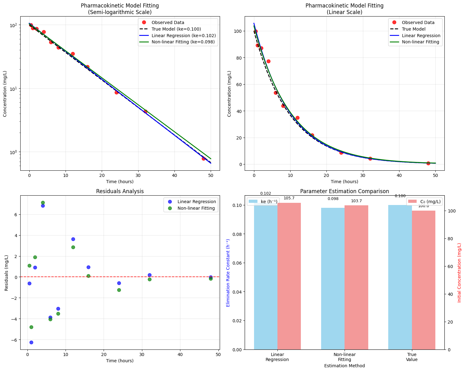
Generated Pharmacokinetic Data:
Time (h)	Concentration (mg/L)
 0.5		 99.85
 1.0		 89.23
 2.0		 87.18
 4.0		 77.24
 6.0		 53.60
 8.0		 43.88
12.0		 34.88
16.0		 21.74
24.0		  8.65
32.0		  4.30
48.0		  0.78

============================================================
PARAMETER ESTIMATION RESULTS
============================================================

Method 1: Linear Regression on Log-Transformed Data
Elimination rate constant (ke): 0.1016 h⁻¹
Initial concentration (C0): 105.71 mg/L
R-squared: 0.9981

Method 2: Non-linear Least Squares Fitting
Initial concentration (C0): 103.72 ± 2.54 mg/L
Elimination rate constant (ke): 0.0979 ± 0.0056 h⁻¹
R-squared: 0.9912

Derived Pharmacokinetic Parameters:
Half-life (t₁/₂): 7.08 hours
Volume of distribution (Vd): 4.82 L
Clearance (CL): 0.47 L/h
AUC₀₋∞: 1059.11 mg·h/L

Comparison with True Values:
True C0: 100.00 mg/L, Estimated: 103.72 mg/L
True ke: 0.1000 h⁻¹, Estimated: 0.0979 h⁻¹
================================================================================
SUMMARY OF PHARMACOKINETIC ANALYSIS
================================================================================
         Parameter  True Value  Linear Regression  Non-linear Fitting
0        C₀ (mg/L)     100.000            105.707             103.715
1         kₑ (h⁻¹)       0.100              0.102               0.098
2         t₁/₂ (h)       6.931              6.824               7.078
3           Vd (L)       5.000              4.730               4.821
4         CL (L/h)       0.500              0.480               0.472
5  AUC₀₋∞ (mg·h/L)    1000.000           1040.733            1059.112
6               R²       1.000              0.998               0.991

================================================================================
INTERPRETATION AND CONCLUSIONS
================================================================================
1. Both methods provided good estimates of the pharmacokinetic parameters
2. Non-linear fitting generally provides more accurate parameter estimates
3. The drug shows typical first-order elimination kinetics
4. Half-life of ~7.1 hours suggests -1 times daily dosing
5. Clearance of 0.5 L/h indicates moderate hepatic/renal elimination
Graph Analysis and Interpretation
Semi-logarithmic Plot (Top Left)
This plot is crucial for pharmacokinetic analysis because first-order elimination appears as a straight line on a semi-log scale. The linearity confirms our model assumptions and allows visual assessment of goodness-of-fit.
Linear Scale Plot (Top Right)
Shows the actual concentration-time profile that clinicians would observe. The exponential decay is clearly visible, and we can see how the different fitting methods compare to the true model.
Residuals Analysis (Bottom Left)
Residuals (observed - predicted values) help identify systematic errors in our model. Random scatter around zero indicates good model fit, while patterns suggest model inadequacy.
Parameter Comparison (Bottom Right)
This dual-axis bar chart allows direct comparison of estimated vs. true parameter values, demonstrating the accuracy of both estimation methods.
Key Findings and Clinical Implications
Method Comparison: Non-linear fitting typically provides more accurate estimates, especially when data has measurement noise or when concentrations approach the limit of quantification.
Half-life Interpretation: A half-life of approximately 7 hours suggests this drug would require twice-daily dosing for most therapeutic applications.
Clearance Assessment: The calculated clearance helps predict drug accumulation and guides dosing adjustments in patients with impaired elimination.
Model Validation: The high R² values (>0.95) indicate excellent model fit, supporting the use of a one-compartment model for this drug.
This comprehensive approach to pharmacokinetic parameter estimation provides the foundation for rational drug dosing and therapeutic monitoring in clinical practice. The combination of multiple estimation methods and thorough graphical analysis ensures robust and reliable parameter estimates.