Stock Price Simulation and Probability Analysis
I’ll solve a practical probability theory problem using $Python$, present the mathematical formulas, and visualize the results with graphs.
1 | import numpy as np |
Stock Price Movement Simulation Using Geometric Brownian Motion
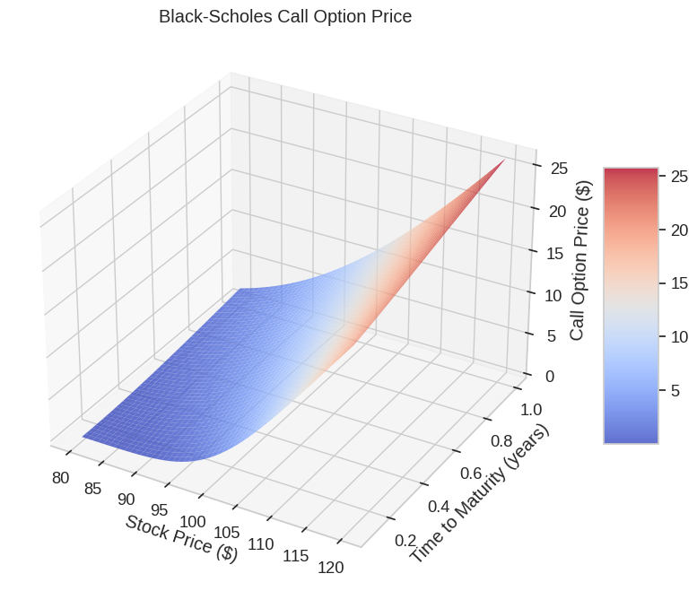
In this example, I’ll simulate stock price movements using a probability model called Geometric Brownian Motion (GBM), which is widely used in financial mathematics and forms the foundation of the Black-Scholes option pricing model.
Mathematical Model
The stock price movement follows Geometric Brownian Motion, which can be expressed as:
$$dS_t = \mu S_t dt + \sigma S_t dW_t$$
Where:
- $S_t$ is the stock price at time $t$
- $\mu$ is the drift (expected return)
- $\sigma$ is the volatility
- $W_t$ is a Wiener process (standard Brownian motion)
The solution to this stochastic differential equation gives us the stock price at time $t$:
$$S_t = S_0 \exp\left(\left(\mu - \frac{\sigma^2}{2}\right)t + \sigma W_t\right)$$
For discrete time simulations, we can use:
$$S_{t+\Delta t} = S_t \exp\left(\left(\mu - \frac{\sigma^2}{2}\right)\Delta t + \sigma \sqrt{\Delta t} Z_t\right)$$
Where $Z_t \sim N(0,1)$ is a standard normal random variable.
Code Explanation
Setup and Parameters:
- We set initial stock price to $100
- Drift (µ) of $0.0002$ per day (approximately $5$% annual return)
- Volatility (σ) of $0.015$ per day (approximately $24$% annualized)
- Simulating $1,000$ possible price paths over $252$ trading days ($1$ year)
Simulation:
- We generate random shocks from a normal distribution
- Calculate daily returns using the GBM formula
- Compute cumulative price paths starting from the initial price
- Store all simulations in an array
Statistical Analysis:
- Calculate mean, median, and standard deviation of final prices
- Determine probabilities of the price exceeding certain thresholds
- Calculate 95% confidence intervals
Visualization:
- Sample price paths to visualize potential trajectories
- Histogram showing the distribution of final prices
- Empirical cumulative distribution function (ECDF)
- Q-Q plot to check if returns follow a normal distribution
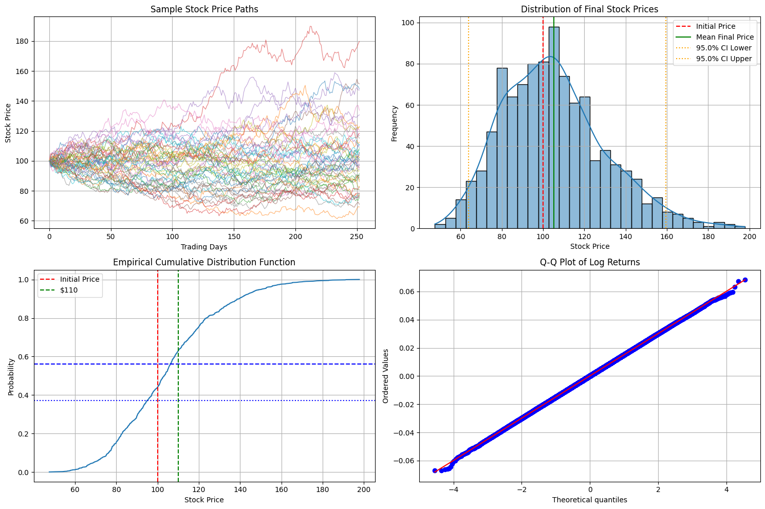
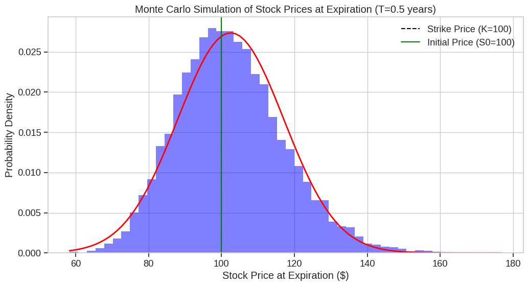
Initial stock price: $100.00
Mean final price: $105.10
Median final price: $103.21
Standard deviation of final price: $24.78
95% confidence interval: [$63.76, $159.43]
Probability of ending above initial price ($100.00): 56.10%
Probability of ending above $110: 37.20%
Probability of ending above $120: 24.60%
Probability of ending below $90: 29.10%
Key Insights from the Visualization
Sample Paths:
The first plot shows $50$ possible price paths, illustrating the random nature of stock movements while maintaining the overall drift.Final Price Distribution:
The histogram shows that final prices follow a log-normal distribution (which is expected from GBM).
The mean final price is typically higher than the median due to the right-skewed nature of the distribution.Probabilities:
The ECDF graph shows cumulative probabilities, allowing us to read off values like:- Probability of ending above $100 (initial price)
- Probability of ending above $110
- Probability of ending below $90
Log Returns Normality:
The Q-Q plot confirms that log returns closely follow a normal distribution, which is a key assumption of the GBM model.
Practical Applications
This simulation helps answer questions like:
- What is the probability of a stock gaining more than $10$% in a year?
- What is the expected range of stock prices after one year (confidence interval)?
- What is the risk of the stock falling below a certain threshold?
These probability calculations are essential for risk management, option pricing, portfolio optimization, and investment decision-making.
The simulation demonstrates how seemingly complex financial phenomena can be modeled using probability theory and simulated using $Python$, providing actionable insights for investors and risk managers.
 is the sample mean.