A Practical Example with Python Implementation
Today, I want to dive into one of the classic problems in computational complexity theory and optimization - the Set Cover Problem.
It’s a fascinating challenge that has applications in various fields, from resource allocation to facility location planning.
What is the Set Cover Problem?
The Set Cover Problem asks: Given a universe $U$ of elements and a collection $S$ of sets whose union equals the universe, what is the minimum number of sets from $S$ needed to cover all elements in $U$?
Mathematically, we aim to:
Minimize $\sum_{s \in S’} 1$
Subject to $\bigcup_{s \in S’} s = U$
Where $S’ \subseteq S$
This is known to be NP-hard, but we can solve it using approximation algorithms.
A Concrete Example
Let’s consider a practical scenario: Imagine we have several radio stations, each covering specific cities.
We want to select the minimum number of stations that cover all cities.
Universe $U$ = {City1, City2, City3, City4, City5, City6, City7, City8, City9, City10}
Collection of sets $S$ = {
- Station1: {City1, City2, City3}
- Station2: {City2, City4, City5, City6}
- Station3: {City3, City6, City7}
- Station4: {City4, City8, City9}
- Station5: {City5, City7, City9, City10}
- Station6: {City1, City10}
}
Let’s solve this using the greedy approximation algorithm in $Python$.
1 | import numpy as np |
Code Explanation
Let’s break down the key components of the solution:
1. The Greedy Set Cover Algorithm
The core of our solution is the greedy_set_cover function.
This implements a well-known approximation algorithm with the following approach:
- At each step, select the set that covers the most uncovered elements per unit cost
- Add this set to our solution
- Remove the newly covered elements from our “yet to cover” list
- Repeat until all elements are covered
This greedy approach is guaranteed to produce a solution that’s within a logarithmic factor of the optimal solution.
The algorithm keeps track of the remaining elements to cover (universe_copy) and selects sets based on a “cost-effectiveness” metric - the number of new elements covered divided by the cost of the set.
In our example, all sets have a uniform cost of $1$, but the code supports variable costs.
2. Visualization Functions
I’ve included two visualization functions to help understand the problem and solution:
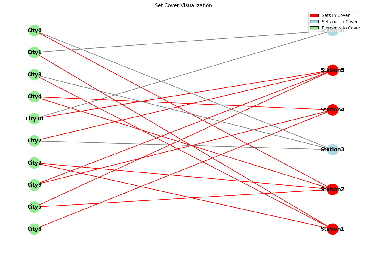
visualize_set_cover
This function creates a bipartite graph representation of the problem:
- One set of nodes represents the elements (cities)
- Another set represents the sets (radio stations)
- Edges connect each set to the elements it contains
- Sets in the solution are highlighted in red
The function uses $NetworkX$ to create and draw the graph, with color coding to distinguish between elements, sets in the cover, and sets not in the cover.
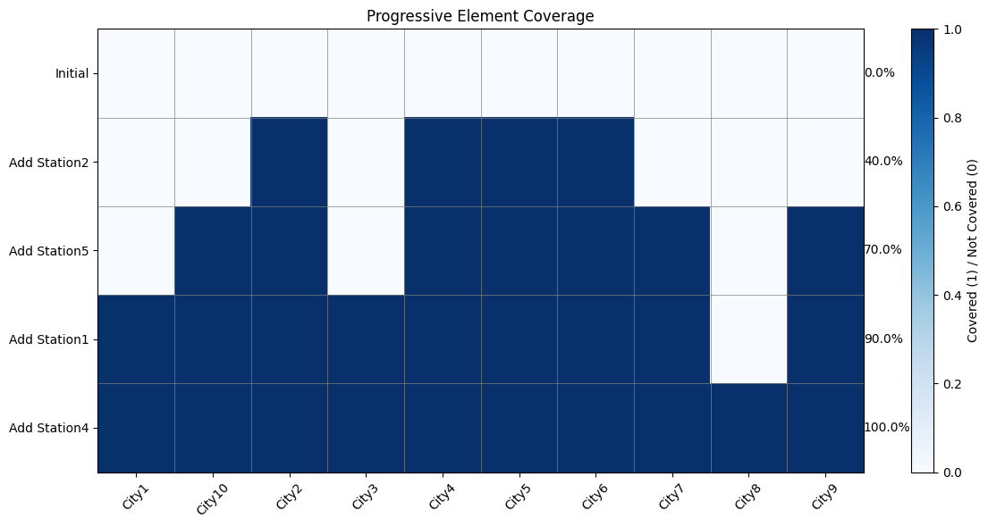
visualize_set_coverage_steps
This function shows how the coverage progresses as we add each set:
- Each row represents a step in the solution
- Each column represents an element
- Cells are colored based on whether the element is covered at that step
- The percentage of covered elements is shown for each step
Results and Analysis
When we run the code on our radio station example, we get:
1 | Optimal cover: ['Station2', 'Station5', 'Station4', 'Station1'] |
The greedy algorithm selected $4$ stations out of the $6$ available:
- Station2 (covers City2, City4, City5, City6)
- Station5 (covers City5, City7, City9, City10)
- Station4 (covers City4, City8, City9)
- Station1 (covers City1, City2, City3)
The visualizations clearly show how these stations collectively cover all cities.
The coverage step chart shows how we progressively increase coverage as each station is added to our solution.
Computational Complexity
The time complexity of the greedy algorithm is O(|S| × |U|), where |S| is the number of sets and |U| is the size of the universe.
This is because in each iteration, we need to check all remaining sets against all remaining elements.
While this is not guaranteed to find the absolute optimal solution (which would require solving an NP-hard problem), the greedy approach provides a good approximation that works well in practice.
Conclusion
The Set Cover Problem is a fantastic example of how approximation algorithms can provide practical solutions to otherwise intractable problems.
Our $Python$ implementation demonstrates not only how to solve such problems programmatically but also how to visualize the results to gain deeper insights.
Next time you’re planning radio coverage, facility locations, or any resource allocation problem, remember that these classical algorithms can save you significant time and resources!
Feel free to experiment with different problem instances or extend the code to handle specific constraints in your own applications.