Problem: Partition Function and Average Energy in a 2-Level System
In statistical mechanics, the partition function is a fundamental quantity that describes the statistical properties of a system in thermal equilibrium.
Using $Python$, we can compute the partition function and derive physical quantities such as the average energy of a 2-level quantum system.
Problem Statement
Consider a system with two energy levels:
- Ground state energy $E_0 = 0$,
- Excited state energy $E_1 = \Delta E$.
The system is in thermal equilibrium at temperature $T$. Solve for:
- The partition function $Z$:
$$
Z = \sum_{i} e^{-E_i / k_B T}
$$ - The average energy $ \langle E \rangle$:
$$
\langle E \rangle = \frac{\sum_{i} E_i e^{-E_i / k_B T}}{Z}
$$
Python Code
1 | import numpy as np |
Explanation
Partition Function:
- The partition function $Z$ is the sum of the $Boltzmann$ factors $e^{-E_i / k_B T}$.
- For the 2-level system, $Z = 1 + e^{-\Delta E / k_B T}$.
Average Energy:
- The average energy $\langle E \rangle$ is computed by weighting each energy level by its $Boltzmann$ factor, normalized by $Z$.
Temperature Dependence:
- At low temperatures, most particles are in the ground state, and $\langle E \rangle \approx 0$.
- At high temperatures, both levels are equally populated, and $\langle E \rangle \to \Delta E / 2$.
Results and Insights
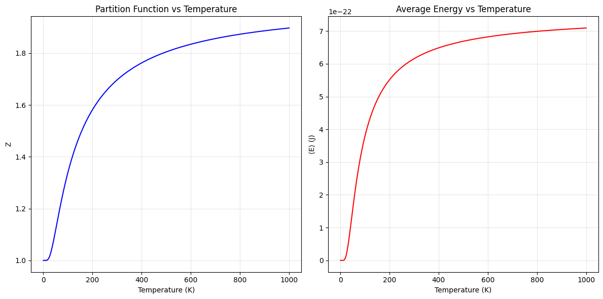
Partition Function:
- $Z$ starts close to 1 at low temperatures, where only the ground state is occupied.
- As temperature increases, $Z$ grows, reflecting the contribution of the excited state.
Average Energy:
- At low $T$, $(\langle E \rangle \to 0)$, as particles are mostly in the ground state.
- At high $(T)$, the system reaches a thermal equilibrium where $(\langle E \rangle \to \Delta E / 2)$, consistent with equal population of both states.
This example demonstrates how statistical mechanics connects microscopic energy states with macroscopic thermodynamic quantities.