Let’s work on an algebra problem involving solving and visualizing quadratic equations.
Quadratic equations are commonly encountered in algebra and can model various real-world phenomena like projectile motion and area calculations.
Problem: Solving a Quadratic Equation
Given a quadratic equation:
$$
f(x) = ax^2 + bx + c
$$
we want to:
- Solve for the roots (values of $( x )$ where $ f(x) = 0 $).
- Plot the quadratic function to visualize its shape, marking the roots if they exist.
Let’s use a specific example:
$$
f(x) = 2x^2 - 4x - 6
$$
In this case, $( a = 2 )$, $( b = -4 )$, and $( c = -6 )$.
Solution Outline
- Roots Calculation:
- Solve the quadratic equation $ 2x^2 - 4x - 6 = 0 $ using the quadratic formula:
$$
x = \frac{-b \pm \sqrt{b^2 - 4ac}}{2a}
$$
- Solve the quadratic equation $ 2x^2 - 4x - 6 = 0 $ using the quadratic formula:
- Plotting the Function:
- Plot the quadratic function to observe its parabolic shape and mark the roots for easy visualization.
Python Code
Here’s the $Python$ code to solve the equation and plot the function along with its roots:
1 | import numpy as np |
Explanation of the Code
- Root Calculation:
- The discriminant $ (b^2 - 4ac) $ is calculated first.
- Depending on the discriminant’s value:
- Two real roots if the discriminant is positive.
- One real root if the discriminant is zero (the parabola just touches the $x$-$axis$).
- No real roots if the discriminant is negative.
- Function Definition and Plotting:
- We define $ f(x) $ and compute $ y $-$values$ for a range of $ x $-$values$ to create a smooth plot.
- If real roots are found, they are marked on the graph with red dots.
- Graph Details:
- The plot includes axis labels, a title, and a legend for clarity.
Visualization
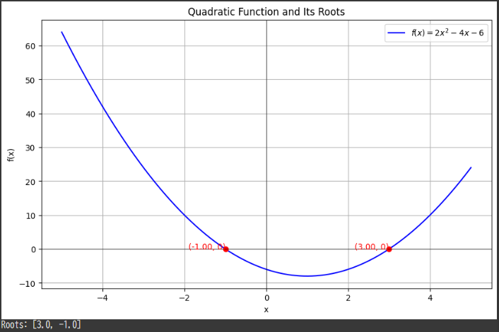
The plot shows:
- Blue Curve: The parabola representing $ f(x) = 2x^2 - 4x - 6 $.
- Red Dots: These indicate the roots where the parabola intersects the $x$-$axis$.
Interpretation
- Roots: The roots are the points where $ f(x) = 0 $. They provide key insights, such as when a quantity reaches zero or crosses a threshold.
- Parabola Shape: The shape of $ f(x) $ depends on $ a $; here, $ a = 2 $, so the parabola opens upwards.
- Applications: Quadratic functions appear in physics, economics, and engineering, making their roots crucial in problem-solving, such as determining when a projectile hits the ground or optimizing profit based on cost and revenue functions.