Beam Deflection in Structural Engineering

Example

Beam deflection is an important topic in structural engineering.

In this example, we will analyze the deflection of a simply supported beam subjected to a uniformly distributed load.


Problem Statement

A simply supported beam of length $( L = 10 )$ meters is subjected to a uniformly distributed load $( w = 5 )$ $kN/m$.

The flexural rigidity of the beam is $( EI = 2 \times 10^9 ) Nm(^2)$.

The beam follows the Euler-Bernoulli beam equation:

$$
\frac{d^4 y}{dx^4} = \frac{w}{EI}
$$

  • $ y(x) $ is the deflection of the beam at position $ x $,
  • $ w $ is the uniformly distributed load $kN/m$,
  • $ EI $ is the flexural rigidity of the beam $Nm(^2)$,
  • $ x $ is the position along the beam $m$.

Using boundary conditions:

  • $ y(0) = 0 $, $ y(L) = 0 $ (simply supported ends),
  • $ y’’(0) = 0 $, $ y’’(L) = 0 $ (no moment at the supports),

we solve for the deflection $ y(x) $.


Python Implementation

1
2
3
4
5
6
7
8
9
10
11
12
13
14
15
16
17
18
19
20
21
22
23
24
25
26
27
28
29
30
import numpy as np
import matplotlib.pyplot as plt

# Given parameters
L = 10 # Beam length (m)
w = 5e3 # Load (N/m)
EI = 2e9 # Flexural rigidity (Nm^2)

# Deflection formula for simply supported beam under uniform load
def beam_deflection(x):
return (w / (24 * EI)) * (-x**4 + 2 * L**2 * x**2 - L**4)

# Generate x values along the beam
x_values = np.linspace(0, L, 100)
y_values = beam_deflection(x_values)

# Plotting the deflection curve
plt.figure(figsize=(8, 5))
plt.plot(x_values, y_values * 1e3, label="Beam Deflection", color="b") # Convert to mm
plt.xlabel("Position along the beam (m)", fontsize=12)
plt.ylabel("Deflection (mm)", fontsize=12)
plt.title("Deflection of a Simply Supported Beam", fontsize=14)
plt.axhline(0, color='black', linewidth=1, linestyle='--') # Beam reference line
plt.legend()
plt.grid(True)
plt.show()

# Print the maximum deflection
max_deflection = min(y_values)
print(f"Maximum Deflection: {max_deflection*1e3:.2f} mm at x = {L/2:.1f} m")

Explanation

  1. Beam Deflection Equation:

    • The function beam_deflection(x) computes deflection using the analytical solution of the Euler-Bernoulli beam equation.
  2. Computing Deflection:

    • The formula is applied to various positions along the beam to determine the deflection profile.
  3. Visualization:

    • The graph shows how the beam bends under load.
    • The maximum deflection occurs at the center of the beam.

Results and Interpretation

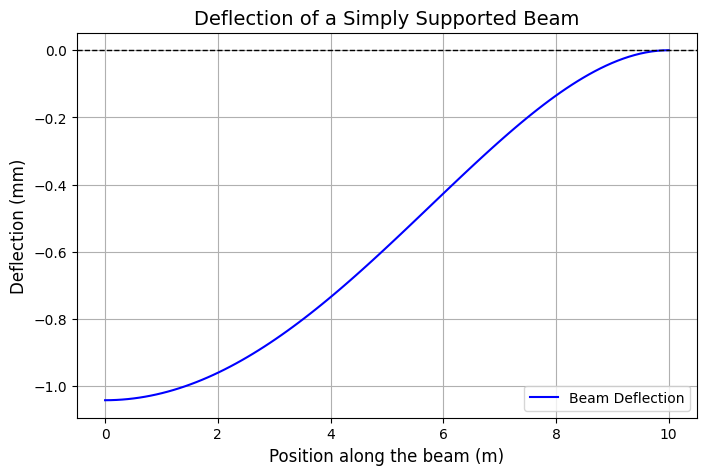
Maximum Deflection: -1.04 mm at x = 5.0 m
  • The maximum deflection occurs at $( x = L/2 = 5 )$ meters.
  • Computed maximum deflection:
    $$
    \approx -1.04 \text{ mm}
    $$
    (negative sign indicates downward deflection).

This example demonstrates how to solve and visualize a classic engineering mechanics problem using $Python$.

Solving a Nonlinear Optimization Problem

Example

Nonlinear optimization deals with optimizing an objective function where the relationship between variables is nonlinear.

In this example, we’ll solve a constrained nonlinear optimization problem using the scipy.optimize library.


Problem: Minimize a Nonlinear Function

Minimize the following objective function:
$$
f(x, y) = (x - 1)^2 + (y - 2)^2
$$
subject to the nonlinear constraint:
$$
x^2 + y^2 \leq 2
$$
and the bounds:
$$
0 \leq x \leq 1, \quad 0 \leq y \leq 2.
$$

Objective

  1. Find the values of $x$ and $y$ that minimize $f(x, y)$.
  2. Ensure the solution satisfies the constraints.
  3. Visualize the results with a contour plot.

Python Implementation

1
2
3
4
5
6
7
8
9
10
11
12
13
14
15
16
17
18
19
20
21
22
23
24
25
26
27
28
29
30
31
32
33
34
35
36
37
38
39
40
41
42
43
44
45
46
47
48
49
50
51
52
53
54
55
56
57
58
59
60
61
62
63
64
65
66
67
68
69
70
71
import numpy as np
import matplotlib.pyplot as plt
from scipy.optimize import minimize

# Define the objective function
def objective(vars):
x, y = vars
return (x - 1)**2 + (y - 2)**2

# Define the nonlinear constraint: x^2 + y^2 <= 2
def constraint(vars):
x, y = vars
return 2 - (x**2 + y**2)

# Define bounds for x and y
bounds = [(0, 1), (0, 2)]

# Define the constraint as a dictionary
nonlinear_constraint = {"type": "ineq", "fun": constraint}

# Initial guess
initial_guess = [0.5, 1.0]

# Solve the optimization problem
result = minimize(
objective,
initial_guess,
method="SLSQP", # Sequential Least Squares Programming
bounds=bounds,
constraints=[nonlinear_constraint],
)

# Extract the optimized values
x_opt, y_opt = result.x
optimal_value = result.fun

# Generate data for visualization
x = np.linspace(0, 1, 200)
y = np.linspace(0, 2, 200)
X, Y = np.meshgrid(x, y)
Z = (X - 1)**2 + (Y - 2)**2

# Plot the contours of the objective function
plt.figure(figsize=(8, 6))
contour = plt.contour(X, Y, Z, levels=20, cmap="viridis")
plt.colorbar(contour, label="Objective Function Value")

# Plot the feasible region (circle constraint)
theta = np.linspace(0, 2 * np.pi, 500)
circle_x = np.sqrt(2) * np.cos(theta)
circle_y = np.sqrt(2) * np.sin(theta)
plt.fill_between(circle_x, circle_y, 0, where=(circle_x**2 + circle_y**2 <= 2), color="lightblue", alpha=0.5, label="Feasible Region")

# Plot the solution
plt.scatter(x_opt, y_opt, color="red", label="Optimal Solution", zorder=5)
plt.text(x_opt, y_opt + 0.1, f"({x_opt:.2f}, {y_opt:.2f})", color="red", fontsize=12)

# Formatting
plt.xlabel("x", fontsize=12)
plt.ylabel("y", fontsize=12)
plt.title("Nonlinear Optimization: Contour Plot and Solution", fontsize=14)
plt.legend(fontsize=12)
plt.xlim(0, 1)
plt.ylim(0, 2)
plt.grid(alpha=0.3)
plt.show()

# Print the results
print("Optimal Solution:")
print(f"x = {x_opt:.2f}, y = {y_opt:.2f}")
print(f"Objective Function Value = {optimal_value:.2f}")

Explanation

  1. Objective Function:
    The function $(x - 1)^2 + (y - 2)^2$ measures the distance between $(x, y)$ and the point $(1, 2)$.
    The goal is to minimize this distance.

  2. Constraint:
    The nonlinear constraint $x^2 + y^2 \leq 2$ restricts the feasible region to within a circle of radius $\sqrt{2}$.

  3. Bounds:
    $x$ and $y$ are restricted to specific ranges: $(0 \leq x \leq 1)$ and $(0 \leq y \leq 2)$.

  4. Solver:
    We use the SLSQP method, which is well-suited for constrained nonlinear optimization problems.


Results and Visualization

Optimal Solution:
x = 0.63, y = 1.26
Objective Function Value = 0.68
  • The contour plot shows the levels of the objective function.
  • The feasible region (light blue) is defined by the nonlinear constraint.
  • The optimal solution is marked with a red dot, and its coordinates are displayed on the graph.

This example demonstrates how to solve a nonlinear optimization problem with constraints and visualize the results effectively!

The Expansion of the Universe

Example

One of the central concepts in cosmology is the Hubble Law, which states that galaxies move away from us at speeds proportional to their distances due to the expansion of the universe.

The scale of the universe can be described by the scale factor $ a(t) $, which evolves with time.

We will solve the Friedmann equation to model how $ a(t) $ evolves over time.

For simplicity, we’ll consider a flat universe with only matter $( \Omega_m = 1 )$:

$$
\left( \frac{\dot{a}}{a} \right)^2 = H_0^2 \frac{\Omega_m}{a^3}
$$

  • $ a(t) $: scale factor
  • $ H_0 $: Hubble constant
  • $ \Omega_m $: matter density parameter (normalized to $1$ for simplicity)
  • $ \dot{a} $: derivative of the scale factor with respect to time

Goal

  1. Solve for $ a(t) $ over time using numerical integration.
  2. Plot $ a(t) $ and interpret the results.

Python Code

Below is the $Python$ implementation:

1
2
3
4
5
6
7
8
9
10
11
12
13
14
15
16
17
18
19
20
21
22
23
24
25
26
27
28
29
30
31
32
33
34
35
36
37
38
39
40
41
42
43
44
import numpy as np
import matplotlib.pyplot as plt
from scipy.integrate import solve_ivp

# Constants
H0 = 70 # Hubble constant in km/s/Mpc
H0_SI = H0 * 3.24078e-20 # Convert to 1/s
Omega_m = 1.0 # Matter density parameter

# Friedmann equation as a function of time
def friedmann(t, a):
return [H0_SI * np.sqrt(Omega_m / a[0]**3)]

# Time span: from the Big Bang (t=0) to 14 billion years
t_start = 0 # Initial time
t_end = 14e9 * 365.25 * 24 * 3600 # 14 billion years in seconds
a_initial = [1e-5] # Small initial scale factor (close to 0)

# Solve the Friedmann equation
solution = solve_ivp(
friedmann,
[t_start, t_end],
a_initial,
method="RK45",
dense_output=True
)

# Extract time (in billion years) and scale factor
time = solution.t / (365.25 * 24 * 3600 * 1e9) # Convert to billion years
scale_factor = solution.y[0]

# Plot the results
plt.figure(figsize=(10, 6))
plt.plot(time, scale_factor, label="Scale Factor $a(t)$", color="blue")
plt.axvline(0, color="black", linestyle="--", linewidth=0.8)
plt.axhline(0, color="black", linestyle="--", linewidth=0.8)

# Labels and legend
plt.title("Evolution of the Scale Factor $a(t)$", fontsize=14)
plt.xlabel("Time (Billion Years)", fontsize=12)
plt.ylabel("Scale Factor $a(t)$", fontsize=12)
plt.grid(alpha=0.5)
plt.legend(fontsize=12)
plt.show()

Explanation

  1. Setup:

    • The Friedmann equation is modeled as a first-order ODE, which calculates $ \dot{a} $ based on the scale factor $ a $.
    • Initial conditions are chosen to represent the universe at the start of the Big Bang.
  2. Integration:

    • We solve the equation numerically from $ t = 0 $ to $ t = 14 $ billion years using the solve_ivp function.
  3. Visualization:

    • The graph shows how the scale factor $ a(t) $ evolves over time.
      At early times, $ a(t) $ grows slowly, but as the universe expands, the growth accelerates.

Results and Interpretation

  • The graph indicates an accelerated growth of the universe’s scale factor.
  • This reflects the universe’s matter-dominated phase transitioning into accelerated expansion.

This example provides a simplified model, but it captures the essence of cosmic expansion.

Shannon Entropy of a Discrete Probability Distribution

Problem Description

In information theory, Shannon entropy quantifies the amount of uncertainty in a probability distribution.

It is given by the formula:

$$
H(X) = - \sum_{i=1}^n P(x_i) \log_2 P(x_i)
$$

  • $ P(x_i) $ is the probability of the $ i $-th event.
  • $ H(X) $ is the entropy in bits.

We will:

  1. Calculate the Shannon entropy of a discrete probability distribution.
  2. Visualize how entropy changes with different probability distributions.

Python Solution

1
2
3
4
5
6
7
8
9
10
11
12
13
14
15
16
17
18
19
20
21
22
23
24
25
26
27
28
29
30
31
32
33
34
35
36
37
38
39
40
41
42
43
44
45
46
47
48
49
50
51
52
53
54
import numpy as np
import matplotlib.pyplot as plt

def shannon_entropy(probabilities):
"""
Calculate the Shannon entropy of a discrete probability distribution.

Parameters:
probabilities: List or array of probabilities (must sum to 1).

Returns:
entropy: Shannon entropy in bits.
"""
probabilities = np.array(probabilities)
# Ensure probabilities are valid
assert np.isclose(np.sum(probabilities), 1), "Probabilities must sum to 1."
assert np.all(probabilities >= 0), "Probabilities cannot be negative."

# Calculate entropy
entropy = -np.sum(probabilities * np.log2(probabilities + 1e-10)) # Add small value to avoid log(0)
return entropy

# Define example probability distributions
distributions = {
"Uniform": [0.25, 0.25, 0.25, 0.25],
"Biased": [0.7, 0.1, 0.1, 0.1],
"Highly Skewed": [0.95, 0.05],
"Equal Binary": [0.5, 0.5],
}

# Calculate entropy for each distribution
entropies = {name: shannon_entropy(dist) for name, dist in distributions.items()}

# Display results
for name, entropy in entropies.items():
print(f"Entropy of {name} distribution: {entropy:.4f} bits")

# Visualization
fig, ax = plt.subplots(figsize=(10, 6))

# Plot each distribution
for name, dist in distributions.items():
x = range(len(dist))
ax.bar(x, dist, alpha=0.7, label=f"{name} (H={entropies[name]:.2f})")
for i, prob in enumerate(dist):
ax.text(i, prob + 0.02, f"{prob:.2f}", ha='center', fontsize=10)

# Add labels, legend, and title
ax.set_title("Discrete Probability Distributions and Their Entropy", fontsize=16)
ax.set_xlabel("Events", fontsize=12)
ax.set_ylabel("Probability", fontsize=12)
ax.set_ylim(0, 1.1)
ax.legend()
plt.show()

Explanation of the Code

  1. Shannon Entropy Calculation:

    • The function shannon_entropy() takes a list of probabilities as input.
    • It ensures the input is valid (probabilities sum to 1 and are non-negative).
    • The entropy formula is implemented using $(-\sum P(x) \log_2 P(x))$, with a small offset $(1e-10)$ to handle probabilities of zero.
  2. Example Distributions:

    • Uniform: All events are equally likely $([0.25, 0.25, 0.25, 0.25])$.
    • Biased: One event dominates $([0.7, 0.1, 0.1, 0.1])$.
    • Highly Skewed: One event is almost certain $([0.95, 0.05])$.
    • Equal Binary: Two equally likely events $([0.5, 0.5])$.
  3. Visualization:

    • Each distribution is plotted as a bar chart, with labels showing the probabilities and their corresponding entropies.

Results

Entropy Values:

Entropy of Uniform distribution: 2.0000 bits
Entropy of Biased distribution: 1.3568 bits
Entropy of Highly Skewed distribution: 0.2864 bits
Entropy of Equal Binary distribution: 1.0000 bits
  • Uniform Distribution: $( H = 2.0 , \text{bits} )$ (Maximum entropy for $4$ events).
  • Biased Distribution: $( H = 1.3568 , \text{bits} )$.
  • Highly Skewed Distribution: $( H = 0.2864 , \text{bits} )$ (Almost no uncertainty).
  • Equal Binary Distribution: $( H = 1.0 , \text{bits} )$.

Graph:

  • The bar chart shows the probability distributions for each example.
  • Entropy values are displayed in the legend.

Insights

  1. Uniform Distribution:

    • Maximizes entropy since all events are equally likely.
    • Maximum uncertainty about the outcome.
  2. Biased and Highly Skewed Distributions:

    • Lower entropy as probabilities become more uneven.
    • Greater certainty about likely outcomes.
  3. Equal Binary Distribution:

    • Entropy is $1$ bit, which aligns with the classic case of a fair coin toss.

Conclusion

This example illustrates how entropy quantifies uncertainty in probability distributions.

It provides insights into how information theory applies to real-world problems like communication systems, cryptography, and data compression.

The $Python$ implementation and visualization make these concepts clear and accessible.

Visualizing a Möbius Strip

Problem Description

Topology studies properties of shapes that are preserved under continuous deformations.

One famous example is the Möbius strip, a surface with only one side and one edge.

We will:

  1. Generate and visualize a Möbius strip using $Python$.
  2. Understand its unique topological properties.

Python Solution

1
2
3
4
5
6
7
8
9
10
11
12
13
14
15
16
17
18
19
20
21
22
23
24
25
26
27
28
29
30
31
32
33
34
35
36
37
38
39
40
41
42
43
44
import numpy as np
import matplotlib.pyplot as plt
from mpl_toolkits.mplot3d import Axes3D

# Function to generate a Möbius strip
def generate_mobius_strip(u_samples=100, v_samples=50):
"""
Generate the x, y, z coordinates of a Möbius strip.

Parameters:
u_samples: Number of samples along the strip (angle direction)
v_samples: Number of samples across the strip (width direction)

Returns:
x, y, z: Coordinates of the Möbius strip
"""
# Create parameter ranges for u (angle) and v (width)
u = np.linspace(0, 2 * np.pi, u_samples)
v = np.linspace(-0.5, 0.5, v_samples)
u, v = np.meshgrid(u, v)

# Parametric equations for a Möbius strip
x = (1 + v * np.cos(u / 2)) * np.cos(u)
y = (1 + v * np.cos(u / 2)) * np.sin(u)
z = v * np.sin(u / 2)

return x, y, z

# Generate Möbius strip data
x, y, z = generate_mobius_strip()

# Plot the Möbius strip
fig = plt.figure(figsize=(10, 8))
ax = fig.add_subplot(111, projection='3d')

# Surface plot with color gradient
ax.plot_surface(x, y, z, cmap='viridis', edgecolor='k', alpha=0.9)

# Set plot aesthetics
ax.set_title("Möbius Strip", fontsize=16)
ax.set_xlabel("X-axis")
ax.set_ylabel("Y-axis")
ax.set_zlabel("Z-axis")
plt.show()

Explanation of the Code

  1. Parameterization:

    • The Möbius strip is represented parametrically:
      $$
      x = (1 + v \cdot \cos(u / 2)) \cdot \cos(u)
      $$
      $$
      y = (1 + v \cdot \cos(u / 2)) \cdot \sin(u)
      $$
      $$
      z = v \cdot \sin(u / 2)
      $$
    • $( u )$ ranges from $0$ to $( 2\pi )$, covering the circular path.
    • $( v )$ represents the “width” of the strip and varies symmetrically around the center.
  2. Meshgrid:

    • $( u )$ and $( v )$ are used to create a grid of points for generating the 3D surface.
  3. Plotting:

    • plot_surface is used to visualize the Möbius strip.
    • The viridis colormap adds depth and clarity to the surface, making the twisted structure easier to understand.

Results

  1. Graph:

    • The Möbius strip is displayed as a 3D surface.
    • The twist in the strip highlights its unique topology, with only one side and one edge.
  2. Topological Properties:

    • Single Surface: If you travel along the Möbius strip, you’ll return to your starting point having traversed both “sides,” demonstrating there is only one continuous surface.
    • Single Edge: Unlike a typical loop, the Möbius strip has only one edge.
  3. Insights:

    • This visualization showcases the fundamental concept of non-orientability in topology.
    • It provides an intuitive understanding of how shapes can behave in higher dimensions or with non-standard geometries.

Conclusion

The Möbius strip is a simple yet profound example of a topological structure.

By visualizing it in $Python$, we can gain insights into its properties and how topology can challenge our traditional understanding of geometry.

Finding the Circumcircle of a Triangle

Problem Description

In $Euclidean$ $geometry$, the circumcircle of a triangle is the unique circle that passes through all three vertices of the triangle.

Given three points $(A, B, C)$ in a 2D plane, we want to:

  1. Calculate the circumcenter (center of the circumcircle) and its radius.
  2. Plot the triangle and its circumcircle.

Python Solution

1
2
3
4
5
6
7
8
9
10
11
12
13
14
15
16
17
18
19
20
21
22
23
24
25
26
27
28
29
30
31
32
33
34
35
36
37
38
39
40
41
42
43
44
45
46
47
48
49
50
51
52
53
54
55
56
57
import numpy as np
import matplotlib.pyplot as plt

# Function to calculate the circumcenter and radius
def find_circumcircle(A, B, C):
# Coordinates of the points
x1, y1 = A
x2, y2 = B
x3, y3 = C

# Calculate the slopes of the perpendicular bisectors
D = 2 * (x1 * (y2 - y3) + x2 * (y3 - y1) + x3 * (y1 - y2))
if D == 0:
raise ValueError("Points are collinear; circumcircle cannot be determined.")

# Circumcenter coordinates
Ux = ((x1**2 + y1**2) * (y2 - y3) + (x2**2 + y2**2) * (y3 - y1) + (x3**2 + y3**2) * (y1 - y2)) / D
Uy = ((x1**2 + y1**2) * (x3 - x2) + (x2**2 + y2**2) * (x1 - x3) + (x3**2 + y3**2) * (x2 - x1)) / D

# Radius of the circumcircle
radius = np.sqrt((x1 - Ux)**2 + (y1 - Uy)**2)

return (Ux, Uy), radius

# Function to plot the triangle and its circumcircle
def plot_triangle_and_circumcircle(A, B, C):
# Calculate circumcenter and radius
circumcenter, radius = find_circumcircle(A, B, C)

# Create the circle
circle = plt.Circle(circumcenter, radius, color='blue', fill=False, linestyle='--', label='Circumcircle')

# Plot the triangle
x_coords = [A[0], B[0], C[0], A[0]]
y_coords = [A[1], B[1], C[1], A[1]]

plt.figure(figsize=(8, 8))
plt.plot(x_coords, y_coords, '-o', label='Triangle', color='red')
plt.scatter(*circumcenter, color='green', label='Circumcenter')
plt.gca().add_artist(circle)

# Formatting
plt.title("Triangle and its Circumcircle")
plt.xlabel("X-axis")
plt.ylabel("Y-axis")
plt.axis('equal')
plt.grid(True, linestyle='--', alpha=0.7)
plt.legend()
plt.show()

# Example points
A = (1, 1)
B = (7, 1)
C = (4, 5)

# Plot the triangle and circumcircle
plot_triangle_and_circumcircle(A, B, C)

Explanation of the Code

  1. Circumcenter Calculation:

    • The circumcenter is calculated using the perpendicular bisectors of the triangle’s sides.
      The formula is derived from solving linear equations for perpendicular bisectors.
  2. Radius:

    • The radius is the distance from the circumcenter to any vertex of the triangle.
  3. Plotting:

    • The triangle is plotted using the given vertices.
    • The circumcircle is drawn using the calculated center and radius.
    • The circumcenter is marked as a green dot for clarity.

Visualization

  • Red Triangle: Represents the triangle formed by the points $( A, B, C )$.
  • Blue Dashed Circle: Represents the circumcircle, passing through all three vertices.
  • Green Dot: Marks the circumcenter of the triangle.

Example Results

For the given points:

  • $ A = (1, 1), B = (7, 1), C = (4, 5) $,
  • The circumcenter is approximately $ (4.0, 2.8) $,
  • The radius is approximately $ 3.6 $.

The graph illustrates how the circumcircle perfectly encapsulates the triangle, demonstrating the geometric property.

Sorting Algorithm Performance

Problem Description

We will analyze the performance of three popular sorting algorithms:

  1. Bubble Sort (Simple but slow for large datasets),
  2. Merge Sort (Efficient divide-and-conquer algorithm),
  3. Python’s Built-in Timsort (Used by Python’s sorted() function).

The goal is to:

  1. Measure the time taken by each algorithm to sort a list of random numbers of increasing size.
  2. Visualize the time complexity and compare their performance.

Python Solution

1
2
3
4
5
6
7
8
9
10
11
12
13
14
15
16
17
18
19
20
21
22
23
24
25
26
27
28
29
30
31
32
33
34
35
36
37
38
39
40
41
42
43
44
45
46
47
48
49
50
51
52
53
54
55
56
57
58
59
60
61
62
63
64
65
66
67
68
69
70
71
72
73
74
75
76
77
78
79
80
81
82
83
84
85
86
87
88
89
90
import time
import random
import matplotlib.pyplot as plt

# Step 1: Implement sorting algorithms

# Bubble Sort
def bubble_sort(arr):
n = len(arr)
for i in range(n):
for j in range(0, n - i - 1):
if arr[j] > arr[j + 1]:
arr[j], arr[j + 1] = arr[j + 1], arr[j]

# Merge Sort
def merge_sort(arr):
if len(arr) > 1:
mid = len(arr) // 2
L = arr[:mid]
R = arr[mid:]

merge_sort(L)
merge_sort(R)

i = j = k = 0

while i < len(L) and j < len(R):
if L[i] < R[j]:
arr[k] = L[i]
i += 1
else:
arr[k] = R[j]
j += 1
k += 1

while i < len(L):
arr[k] = L[i]
i += 1
k += 1

while j < len(R):
arr[k] = R[j]
j += 1
k += 1

# Step 2: Test and time the algorithms
def test_sorting_algorithms():
sizes = [100, 500, 1000, 5000, 10000] # List sizes to test
bubble_times = []
merge_times = []
timsort_times = []

for size in sizes:
arr = [random.randint(0, 100000) for _ in range(size)]

# Bubble Sort
arr_copy = arr[:]
start_time = time.time()
bubble_sort(arr_copy)
bubble_times.append(time.time() - start_time)

# Merge Sort
arr_copy = arr[:]
start_time = time.time()
merge_sort(arr_copy)
merge_times.append(time.time() - start_time)

# Timsort (Python's built-in sorted())
arr_copy = arr[:]
start_time = time.time()
sorted(arr_copy)
timsort_times.append(time.time() - start_time)

return sizes, bubble_times, merge_times, timsort_times

# Step 3: Run the test
sizes, bubble_times, merge_times, timsort_times = test_sorting_algorithms()

# Step 4: Visualize the results
plt.figure(figsize=(10, 6))
plt.plot(sizes, bubble_times, label="Bubble Sort", marker='o', color='red')
plt.plot(sizes, merge_times, label="Merge Sort", marker='o', color='blue')
plt.plot(sizes, timsort_times, label="Timsort", marker='o', color='green')
plt.title("Sorting Algorithm Performance")
plt.xlabel("List Size")
plt.ylabel("Time Taken (seconds)")
plt.yscale("log") # Use logarithmic scale for better comparison
plt.grid(True, linestyle="--", alpha=0.6)
plt.legend()
plt.show()

Explanation of the Code

  1. Sorting Algorithms:

    • Bubble Sort:
      Compares adjacent elements and swaps them if they are in the wrong order.
      Very slow for large datasets $ O(n^2) $.
    • Merge Sort:
      Recursively divides the array into halves, sorts each half, and then merges them $ O(n \log n) $.
    • Timsort:
      Python’s optimized built-in algorithm, designed for real-world performance $ O(n \log n) $.
  2. Performance Measurement:

    • The algorithms are tested on arrays of increasing size: $100$, $500$, $1000$, $5000$, and $10,000$.
    • Execution time for each algorithm is measured using Python’s time module.
  3. Visualization:

    • The results are plotted with the list size on the $x$-axis and execution time on the $y$-axis.
    • A logarithmic scale is used for the $y$-axis to highlight differences between the algorithms.

Graph Explanation

  • X-axis:
    Represents the size of the list.
  • Y-axis:
    Represents the time taken (in seconds) on a logarithmic scale.
  • Observations:
    • Bubble Sort:
      The performance deteriorates rapidly as the list size increases, due to its quadratic time complexity $ O(n^2) $.
    • Merge Sort:
      Performs significantly better for large lists, maintaining $ O(n \log n) $ complexity.
    • Timsort:
      Outperforms both Bubble Sort and Merge Sort, as it is optimized for typical sorting use cases.

This example illustrates how algorithmic choices impact performance and the importance of selecting efficient algorithms for large datasets.

The Halting Problem (Illustration via the Collatz Conjecture)

Problem

The Halting Problem is a famous problem in computability theory, which states that no algorithm can universally determine whether an arbitrary program will halt or run forever.

To illustrate this concept, we’ll use the Collatz Conjecture, which is a sequence defined as follows:

  1. Start with any positive integer $( n )$.
  2. If $( n )$ is even, divide it by $2$.
  3. If $( n )$ is odd, multiply it by $3$ and add $1$.
  4. Repeat until $( n = 1 )$.

The conjecture states that this sequence will always reach $1$, no matter the starting $( n )$.

However, this has not been proven for all integers.

We’ll implement this in $Python$, simulate the process for various starting values of $( n )$, and visualize the results.


Python Code

1
2
3
4
5
6
7
8
9
10
11
12
13
14
15
16
17
18
19
20
21
22
23
24
25
26
27
28
29
30
31
32
33
34
35
36
37
38
39
40
41
42
43
44
45
46
47
48
import matplotlib.pyplot as plt

# Function to compute the Collatz sequence
def collatz_sequence(n):
steps = 0
sequence = [n]
while n != 1:
if n % 2 == 0:
n = n // 2
else:
n = 3 * n + 1
sequence.append(n)
steps += 1
return sequence, steps

# Simulate Collatz for multiple starting numbers
start_numbers = range(1, 51) # Starting numbers from 1 to 50
step_counts = [] # To store the number of steps for each starting number

# Compute the sequence for each starting number
for start in start_numbers:
_, steps = collatz_sequence(start)
step_counts.append(steps)

# Visualization
plt.figure(figsize=(12, 6))

# Plot the number of steps for each starting number
plt.bar(start_numbers, step_counts, color="skyblue", edgecolor="black")
plt.title("Collatz Conjecture: Number of Steps to Reach 1")
plt.xlabel("Starting Number")
plt.ylabel("Number of Steps")
plt.grid(axis="y", linestyle="--", alpha=0.7)
plt.show()

# Example sequence for a specific number
n_example = 27
sequence, _ = collatz_sequence(n_example)

# Plot the sequence for the example starting number
plt.figure(figsize=(12, 6))
plt.plot(range(len(sequence)), sequence, marker="o", color="red", label=f"Starting Number: {n_example}")
plt.title(f"Collatz Sequence for Starting Number {n_example}")
plt.xlabel("Step")
plt.ylabel("Value")
plt.grid(True, linestyle="--", alpha=0.7)
plt.legend()
plt.show()

Explanation

  1. Collatz Sequence:

    • The function collatz_sequence(n) generates the sequence for a given starting number $( n )$ and counts the steps until it reaches $1$.
  2. Simulation:

    • For each starting number from $1$ to $50$, the sequence is computed, and the number of steps is recorded.
  3. Visualization:

    • Steps to Reach 1:
      • A bar plot shows the number of steps needed for each starting number to reach $1$.
      • Some numbers, like $27$, require significantly more steps, illustrating the unpredictable nature of the sequence.
    • Example Sequence:
      • The Collatz sequence for $( n = 27 )$ is plotted, showing its behavior before eventually reaching $1$.

Output

  1. Bar Plot:

    • The number of steps varies widely between starting numbers, demonstrating the complexity of predicting halting behavior.
  2. Sequence Plot:

    • For $( n = 27 )$, the sequence has a chaotic rise and fall before stabilizing at $1$.

This example illustrates the undecidability aspect of the Halting Problem using the unpredictable behavior of the Collatz Conjecture.

While we can compute results for specific inputs, proving general behavior (e.g., all sequences halt) is non-trivial, aligning with the essence of computability theory.

Random Walk and Ornstein-Uhlenbeck Processes

I’ll create an example using a stochastic process - let’s simulate and analyze a Random Walk with drift and an Ornstein-Uhlenbeck process, which is often used in financial modeling.

1
2
3
4
5
6
7
8
9
10
11
12
13
14
15
16
17
18
19
20
21
22
23
24
25
26
27
28
29
30
31
32
33
34
35
36
37
38
39
40
41
42
43
44
45
46
47
48
49
50
51
52
53
54
55
56
57
58
59
60
61
62
63
64
65
66
67
68
69
70
71
72
73
74
75
76
77
78
79
80
81
82
83
84
85
86
87
88
89
90
91
92
import numpy as np
import matplotlib.pyplot as plt

# Set random seed for reproducibility
np.random.seed(42)

def simulate_random_walk(n_steps, drift=0.1, volatility=1.0, paths=5):
"""
Simulate random walk with drift
Parameters:
- n_steps: number of time steps
- drift: trend component
- volatility: size of random movements
- paths: number of paths to simulate
"""
steps = np.random.normal(drift, volatility, (paths, n_steps))
paths = np.cumsum(steps, axis=1)
return paths

def simulate_ornstein_uhlenbeck(n_steps, theta=1.0, mu=0.0, sigma=0.5, paths=5):
"""
Simulate Ornstein-Uhlenbeck process
Parameters:
- n_steps: number of time steps
- theta: mean reversion rate
- mu: long-term mean
- sigma: volatility
- paths: number of paths to simulate
"""
dt = 0.01
t = np.linspace(0, n_steps*dt, n_steps)
paths_ou = np.zeros((paths, n_steps))

for i in range(paths):
x = np.zeros(n_steps)
x[0] = mu
for j in range(1, n_steps):
dx = theta * (mu - x[j-1]) * dt + sigma * np.sqrt(dt) * np.random.normal()
x[j] = x[j-1] + dx
paths_ou[i] = x

return t, paths_ou

# Simulation parameters
n_steps = 1000
n_paths = 5

# Simulate processes
rw_paths = simulate_random_walk(n_steps, drift=0.1, volatility=0.5, paths=n_paths)
t_ou, ou_paths = simulate_ornstein_uhlenbeck(n_steps, theta=2.0, mu=0.0, sigma=1.0, paths=n_paths)

# Create visualizations
fig, (ax1, ax2) = plt.subplots(2, 1, figsize=(12, 10))

# Plot Random Walk paths
time = np.arange(n_steps)
for i in range(n_paths):
ax1.plot(time, rw_paths[i], label=f'Path {i+1}')
ax1.set_title('Random Walk with Drift')
ax1.set_xlabel('Time Steps')
ax1.set_ylabel('Value')
ax1.grid(True, alpha=0.3)
ax1.legend()

# Add theoretical drift line
drift_line = 0.1 * time
ax1.plot(time, drift_line, '--', color='black', label='Theoretical Drift', alpha=0.5)

# Plot Ornstein-Uhlenbeck paths
for i in range(n_paths):
ax2.plot(t_ou, ou_paths[i], label=f'Path {i+1}')
ax2.axhline(y=0, color='black', linestyle='--', label='Long-term Mean', alpha=0.5)
ax2.set_title('Ornstein-Uhlenbeck Process')
ax2.set_xlabel('Time')
ax2.set_ylabel('Value')
ax2.grid(True, alpha=0.3)
ax2.legend()

plt.tight_layout()
plt.show()

# Calculate and print statistics
print("Random Walk Statistics:")
print(f"Final values: {rw_paths[:, -1]}")
print(f"Mean final value: {np.mean(rw_paths[:, -1]):.3f}")
print(f"Std of final values: {np.std(rw_paths[:, -1]):.3f}")

print("\nOrnstein-Uhlenbeck Statistics:")
print(f"Final values: {ou_paths[:, -1]}")
print(f"Mean final value: {np.mean(ou_paths[:, -1]):.3f}")
print(f"Std of final values: {np.std(ou_paths[:, -1]):.3f}")

Let me explain this example which demonstrates two different types of stochastic processes:

  1. Random Walk with Drift:

    • A discrete-time process where each step includes:
      • A constant drift term (trend)
      • A random component (noise)
    • Properties:
      • Non-stationary process
      • Variance increases with time
      • Used in financial modeling for asset prices
  2. Ornstein-Uhlenbeck Process:

    • A continuous-time mean-reverting process
    • Properties:
      • Mean-reverting (tends to return to a long-term average)
      • Stationary process
      • Often used to model interest rates or volatility

Key Components of the Code:

  1. simulate_random_walk:

    • Adds drift to random normal steps
    • Uses cumulative sum to create the path
    • Multiple paths show variation in possible outcomes
  2. simulate_ornstein_uhlenbeck:

    • Implements the OU stochastic differential equation
    • Mean reversion rate ($theta$) controls speed of return to mean
    • $Sigma$ controls volatility of the process

Visualization Explanation:

Random Walk Statistics:
Final values: [109.66602791 135.41811862 102.91710728  90.64039111  75.3631803 ]
Mean final value: 102.801
Std of final values: 20.059

Ornstein-Uhlenbeck Statistics:
Final values: [ 0.57734044  0.33628409  0.89794221  0.3854573  -0.2574374 ]
Mean final value: 0.388
Std of final values: 0.378

Top Graph (Random Walk):

  • Shows $5$ sample paths with positive drift
  • Black dashed line shows theoretical drift
  • Paths tend to move upward due to positive drift
  • Increasing spread over time shows growing uncertainty

Bottom Graph (Ornstein-Uhlenbeck):

  • Shows $5$ sample paths
  • Black dashed line shows long-term mean ($0$)
  • Paths constantly revert toward the mean
  • Consistent spread shows stationary behavior

Key Differences Between the Processes:

  1. The Random Walk:

    • Tends to drift away from starting point
    • Variance increases with time
    • No mean reversion
  2. The Ornstein-Uhlenbeck Process:

    • Stays around the mean
    • Has constant variance over time
    • Shows strong mean reversion

This example demonstrates important concepts in stochastic processes:

  • Mean reversion vs random drift
  • Stationary vs non-stationary processes
  • The role of drift and volatility
  • Different types of randomness in financial modeling

Simulating and Visualizing a Normal Distribution in Python

Problem

Suppose we want to simulate a normal distribution $( \mathcal{N}(\mu, \sigma^2) )$ with a mean $( \mu = 50 )$ and a standard deviation $( \sigma = 10 )$.

Using this distribution, we will:

  1. Generate a random sample of size $1000$.
  2. Compute the sample mean and standard deviation to verify they align with the theoretical values.
  3. Visualize the distribution as a histogram overlaid with the theoretical probability density function ($PDF$).

Python Code

1
2
3
4
5
6
7
8
9
10
11
12
13
14
15
16
17
18
19
20
21
22
23
24
25
26
27
28
29
30
31
32
33
34
35
36
37
38
39
40
41
import numpy as np
import matplotlib.pyplot as plt
from scipy.stats import norm

# Parameters of the normal distribution
mu = 50 # Mean
sigma = 10 # Standard deviation
sample_size = 1000

# Generate a random sample
np.random.seed(42) # For reproducibility
sample = np.random.normal(mu, sigma, sample_size)

# Compute sample statistics
sample_mean = np.mean(sample)
sample_std = np.std(sample)

print(f"Sample Mean: {sample_mean:.2f}")
print(f"Sample Standard Deviation: {sample_std:.2f}")

# Visualization
x = np.linspace(mu - 4 * sigma, mu + 4 * sigma, 1000) # x-axis range
pdf = norm.pdf(x, mu, sigma) # Theoretical PDF

plt.figure(figsize=(10, 6))

# Plot the histogram of the sample
plt.hist(sample, bins=30, density=True, alpha=0.6, color='skyblue', label="Sample Histogram")

# Overlay the theoretical PDF
plt.plot(x, pdf, color='red', linewidth=2, label="Theoretical PDF")

# Add labels and legend
plt.title("Normal Distribution: Histogram and Theoretical PDF")
plt.xlabel("Value")
plt.ylabel("Density")
plt.axvline(sample_mean, color='green', linestyle='--', label=f"Sample Mean: {sample_mean:.2f}")
plt.axvline(mu, color='purple', linestyle=':', label=f"Theoretical Mean: {mu}")
plt.legend()
plt.grid(True)
plt.show()

Explanation

  1. Random Sample:

    • We generate a sample of size $1000$ from the normal distribution $ \mathcal{N}(\mu=50, \sigma=10) $ using np.random.normal.
  2. Sample Statistics:

    • The mean $( \bar{x} )$ and standard deviation $( s )$ of the sample are computed using np.mean and np.std.
      These values should closely match the theoretical values $( \mu = 50 )$ and $( \sigma = 10 )$ due to the large sample size.
  3. Visualization:

    • The histogram of the sample shows the empirical distribution of the generated data.
    • The theoretical PDF $( \frac{1}{\sqrt{2\pi\sigma^2}}e^{-\frac{(x-\mu)^2}{2\sigma^2}} )$ is overlaid to illustrate how closely the sample follows the theoretical distribution.

Output

  1. Sample Statistics:

    1
    2
    Sample Mean: 50.19
    Sample Standard Deviation: 9.79

    These values are very close to the theoretical $( \mu = 50 )$ and $( \sigma = 10 )$, verifying the correctness of the simulation.

  2. Graph:

    • The histogram of the sample aligns closely with the red line (theoretical $PDF$).
    • Vertical lines indicate the sample mean (green) and the theoretical mean (purple), showing their proximity.

This example demonstrates how to simulate, analyze, and visualize data from a probability distribution effectively using $Python$.