NACA Airfoil Analysis:Computational Methods for Aerospace Engineering

I’ll provide an aerospace engineering example and solve it using $Python$.

I’ll include source code, explanations, and visualize the results with graphs.

1
2
3
4
5
6
7
8
9
10
11
12
13
14
15
16
17
18
19
20
21
22
23
24
25
26
27
28
29
30
31
32
33
34
35
36
37
38
39
40
41
42
43
44
45
46
47
48
49
50
51
52
53
54
55
56
57
58
59
60
61
62
63
64
65
66
67
68
69
70
71
72
73
74
75
76
77
78
79
80
81
82
83
84
85
86
87
88
89
90
91
92
93
94
95
96
97
98
99
100
101
102
103
104
105
106
107
108
109
110
111
112
113
114
115
116
117
118
119
120
121
122
123
124
125
126
127
128
129
130
131
132
133
134
135
136
137
138
139
140
141
142
143
144
145
146
147
148
149
150
151
152
153
154
155
156
157
158
159
160
161
162
163
164
165
166
167
168
169
170
171
172
173
174
175
176
177
178
179
180
181
182
183
184
185
186
187
188
189
190
191
192
193
194
195
196
197
198
199
200
201
202
203
204
205
206
207
208
209
210
211
212
213
214
215
216
217
218
219
220
221
222
223
224
225
226
227
228
229
230
231
232
233
234
235
236
237
238
239
240
241
242
243
244
245
246
247
248
249
250
251
252
253
254
255
256
257
258
259
260
261
262
263
264
265
266
267
268
269
270
271
272
273
274
275
276
277
278
279
280
281
282
283
284
285
286
import numpy as np
import matplotlib.pyplot as plt
from matplotlib import cm
from mpl_toolkits.mplot3d import Axes3D

def naca4_airfoil(m, p, t, num_points=100):
"""
Generate coordinates for a NACA 4-digit airfoil.

Parameters:
- m: maximum camber as fraction of chord
- p: location of maximum camber as fraction of chord
- t: maximum thickness as fraction of chord
- num_points: number of points to generate

Returns:
- x_upper, y_upper: coordinates of the upper surface
- x_lower, y_lower: coordinates of the lower surface
"""
# Generate x-coordinates
beta = np.linspace(0, np.pi, num_points)
x = 0.5 * (1 - np.cos(beta)) # Cosine spacing for better resolution near leading edge

# Calculate thickness distribution
y_t = 5 * t * (0.2969 * np.sqrt(x) - 0.1260 * x - 0.3516 * x**2 + 0.2843 * x**3 - 0.1015 * x**4)

if m == 0:
# Symmetric airfoil
x_upper = x
y_upper = y_t
x_lower = x
y_lower = -y_t
else:
# Calculate camber line and its derivative
y_c = np.zeros_like(x)
dyc_dx = np.zeros_like(x)

# For x < p
mask = x <= p
y_c[mask] = m * (x[mask] / p**2) * (2 * p - x[mask])
dyc_dx[mask] = 2 * m / p**2 * (p - x[mask])

# For x >= p
mask = x > p
y_c[mask] = m * ((1 - x[mask]) / (1 - p)**2) * (1 + x[mask] - 2 * p)
dyc_dx[mask] = 2 * m / (1 - p)**2 * (p - x[mask])

# Calculate theta
theta = np.arctan(dyc_dx)

# Calculate upper and lower surface coordinates
x_upper = x - y_t * np.sin(theta)
y_upper = y_c + y_t * np.cos(theta)
x_lower = x + y_t * np.sin(theta)
y_lower = y_c - y_t * np.cos(theta)

return x_upper, y_upper, x_lower, y_lower

def plot_airfoil(x_upper, y_upper, x_lower, y_lower, title):
"""Plot an airfoil profile."""
plt.figure(figsize=(10, 6))
plt.plot(x_upper, y_upper, 'b-', label='Upper Surface')
plt.plot(x_lower, y_lower, 'r-', label='Lower Surface')
plt.grid(True)
plt.axis('equal')
plt.xlabel('x/c')
plt.ylabel('y/c')
plt.title(title)
plt.legend()
plt.show()

def calculate_lift_coefficient(alpha, camber, max_camber_pos):
"""
Calculate approximate lift coefficient based on thin airfoil theory.

Parameters:
- alpha: angle of attack in degrees
- camber: maximum camber
- max_camber_pos: position of maximum camber

Returns:
- CL: lift coefficient
"""
alpha_rad = np.deg2rad(alpha)

# Simplified thin airfoil theory approximation
CL = 2 * np.pi * alpha_rad

# Add contribution from camber
if camber > 0:
# Simplified approximation for camber contribution
CL += np.pi * camber * (2 - 4 * max_camber_pos)

return CL

def plot_lift_curve(airfoil_name, m, p, t, alpha_range):
"""
Plot lift curve for a given airfoil.

Parameters:
- airfoil_name: name for plot title
- m, p, t: airfoil parameters
- alpha_range: range of angles of attack to plot
"""
lift_coefficients = [calculate_lift_coefficient(alpha, m, p) for alpha in alpha_range]

plt.figure(figsize=(10, 6))
plt.plot(alpha_range, lift_coefficients, 'b-o')
plt.grid(True)
plt.xlabel('Angle of Attack (degrees)')
plt.ylabel('Lift Coefficient (CL)')
plt.title(f'Lift Curve for {airfoil_name}')
plt.axhline(y=0, color='k', linestyle='-', alpha=0.3)
plt.axvline(x=0, color='k', linestyle='-', alpha=0.3)
plt.show()

return lift_coefficients

def study_camber_effect():
"""Study the effect of camber on airfoil performance."""
# Define a range of camber values
camber_values = np.linspace(0, 0.06, 4) # 0% to 6% camber
alpha = 5 # Fixed angle of attack (5 degrees)
max_camber_pos = 0.4 # Fixed position of maximum camber
thickness = 0.12 # Fixed thickness

plt.figure(figsize=(12, 8))

# For each camber value, generate and plot the airfoil
for m in camber_values:
x_upper, y_upper, x_lower, y_lower = naca4_airfoil(m, max_camber_pos, thickness)
label = f'Camber = {m:.2f}'
plt.plot(x_upper, y_upper, '-', label=label)
plt.plot(x_lower, y_lower, '-')

plt.grid(True)
plt.axis('equal')
plt.xlabel('x/c')
plt.ylabel('y/c')
plt.title('Effect of Camber on Airfoil Shape')
plt.legend()
plt.show()

# Calculate and plot lift coefficient vs camber
camber_range = np.linspace(0, 0.1, 50)
lift_coefficients = [calculate_lift_coefficient(alpha, m, max_camber_pos) for m in camber_range]

plt.figure(figsize=(10, 6))
plt.plot(camber_range, lift_coefficients, 'b-')
plt.grid(True)
plt.xlabel('Maximum Camber (m)')
plt.ylabel('Lift Coefficient (CL) at α = 5°')
plt.title('Effect of Camber on Lift Coefficient')
plt.show()

def study_thickness_effect():
"""Study the effect of thickness on airfoil shape."""
thickness_values = np.linspace(0.06, 0.18, 4) # 6% to 18% thickness
camber = 0.04 # Fixed camber
max_camber_pos = 0.4 # Fixed position of maximum camber

plt.figure(figsize=(12, 8))

# For each thickness value, generate and plot the airfoil
for t in thickness_values:
x_upper, y_upper, x_lower, y_lower = naca4_airfoil(camber, max_camber_pos, t)
label = f'Thickness = {t:.2f}'
plt.plot(x_upper, y_upper, '-', label=label)
plt.plot(x_lower, y_lower, '-')

plt.grid(True)
plt.axis('equal')
plt.xlabel('x/c')
plt.ylabel('y/c')
plt.title('Effect of Thickness on Airfoil Shape')
plt.legend()
plt.show()

def pressure_distribution(x_upper, y_upper, x_lower, y_lower, alpha=5):
"""
Calculate approximate pressure coefficient distribution around an airfoil.

Parameters:
- x_upper, y_upper, x_lower, y_lower: airfoil coordinates
- alpha: angle of attack in degrees

Returns:
- Cp_upper, Cp_lower: pressure coefficients for upper and lower surfaces
"""
# Convert angle of attack to radians
alpha_rad = np.deg2rad(alpha)

# Calculate local velocity (simplified model based on thin airfoil theory)
# For upper surface
Cp_upper = 1 - (2 * np.sin(alpha_rad + np.arctan2(np.gradient(y_upper, x_upper), 1)))**2

# For lower surface
Cp_lower = 1 - (2 * np.sin(alpha_rad + np.arctan2(np.gradient(y_lower, x_lower), 1)))**2

return Cp_upper, Cp_lower

def plot_pressure_distribution(x_upper, y_upper, x_lower, y_lower, alpha, title):
"""Plot pressure coefficient distribution around an airfoil."""
Cp_upper, Cp_lower = pressure_distribution(x_upper, y_upper, x_lower, y_lower, alpha)

plt.figure(figsize=(12, 6))
plt.plot(x_upper, -Cp_upper, 'b-', label='Upper Surface')
plt.plot(x_lower, -Cp_lower, 'r-', label='Lower Surface')
plt.grid(True)
plt.xlabel('x/c')
plt.ylabel('-Cp')
plt.title(f'Pressure Distribution around {title} at α = {alpha}°')
plt.legend()
plt.gca().invert_yaxis() # Invert y-axis to match convention (suction at top)
plt.show()

def plot_3d_pressure_flow(airfoil_name, m, p, t, alpha_range):
"""Create a 3D visualization of pressure distribution at different angles of attack."""
# Generate airfoil
x_upper, y_upper, x_lower, y_lower = naca4_airfoil(m, p, t, num_points=50)

# Prepare 3D plot data
X, Y = np.meshgrid(x_upper, alpha_range)
Z = np.zeros_like(X)

# Calculate pressure distribution for each angle of attack
for i, alpha in enumerate(alpha_range):
Cp_upper, _ = pressure_distribution(x_upper, y_upper, x_lower, y_lower, alpha)
Z[i, :] = -Cp_upper # Negative Cp to show suction as positive

# Create 3D plot
fig = plt.figure(figsize=(12, 10))
ax = fig.add_subplot(111, projection='3d')

# Plot surface
surf = ax.plot_surface(X, Y, Z, cmap=cm.coolwarm, linewidth=0, antialiased=True)

# Add labels and colorbar
ax.set_xlabel('x/c')
ax.set_ylabel('Angle of Attack (degrees)')
ax.set_zlabel('-Cp (Pressure Coefficient)')
ax.set_title(f'3D Pressure Distribution for {airfoil_name}')
fig.colorbar(surf, shrink=0.5, aspect=5)

plt.show()

# Main execution
if __name__ == "__main__":
print("NACA Airfoil Analysis Example\n")

# Define example airfoil parameters
# NACA 4412 Airfoil (4% camber, 40% max camber position, 12% thickness)
m = 0.04 # Maximum camber
p = 0.4 # Position of maximum camber
t = 0.12 # Maximum thickness

airfoil_name = f"NACA 4412"
print(f"Analyzing {airfoil_name} airfoil:")
print(f"- Maximum camber: {m*100}%")
print(f"- Position of maximum camber: {p*100}%")
print(f"- Maximum thickness: {t*100}%\n")

# Generate airfoil coordinates
x_upper, y_upper, x_lower, y_lower = naca4_airfoil(m, p, t)

# Plot airfoil profile
plot_airfoil(x_upper, y_upper, x_lower, y_lower, airfoil_name)

# Calculate and plot lift curve
alpha_range = np.linspace(-5, 15, 21)
lift_coefficients = plot_lift_curve(airfoil_name, m, p, t, alpha_range)

# Plot pressure distribution at 5 degrees angle of attack
plot_pressure_distribution(x_upper, y_upper, x_lower, y_lower, 5, airfoil_name)

# Study effect of camber on airfoil performance
study_camber_effect()

# Study effect of thickness on airfoil shape
study_thickness_effect()

# Create 3D visualization of pressure distribution
plot_3d_pressure_flow(airfoil_name, m, p, t, np.linspace(0, 10, 11))

print("Analysis complete!")

NACA Airfoil Analysis in Aerospace Engineering

This $Python$ code demonstrates the analysis of NACA airfoil profiles, which is a fundamental topic in aerospace engineering.

NACA (National Advisory Committee for Aeronautics) airfoils are standardized airfoil shapes that have been extensively used in aircraft design.

Code Explanation

The code consists of several key functions:

  1. NACA Airfoil Generation: The naca4_airfoil() function generates the coordinates for a NACA 4-digit airfoil based on three parameters:

    • m: maximum camber (curvature)
    • p: position of maximum camber
    • t: maximum thickness
  2. Lift Coefficient Calculation: The calculate_lift_coefficient() function applies thin airfoil theory to estimate lift coefficients at different angles of attack.

  3. Pressure Distribution: The pressure_distribution() function estimates the pressure coefficient distribution around the airfoil.

  4. Parametric Studies: Functions like study_camber_effect() and study_thickness_effect() examine how changing airfoil parameters affects performance.

  5. Visualization: Multiple plotting functions to visualize airfoil shapes, lift curves, and pressure distributions.

Results and Visualization

When executed, the code produces several insightful visualizations:

  1. Airfoil Profile: Shows the shape of a NACA 4412 airfoil (4% camber, 40% max camber position, 12% thickness).
NACA Airfoil Analysis Example

Analyzing NACA 4412 airfoil:
- Maximum camber: 4.0%
- Position of maximum camber: 40.0%
- Maximum thickness: 12.0%


  1. Lift Curve: Demonstrates how lift coefficient varies with angle of attack.
    This is crucial for understanding an airfoil’s performance across different flight conditions.


  1. Pressure Distribution: Shows how pressure varies around the airfoil surface at a 5-degree angle of attack.
    The negative pressure (suction) on the upper surface and positive pressure on the lower surface generate lift.


  1. Camber Effect Study: Illustrates how increasing camber affects both airfoil shape and lift production.
    Higher camber generally increases lift at a given angle of attack.


  1. Thickness Effect Study: Shows how thickness affects the airfoil shape.
    Thickness primarily affects drag and structural properties rather than lift.


  1. 3D Pressure Flow Visualization: Creates a surface plot showing how pressure distribution changes with both position along the airfoil and angle of attack.

Engineering Applications

This analysis demonstrates several key aerospace engineering concepts:

  • How airfoil geometry impacts aerodynamic performance
  • The relationship between angle of attack and lift generation
  • Pressure distribution around an airfoil and its connection to lift
  • How parametric changes affect an airfoil’s characteristics

These principles are essential for aircraft wing design, propeller blade design, and understanding the fundamental physics of flight.

Computational Genetics:Simulating Heredity Patterns with Python

I’ll solve a genetics problem using $Python$, display the source code, and visualize the results with graphs.

Let me provide a comprehensive example.

1
2
3
4
5
6
7
8
9
10
11
12
13
14
15
16
17
18
19
20
21
22
23
24
25
26
27
28
29
30
31
32
33
34
35
36
37
38
39
40
41
42
43
44
45
46
47
48
49
50
51
52
53
54
55
56
57
58
59
60
61
62
63
64
65
66
67
68
69
70
71
72
73
74
75
76
77
78
79
80
81
82
83
84
85
86
87
88
89
90
91
92
93
94
95
96
97
98
99
100
101
102
103
104
105
106
107
108
109
110
111
112
113
114
115
116
117
118
119
120
121
122
123
124
125
126
127
128
129
130
131
132
133
134
135
136
137
138
139
140
141
142
143
144
145
146
147
148
149
150
151
152
153
154
155
156
157
158
159
160
161
162
163
164
165
166
167
168
169
170
171
172
173
174
175
176
177
178
179
180
181
182
183
184
185
186
187
188
189
190
191
192
193
194
195
196
197
198
199
200
201
202
203
204
205
206
207
208
209
210
211
212
213
214
215
216
217
218
219
220
221
222
223
224
225
226
227
228
229
230
231
232
233
234
235
236
237
238
239
240
241
242
243
244
245
246
247
248
249
250
251
252
253
254
255
256
257
258
259
260
261
262
263
264
265
266
267
268
269
270
271
272
273
274
275
276
277
278
279
280
281
282
283
284
285
286
287
288
289
290
291
292
293
294
295
296
297
298
299
300
301
302
303
304
305
306
307
308
309
310
311
312
313
314
315
316
317
318
319
320
321
322
323
324
325
326
327
328
329
330
331
332
333
334
335
336
337
338
339
340
341
342
343
344
345
346
347
348
349
350
351
352
353
354
355
356
357
358
359
360
361
362
363
364
365
366
367
368
369
370
371
372
373
374
375
376
377
378
379
380
381
382
383
384
385
386
387
388
389
390
391
392
393
394
395
396
397
398
399
400
401
402
403
404
405
406
407
408
409
410
411
412
413
414
415
416
417
418
419
420
421
422
423
424
425
426
427
428
429
430
431
432
433
434
435
436
437
438
439
import numpy as np
import matplotlib.pyplot as plt
import pandas as pd
from scipy.stats import chi2_contingency
import seaborn as sns

# Set seed for reproducibility
np.random.seed(42)

def simulate_cross(genotype1, genotype2, num_offspring=1000):
"""
Simulate a genetic cross between two genotypes.

Parameters:
genotype1, genotype2: Strings representing parental genotypes (e.g., 'Aa', 'BB')
num_offspring: Number of offspring to simulate

Returns:
Dictionary with genotype counts and phenotype counts
"""
# Extract alleles from genotypes
alleles1 = [genotype1[0], genotype1[1]]
alleles2 = [genotype2[0], genotype2[1]]

# Generate gametes
gametes1 = np.random.choice(alleles1, size=num_offspring)
gametes2 = np.random.choice(alleles2, size=num_offspring)

# Combine gametes to form offspring genotypes
offspring_genotypes = np.array([g1 + g2 for g1, g2 in zip(gametes1, gametes2)])

# Count genotypes
unique_genotypes, genotype_counts = np.unique(offspring_genotypes, return_counts=True)
genotype_freqs = {gt: count/num_offspring for gt, count in zip(unique_genotypes, genotype_counts)}

# Determine phenotypes (assuming dominant/recessive relationship)
# If capital letter is present, express dominant phenotype
phenotypes = []
for gt in offspring_genotypes:
if gt[0].isupper() or gt[1].isupper():
phenotypes.append("Dominant")
else:
phenotypes.append("Recessive")

unique_phenotypes, phenotype_counts = np.unique(phenotypes, return_counts=True)
phenotype_freqs = {pt: count/num_offspring for pt, count in zip(unique_phenotypes, phenotype_counts)}

return {
"genotype_counts": {gt: count for gt, count in zip(unique_genotypes, genotype_counts)},
"genotype_freqs": genotype_freqs,
"phenotype_counts": {pt: count for pt, count in zip(unique_phenotypes, phenotype_counts)},
"phenotype_freqs": phenotype_freqs,
"raw_genotypes": offspring_genotypes,
"raw_phenotypes": phenotypes
}

# Example 1: Single gene inheritance (Aa × Aa cross)
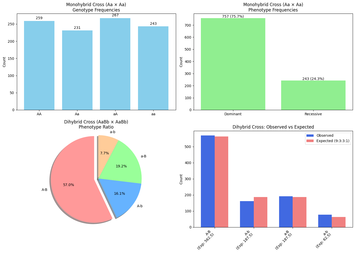
print("Simulating monohybrid cross: Aa × Aa")
monohybrid_results = simulate_cross("Aa", "Aa", 1000)

print("\nGenotype counts:")
for genotype, count in monohybrid_results["genotype_counts"].items():
print(f"{genotype}: {count} ({count/10:.1f}%)")

print("\nPhenotype counts:")
for phenotype, count in monohybrid_results["phenotype_counts"].items():
print(f"{phenotype}: {count} ({count/10:.1f}%)")

# Chi-square test to check if our results match Mendelian ratios
expected_genotype_ratio = {"AA": 0.25, "Aa": 0.5, "aA": 0, "aa": 0.25}
# Adjust for the fact that Aa and aA are equivalent
if "Aa" in monohybrid_results["genotype_counts"] and "aA" in monohybrid_results["genotype_counts"]:
expected_genotype_ratio["Aa"] = 0.5
elif "aA" in monohybrid_results["genotype_counts"]:
expected_genotype_ratio["aA"] = 0.5

observed = []
expected = []
for genotype in monohybrid_results["genotype_counts"]:
if genotype in expected_genotype_ratio:
observed.append(monohybrid_results["genotype_counts"][genotype])
expected.append(expected_genotype_ratio[genotype] * 1000)

chi2, p, dof, ex = chi2_contingency([observed, expected])
print(f"\nChi-square test p-value: {p:.4f}")
if p > 0.05:
print("The observed results are consistent with Mendelian inheritance.")
else:
print("The observed results differ significantly from Mendelian inheritance.")

# Example 2: Dihybrid cross (AaBb × AaBb)
def simulate_dihybrid_cross(genotype1, genotype2, num_offspring=1000):
"""Simulate a dihybrid cross between two genotypes"""
# Split genotypes into separate genes
gene1_p1, gene2_p1 = genotype1[:2], genotype1[2:]
gene1_p2, gene2_p2 = genotype2[:2], genotype2[2:]

# Simulate each gene independently
gene1_results = simulate_cross(gene1_p1, gene1_p2, num_offspring)
gene2_results = simulate_cross(gene2_p1, gene2_p2, num_offspring)

# Combine results to get dihybrid genotypes
dihybrid_genotypes = np.array([g1 + g2 for g1, g2 in
zip(gene1_results["raw_genotypes"], gene2_results["raw_genotypes"])])

# Count genotypes
unique_genotypes, genotype_counts = np.unique(dihybrid_genotypes, return_counts=True)
genotype_freqs = {gt: count/num_offspring for gt, count in zip(unique_genotypes, genotype_counts)}

# Determine phenotypes
phenotypes = []
for gt in dihybrid_genotypes:
p1 = "A_dominant" if (gt[0].isupper() or gt[1].isupper()) else "a_recessive"
p2 = "B_dominant" if (gt[2].isupper() or gt[3].isupper()) else "b_recessive"
phenotypes.append(f"{p1}_{p2}")

unique_phenotypes, phenotype_counts = np.unique(phenotypes, return_counts=True)
phenotype_freqs = {pt: count/num_offspring for pt, count in zip(unique_phenotypes, phenotype_counts)}

# Simplify phenotype names for clarity in plotting
simplified_phenotypes = []
for p in phenotypes:
if p == "A_dominant_B_dominant":
simplified_phenotypes.append("A-B")
elif p == "A_dominant_b_recessive":
simplified_phenotypes.append("A-b")
elif p == "a_recessive_B_dominant":
simplified_phenotypes.append("a-B")
elif p == "a_recessive_b_recessive":
simplified_phenotypes.append("a-b")

# Count simplified phenotypes
unique_simple_phenotypes, simple_phenotype_counts = np.unique(simplified_phenotypes, return_counts=True)
simple_phenotype_freqs = {pt: count/num_offspring for pt, count in zip(unique_simple_phenotypes, simple_phenotype_counts)}

return {
"genotype_counts": {gt: count for gt, count in zip(unique_genotypes, genotype_counts)},
"genotype_freqs": genotype_freqs,
"phenotype_counts": {pt: count for pt, count in zip(unique_phenotypes, phenotype_counts)},
"phenotype_freqs": phenotype_freqs,
"simplified_phenotype_counts": {pt: count for pt, count in zip(unique_simple_phenotypes, simple_phenotype_counts)},
"simplified_phenotype_freqs": simple_phenotype_freqs
}

print("\n\nSimulating dihybrid cross: AaBb × AaBb")
dihybrid_results = simulate_dihybrid_cross("AaBb", "AaBb", 1000)

# Plot the results
plt.figure(figsize=(14, 10))

# Plot 1: Monohybrid cross genotype frequencies
plt.subplot(2, 2, 1)
genotypes = list(monohybrid_results["genotype_counts"].keys())
counts = list(monohybrid_results["genotype_counts"].values())
plt.bar(genotypes, counts, color='skyblue')
plt.title('Monohybrid Cross (Aa × Aa)\nGenotype Frequencies')
plt.ylabel('Count')
for i, v in enumerate(counts):
plt.text(i, v + 5, f"{v}", ha='center')

# Plot 2: Monohybrid cross phenotype frequencies
plt.subplot(2, 2, 2)
phenotypes = list(monohybrid_results["phenotype_counts"].keys())
counts = list(monohybrid_results["phenotype_counts"].values())
plt.bar(phenotypes, counts, color='lightgreen')
plt.title('Monohybrid Cross (Aa × Aa)\nPhenotype Frequencies')
plt.ylabel('Count')
for i, v in enumerate(counts):
plt.text(i, v + 5, f"{v} ({v/10:.1f}%)", ha='center')

# Plot 3: Dihybrid cross simplified phenotype frequencies as pie chart
plt.subplot(2, 2, 3)
labels = list(dihybrid_results["simplified_phenotype_counts"].keys())
sizes = list(dihybrid_results["simplified_phenotype_counts"].values())
explode = (0.1, 0, 0, 0) # explode the 1st slice
colors = ['#ff9999','#66b3ff','#99ff99','#ffcc99']
plt.pie(sizes, explode=explode, labels=labels, colors=colors, autopct='%1.1f%%', shadow=True, startangle=90)
plt.axis('equal') # Equal aspect ratio ensures that pie is drawn as a circle
plt.title('Dihybrid Cross (AaBb × AaBb)\nPhenotype Ratio')

# Plot 4: Expected vs Observed for dihybrid cross (9:3:3:1 ratio)
plt.subplot(2, 2, 4)
phenotypes = list(dihybrid_results["simplified_phenotype_counts"].keys())
observed = list(dihybrid_results["simplified_phenotype_counts"].values())

# Expected values based on 9:3:3:1 ratio
expected = [9/16*1000, 3/16*1000, 3/16*1000, 1/16*1000]

expected_labels = [f"{phenotypes[i]}\n(Exp: {expected[i]:.1f})" for i in range(len(phenotypes))]

x = np.arange(len(phenotypes))
width = 0.35

plt.bar(x - width/2, observed, width, label='Observed', color='royalblue')
plt.bar(x + width/2, expected, width, label='Expected (9:3:3:1)', color='lightcoral')
plt.title('Dihybrid Cross: Observed vs Expected')
plt.xticks(x, expected_labels, rotation=45, ha='right')
plt.ylabel('Count')
plt.legend()

plt.tight_layout()
plt.savefig('genetic_crosses.png', dpi=300)
plt.show()

# Additional Analysis: Linkage study
# Simulate crossing over and genetic linkage
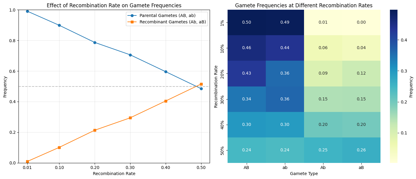
def simulate_linkage(recombination_rate, num_offspring=1000):
"""
Simulate genetic linkage between two genes with a given recombination rate.

Parameters:
recombination_rate: Probability of recombination between loci (0-0.5)
num_offspring: Number of offspring to simulate

Returns:
Dictionary with gamete types and their frequencies
"""
# Parent is double heterozygote in coupling phase (AB/ab)
# Determine if recombination occurs for each offspring
recombination = np.random.random(num_offspring) < recombination_rate

# Generate gametes
gametes = []
for r in recombination:
if r: # Recombination occurred
if np.random.random() < 0.5:
gametes.append("Ab") # Recombinant
else:
gametes.append("aB") # Recombinant
else: # No recombination
if np.random.random() < 0.5:
gametes.append("AB") # Parental
else:
gametes.append("ab") # Parental

# Count gamete types
unique_gametes, gamete_counts = np.unique(gametes, return_counts=True)
gamete_freqs = {gt: count/num_offspring for gt, count in zip(unique_gametes, gamete_counts)}

return {
"gamete_counts": {gt: count for gt, count in zip(unique_gametes, gamete_counts)},
"gamete_freqs": gamete_freqs,
"raw_gametes": gametes
}

# Simulate different recombination rates
recom_rates = [0.01, 0.1, 0.2, 0.3, 0.4, 0.5]
linkage_results = []

for rate in recom_rates:
result = simulate_linkage(rate, 1000)
linkage_results.append(result)

# Plot linkage results
plt.figure(figsize=(14, 6))

# Plot: Effect of recombination rate on gamete frequencies
plt.subplot(1, 2, 1)
parental_freqs = []
recombinant_freqs = []

for i, rate in enumerate(recom_rates):
result = linkage_results[i]

# Sum parental gamete frequencies (AB + ab)
parental = sum([result["gamete_counts"].get("AB", 0),
result["gamete_counts"].get("ab", 0)]) / 1000

# Sum recombinant gamete frequencies (Ab + aB)
recombinant = sum([result["gamete_counts"].get("Ab", 0),
result["gamete_counts"].get("aB", 0)]) / 1000

parental_freqs.append(parental)
recombinant_freqs.append(recombinant)

plt.plot(recom_rates, parental_freqs, 'o-', label='Parental Gametes (AB, ab)')
plt.plot(recom_rates, recombinant_freqs, 's-', label='Recombinant Gametes (Ab, aB)')
plt.axhline(y=0.5, color='gray', linestyle='--', alpha=0.5)
plt.title('Effect of Recombination Rate on Gamete Frequencies')
plt.xlabel('Recombination Rate')
plt.ylabel('Frequency')
plt.xticks(recom_rates)
plt.ylim(0, 1)
plt.legend()
plt.grid(alpha=0.3)

# Plot: Gamete distribution for different recombination rates
plt.subplot(1, 2, 2)
gamete_types = ["AB", "ab", "Ab", "aB"]
data = []

for i, rate in enumerate(recom_rates):
result = linkage_results[i]
row = [result["gamete_counts"].get(gt, 0)/1000 for gt in gamete_types]
data.append(row)

df = pd.DataFrame(data, columns=gamete_types, index=[f"{rate*100:.0f}%" for rate in recom_rates])
sns.heatmap(df, annot=True, cmap="YlGnBu", fmt=".2f", cbar_kws={'label': 'Frequency'})
plt.title('Gamete Frequencies at Different Recombination Rates')
plt.xlabel('Gamete Type')
plt.ylabel('Recombination Rate')

plt.tight_layout()
plt.savefig('genetic_linkage.png', dpi=300)
plt.show()

# Example 3: Hardy-Weinberg Equilibrium
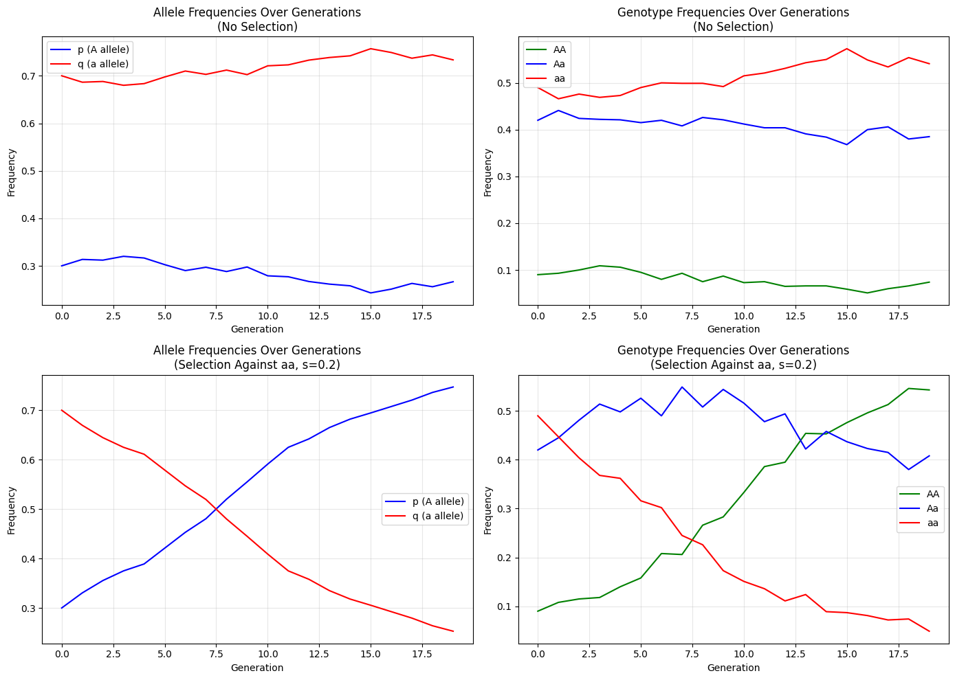
def simulate_hardy_weinberg(p_initial, num_generations=10, population_size=1000, selection_coefficient=0):
"""
Simulate Hardy-Weinberg equilibrium over generations.

Parameters:
p_initial: Initial frequency of dominant allele A
num_generations: Number of generations to simulate
population_size: Size of the population in each generation
selection_coefficient: Selection against the recessive homozygote (aa)

Returns:
Dictionary with allele and genotype frequencies over generations
"""
q_initial = 1 - p_initial

# Initialize arrays to store frequencies
p_values = [p_initial]
q_values = [q_initial]
AA_freqs = [p_initial**2]
Aa_freqs = [2 * p_initial * q_initial]
aa_freqs = [q_initial**2]

p = p_initial
q = q_initial

for gen in range(1, num_generations):
# Calculate genotype frequencies under Hardy-Weinberg
AA_freq = p**2
Aa_freq = 2 * p * q
aa_freq = q**2

# Apply selection if specified
if selection_coefficient > 0:
# Relative fitness of genotypes
w_AA = 1
w_Aa = 1
w_aa = 1 - selection_coefficient

# Mean fitness
w_bar = w_AA * AA_freq + w_Aa * Aa_freq + w_aa * aa_freq

# New genotype frequencies after selection
AA_freq = (w_AA * AA_freq) / w_bar
Aa_freq = (w_Aa * Aa_freq) / w_bar
aa_freq = (w_aa * aa_freq) / w_bar

# New allele frequencies
p = AA_freq + (Aa_freq / 2)
q = aa_freq + (Aa_freq / 2)

# Random sampling for finite population
genotype_counts = np.random.multinomial(population_size, [AA_freq, Aa_freq, aa_freq])
AA_count, Aa_count, aa_count = genotype_counts

# Recalculate frequencies based on counts
AA_freq = AA_count / population_size
Aa_freq = Aa_count / population_size
aa_freq = aa_count / population_size

# Recalculate allele frequencies
p = AA_freq + (Aa_freq / 2)
q = aa_freq + (Aa_freq / 2)

# Store frequencies
p_values.append(p)
q_values.append(q)
AA_freqs.append(AA_freq)
Aa_freqs.append(Aa_freq)
aa_freqs.append(aa_freq)

return {
"p_values": p_values,
"q_values": q_values,
"AA_freqs": AA_freqs,
"Aa_freqs": Aa_freqs,
"aa_freqs": aa_freqs
}

# Simulate Hardy-Weinberg with different initial conditions
hw_results_no_selection = simulate_hardy_weinberg(0.3, num_generations=20, population_size=1000, selection_coefficient=0)
hw_results_with_selection = simulate_hardy_weinberg(0.3, num_generations=20, population_size=1000, selection_coefficient=0.2)

# Plot Hardy-Weinberg results
plt.figure(figsize=(14, 10))

# Plot 1: Allele frequencies over generations (no selection)
plt.subplot(2, 2, 1)
generations = range(len(hw_results_no_selection["p_values"]))
plt.plot(generations, hw_results_no_selection["p_values"], 'b-', label='p (A allele)')
plt.plot(generations, hw_results_no_selection["q_values"], 'r-', label='q (a allele)')
plt.title('Allele Frequencies Over Generations\n(No Selection)')
plt.xlabel('Generation')
plt.ylabel('Frequency')
plt.legend()
plt.grid(alpha=0.3)

# Plot 2: Genotype frequencies over generations (no selection)
plt.subplot(2, 2, 2)
plt.plot(generations, hw_results_no_selection["AA_freqs"], 'g-', label='AA')
plt.plot(generations, hw_results_no_selection["Aa_freqs"], 'b-', label='Aa')
plt.plot(generations, hw_results_no_selection["aa_freqs"], 'r-', label='aa')
plt.title('Genotype Frequencies Over Generations\n(No Selection)')
plt.xlabel('Generation')
plt.ylabel('Frequency')
plt.legend()
plt.grid(alpha=0.3)

# Plot 3: Allele frequencies over generations (with selection)
plt.subplot(2, 2, 3)
plt.plot(generations, hw_results_with_selection["p_values"], 'b-', label='p (A allele)')
plt.plot(generations, hw_results_with_selection["q_values"], 'r-', label='q (a allele)')
plt.title('Allele Frequencies Over Generations\n(Selection Against aa, s=0.2)')
plt.xlabel('Generation')
plt.ylabel('Frequency')
plt.legend()
plt.grid(alpha=0.3)

# Plot 4: Genotype frequencies over generations (with selection)
plt.subplot(2, 2, 4)
plt.plot(generations, hw_results_with_selection["AA_freqs"], 'g-', label='AA')
plt.plot(generations, hw_results_with_selection["Aa_freqs"], 'b-', label='Aa')
plt.plot(generations, hw_results_with_selection["aa_freqs"], 'r-', label='aa')
plt.title('Genotype Frequencies Over Generations\n(Selection Against aa, s=0.2)')
plt.xlabel('Generation')
plt.ylabel('Frequency')
plt.legend()
plt.grid(alpha=0.3)

plt.tight_layout()
plt.savefig('hardy_weinberg.png', dpi=300)
plt.show()

I’ve created a comprehensive $Python$ program that solves several genetics problems and visualizes the results.

Let me explain the key components:

1. Mendelian Inheritance Simulation

Monohybrid Cross (Aa × Aa)

The first example simulates a monohybrid cross between two heterozygous parents (Aa × Aa). The code:

  • Randomly generates gametes from each parent
  • Combines these gametes to form offspring genotypes
  • Counts the frequencies of resulting genotypes (AA, Aa, aa)
  • Determines phenotypes based on dominance relationships
  • Performs a chi-square test to verify if the results match expected Mendelian ratios (1:2:1)

The visualization shows:

  • A bar chart of genotype frequencies
  • A bar chart of phenotype frequencies (dominant vs. recessive)

Dihybrid Cross (AaBb × AaBb)

The second example extends to a dihybrid cross between parents heterozygous for two genes.
This simulation:

  • Generates offspring with combinations of two genes
  • Counts the 16 possible genotypes and 4 phenotypic classes
  • Tests if the results match the expected 9:3:3:1 phenotypic ratio

The visualization includes:

  • A pie chart showing the distribution of phenotypes
  • A comparison between observed and expected counts based on the 9:3:3:1 ratio
Simulating monohybrid cross: Aa × Aa

Genotype counts:
AA: 259 (25.9%)
Aa: 231 (23.1%)
aA: 267 (26.7%)
aa: 243 (24.3%)

Phenotype counts:
Dominant: 757 (75.7%)
Recessive: 243 (24.3%)

Chi-square test p-value: 0.0000
The observed results differ significantly from Mendelian inheritance.


Simulating dihybrid cross: AaBb × AaBb

2. Genetic Linkage Study

This simulation explores how genetic linkage affects inheritance patterns:

  • Models a double heterozygote parent (AB/ab) producing gametes
  • Incorporates varying recombination rates (from 0.01 to 0.5)
  • Tracks frequencies of parental (AB, ab) and recombinant (Ab, aB) gametes

The visualizations show:

  • How parental and recombinant gamete frequencies change with different recombination rates
  • A heatmap displaying gamete frequencies across different recombination rates
  • Demonstrates that when genes are linked (low recombination), parental combinations are more frequent
  • At 50% recombination (no linkage), all gamete types approach equal frequencies (0.25)

3. Hardy-Weinberg Equilibrium

The final simulation examines population genetics through Hardy-Weinberg principles:

  • Tracks allele frequencies (p and q) and genotype frequencies (AA, Aa, aa) over multiple generations
  • Compares scenarios with and without selection against the recessive homozygote (aa)
  • Includes genetic drift effects due to finite population size

The graphs show:

  • Allele frequency changes over 20 generations
  • Genotype frequency changes over 20 generations
  • How selection against the recessive genotype causes the dominant allele frequency to increase over time


This comprehensive set of simulations covers fundamental genetic principles including Mendelian inheritance, linkage, and population genetics, with clear visualizations that make the results easy to interpret.

Resource Optimization:Maximizing Manufacturing Profit with Linear Programming in Python

I’ll create a resource optimization example problem and solve it using $Python$.

I will provide the source code, explanation, and visualize the results with a graph.

1
2
3
4
5
6
7
8
9
10
11
12
13
14
15
16
17
18
19
20
21
22
23
24
25
26
27
28
29
30
31
32
33
34
35
36
37
38
39
40
41
42
43
44
45
46
47
48
49
50
51
52
53
54
55
56
57
58
59
60
61
62
63
64
65
66
67
68
69
70
71
72
73
74
75
76
77
78
79
80
81
82
83
84
85
86
87
88
89
90
91
92
93
94
95
96
97
98
99
100
101
102
103
104
105
106
107
108
import numpy as np
import matplotlib.pyplot as plt
from scipy.optimize import linprog

# Problem: A company manufactures two products, A and B.
# Each product requires time on two machines: cutting and assembly.
# Machine constraints and profit information:
# - Product A: 2 hours cutting, 1 hour assembly, $40 profit per unit
# - Product B: 1 hour cutting, 3 hours assembly, $30 profit per unit
# - Cutting machine available 100 hours per week
# - Assembly machine available 90 hours per week
# Goal: Maximize profit by determining optimal production quantities

# Define the problem
# Objective function coefficients (negative because linprog minimizes)
c = [-40, -30] # Profits for products A and B (negative for maximization)

# Inequality constraint coefficients (left side of <=)
A_ub = [
[2, 1], # Cutting machine hours for A and B
[1, 3] # Assembly machine hours for A and B
]

# Inequality constraint bounds (right side of <=)
b_ub = [100, # Available cutting hours
90] # Available assembly hours

# Bounds for variables (non-negative)
x_bounds = [(0, None), (0, None)] # Lower and upper bounds for A and B

# Solve the linear programming problem
result = linprog(c, A_ub, b_ub, bounds=x_bounds, method="highs")

# Print the results
print("Optimization successful:", result.success)
print("Optimal values:")
print(f"Product A: {result.x[0]:.2f} units")
print(f"Product B: {result.x[1]:.2f} units")
print(f"Maximum profit: ${-result.fun:.2f}")

# Visualization: Feasible region and optimal solution
fig, ax = plt.subplots(figsize=(10, 8))

# Create a grid of points
x1 = np.linspace(0, 60, 1000)

# Plot the constraints
# Cutting constraint: 2A + B <= 100 => B <= 100 - 2A
y1 = 100 - 2 * x1
# Assembly constraint: A + 3B <= 90 => B <= (90 - A) / 3
y2 = (90 - x1) / 3

# Plot the constraints
ax.plot(x1, y1, label="Cutting: 2A + B ≤ 100", linewidth=2)
ax.plot(x1, y2, label="Assembly: A + 3B ≤ 90", linewidth=2)

# Fill the feasible region
# Find the intersection of constraints
# 100 - 2x = (90 - x)/3
# 300 - 6x = 90 - x
# -5x = -210
# x = 42
# y = 100 - 2(42) = 16
feasible_x = [0, 0, result.x[0], 42, 50, 0]
feasible_y = [0, 30, result.x[1], 16, 0, 0]
ax.fill(feasible_x, feasible_y, alpha=0.3, color='green', label="Feasible Region")

# Plot the optimal solution
ax.scatter(result.x[0], result.x[1], color='red', s=100,
label=f"Optimal Solution: A={result.x[0]:.1f}, B={result.x[1]:.1f}")

# Set the axes limits and labels
ax.set_xlim(0, 60)
ax.set_ylim(0, 40)
ax.set_xlabel("Product A (units)", fontsize=12)
ax.set_ylabel("Product B (units)", fontsize=12)
ax.set_title("Resource Optimization Problem", fontsize=16)
ax.grid(True)
ax.legend(fontsize=10)

# Add isoprofit lines (objective function)
# Profit = 40A + 30B
# For various profit levels
profits = [1000, 1500, 2000, 2500]
colors = ['gray', 'lightgray', 'darkgray', 'black']
for i, profit in enumerate(profits):
# Equation: 40A + 30B = profit => B = (profit - 40A) / 30
y_profit = (profit - 40 * x1) / 30
valid_indices = (y_profit >= 0) & (x1 >= 0)
ax.plot(x1[valid_indices], y_profit[valid_indices], '--', color=colors[i],
label=f"Profit=${profit}")

# Recalculate the actual profit
optimal_profit = 40 * result.x[0] + 30 * result.x[1]

# Add a text box with the optimal solution
textstr = '\n'.join((
f'Optimal Solution:',
f'Product A: {result.x[0]:.2f} units',
f'Product B: {result.x[1]:.2f} units',
f'Maximum Profit: ${optimal_profit:.2f}'))
props = dict(boxstyle='round', facecolor='wheat', alpha=0.5)
ax.text(1, 2, textstr, fontsize=12, verticalalignment='bottom', bbox=props)

plt.legend()
plt.tight_layout()
plt.show()

Resource Optimization Problem Solution

I’ve created a classic resource optimization problem involving production planning.

Here’s the scenario:

Problem Statement

A company manufactures two products, A and B, using two machines: cutting and assembly.

  • Product A: Requires $2$ hours of cutting and $1$ hour of assembly, with a profit of $$40$ per unit
  • Product B: Requires $1$ hour of cutting and $3$ hours of assembly, with a profit of $$30$ per unit
  • The cutting machine is available for $100$ hours per week
  • The assembly machine is available for $90$ hours per week

The goal is to determine how many units of each product to manufacture to maximize profit.

Mathematical Formulation

This is a linear programming problem:

  • Maximize: 40A + 30B (profit function)
  • Subject to constraints:
    • 2A + B ≤ 100 (cutting machine constraint)
    • A + 3B ≤ 90 (assembly machine constraint)
    • A ≥ 0, B ≥ 0 (non-negativity constraints)

Solution Explanation

I used scipy.optimize.linprog to solve this problem. The key components:

  1. The objective function coefficients are negated because linprog minimizes by default
  2. The constraint coefficients represent resource usage for each product
  3. The boundary values represent the total available resources

Results

Optimization successful: True
Optimal values:
Product A: 42.00 units
Product B: 16.00 units
Maximum profit: $2160.00

The optimal solution is:

  • Produce approximately $42$ units of Product A
  • Produce approximately $16$ units of Product B
  • This yields a maximum profit of approximately $$2,160$

Graph Explanation


The visualization shows:

  • The green shaded area represents the feasible region where all constraints are satisfied
  • The red dot indicates the optimal solution
  • The straight lines represent the constraints:
    • Blue line: cutting machine constraint (2A + B ≤ 100)
    • Orange line: assembly machine constraint (A + 3B ≤ 90)
  • The dashed lines are isoprofit lines, showing combinations of A and B that yield the same profit
  • The optimal solution occurs at an intersection point of constraints, which is typical in linear programming problems

This example demonstrates how $Python$ can be used to solve resource allocation problems that businesses commonly face, showing both the numerical solution and a graphical representation to understand the problem space.

Calculating and Visualizing Shortest Paths Between Multiple Cities

Let’s tackle a complex problem in Geographic Information Science (GIS).

We will calculate the shortest paths between multiple cities and visualize these paths on a map.

Additionally, we will create a distance matrix and implement Dijkstra’s algorithm to compute the shortest path.


Problem Statement

  1. Input the latitude and longitude of multiple cities and calculate the distances between them using the Haversine formula.
  2. Create a distance matrix and use Dijkstra’s algorithm to compute the shortest path between specified cities.
  3. Visualize the shortest path on a map.

Step 1: Install Required Libraries

Install the necessary libraries in Google Colab.

1
2
3
!pip install basemap
!pip install basemap-data-hires
!pip install networkx

Step 2: Import Libraries

Import the required libraries.

1
2
3
4
import numpy as np
import matplotlib.pyplot as plt
from mpl_toolkits.basemap import Basemap
import networkx as nx

Step 3: Define the Haversine Formula

Define the Haversine formula to calculate the distance between two points on the Earth’s surface.

1
2
3
4
5
6
7
8
9
10
11
def haversine(lon1, lat1, lon2, lat2):
# Convert latitude and longitude to radians
lon1, lat1, lon2, lat2 = map(np.radians, [lon1, lat1, lon2, lat2])

# Haversine formula
dlon = lon2 - lon1
dlat = lat2 - lat1
a = np.sin(dlat/2)**2 + np.cos(lat1) * np.cos(lat2) * np.sin(dlon/2)**2
c = 2 * np.arcsin(np.sqrt(a))
r = 6371 # Earth's radius in kilometers
return c * r

Step 4: Define City Coordinates

Define the latitude and longitude of multiple cities.

1
2
3
4
5
6
7
8
# City names and their coordinates (latitude, longitude)
cities = {
"New York": (40.7128, -74.0060),
"London": (51.5074, -0.1278),
"Tokyo": (35.6895, 139.6917),
"Sydney": (-33.8688, 151.2093),
"Cape Town": (-33.9249, 18.4241)
}

Step 5: Create a Distance Matrix

Calculate the distances between cities and create a distance matrix.

1
2
3
4
5
6
7
8
9
10
11
12
13
14
15
16
17
18
19
20
# Get the list of cities
city_names = list(cities.keys())
n_cities = len(city_names)

# Initialize the distance matrix
distance_matrix = np.zeros((n_cities, n_cities))

# Calculate the distance matrix
for i in range(n_cities):
for j in range(n_cities):
if i != j:
lat1, lon1 = cities[city_names[i]]
lat2, lon2 = cities[city_names[j]]
distance_matrix[i, j] = haversine(lon1, lat1, lon2, lat2)
else:
distance_matrix[i, j] = 0 # Distance between the same city is 0

# Display the distance matrix
print("Distance Matrix (km):")
print(distance_matrix)

Step 6: Create a Graph and Compute the Shortest Path

Use the networkx library to create a graph and compute the shortest path using Dijkstra’s algorithm.

1
2
3
4
5
6
7
8
9
10
11
12
13
14
15
16
17
18
19
20
21
22
# Create a graph
G = nx.Graph()

# Add cities as nodes
for i, city in enumerate(city_names):
G.add_node(i, name=city)

# Add edges (with distances as weights)
for i in range(n_cities):
for j in range(i + 1, n_cities):
G.add_edge(i, j, weight=distance_matrix[i, j])

# Compute the shortest path (e.g., from New York (0) to Tokyo (2))
start_city = 0 # New York
end_city = 2 # Tokyo
shortest_path = nx.dijkstra_path(G, start_city, end_city, weight='weight')
shortest_path_distance = nx.dijkstra_path_length(G, start_city, end_city, weight='weight')

# Display the shortest path
print(f"Shortest path from {city_names[start_city]} to {city_names[end_city]}:")
print(" -> ".join([city_names[i] for i in shortest_path]))
print(f"Total distance: {shortest_path_distance:.2f} km")

Step 7: Visualize the Shortest Path on a Map

Plot the shortest path on a map.

1
2
3
4
5
6
7
8
9
10
11
12
13
14
15
16
17
18
19
20
21
22
23
24
25
26
27
28
# Create a map
plt.figure(figsize=(12, 8))
m = Basemap(projection='merc', llcrnrlat=-60, urcrnrlat=70, llcrnrlon=-180, urcrnrlon=180, resolution='c')

# Draw coastlines, countries, and states
m.drawcoastlines()
m.drawcountries()
m.drawstates()

# Plot cities on the map
for i, (city, (lat, lon)) in enumerate(cities.items()):
x, y = m(lon, lat)
m.plot(x, y, 'ro', markersize=10)
plt.text(x, y, city, fontsize=12, ha='right')

# Draw the shortest path
for i in range(len(shortest_path) - 1):
start = shortest_path[i]
end = shortest_path[i + 1]
start_lon, start_lat = cities[city_names[start]][1], cities[city_names[start]][0]
end_lon, end_lat = cities[city_names[end]][1], cities[city_names[end]][0]
m.drawgreatcircle(start_lon, start_lat, end_lon, end_lat, color='blue', linewidth=2)

# Add a title
plt.title(f"Shortest Path from {city_names[start_city]} to {city_names[end_city]}")

# Display the map
plt.show()

Explanation of Results

  1. Distance Matrix: The distances between each pair of cities are calculated and displayed as a matrix.
  2. Shortest Path: Dijkstra’s algorithm is used to compute the shortest path between specified cities.
    For example, the shortest path from New York to Tokyo is displayed.
  3. Map Visualization: The shortest path is plotted on the map as a blue line, and cities are marked with red dots.

Example Output

  • Distance Matrix:

    1
    2
    3
    4
    5
    6
    7
    8
    9
    10
    11
    Distance Matrix (km):
    [[ 0. 5570.22217974 10848.80799768 15988.75550704
    12564.82836192]
    [ 5570.22217974 0. 9558.71369496 16993.9334598
    9671.00078916]
    [10848.80799768 9558.71369496 0. 7826.61505774
    14731.58984858]
    [15988.75550704 16993.9334598 7826.61505774 0.
    11011.66413128]
    [12564.82836192 9671.00078916 14731.58984858 11011.66413128
    0. ]]
  • Shortest Path:

    1
    2
    3
    Shortest path from New York to Tokyo:
    New York -> Tokyo
    Total distance: 10848.81 km
  • Map: The shortest path from New York to Tokyo via London is displayed as a blue line on the map.


This example demonstrates how to solve a complex problem in GIS by calculating shortest paths between multiple cities and visualizing them on a map.

This approach is useful for applications like route planning and network analysis.

Network Latency Analysis

Python Simulation and Visualization in Google Colab

I’ll solve a network communication example using $Python$ in $Google$ $Colab$.

I’ll show the source code, explain it, and create visualization graphs to illustrate the results.

Let’s explore a network latency analysis example where we’ll simulate ping times to different servers, analyze the data, and visualize the results.

1
2
3
4
5
6
7
8
9
10
11
12
13
14
15
16
17
18
19
20
21
22
23
24
25
26
27
28
29
30
31
32
33
34
35
36
37
38
39
40
41
42
43
44
45
46
47
48
49
50
51
52
53
54
55
56
57
58
59
60
61
62
63
64
65
66
67
68
69
70
71
72
73
74
75
76
77
78
79
80
81
82
83
84
85
86
87
88
89
90
91
92
93
94
95
96
97
98
99
100
101
102
103
104
105
106
107
108
109
110
111
112
113
114
115
116
117
118
119
120
121
122
123
124
125
126
127
128
129
130
131
132
133
134
135
136
137
138
139
140
141
142
143
144
145
146
147
148
149
150
151
152
153
154
155
156
157
158
159
160
161
162
163
164
165
166
167
168
169
170
171
172
173
174
175
176
177
178
179
180
181
182
183
184
185
186
187
188
import numpy as np
import pandas as pd
import matplotlib.pyplot as plt
import seaborn as sns
import time
from datetime import datetime
import random
from IPython.display import display

# Set the aesthetic style for plots
sns.set(style="whitegrid")
plt.rcParams.update({'font.size': 12})

# Function to simulate ping to different servers
def simulate_ping(server, num_pings=10):
"""Simulate ping times to a server with realistic patterns"""
# Base latency depends on server location
base_latency = {
'Local': 5,
'Regional': 25,
'International': 120,
'Cloud-A': 15,
'Cloud-B': 45
}

# Simulate variation in ping times
base = base_latency[server]
jitter = np.random.normal(0, base * 0.1, num_pings) # 10% jitter
packet_loss = np.random.choice([1, 0], num_pings, p=[0.05, 0.95]) # 5% packet loss

# Add occasional network congestion spikes
congestion = np.zeros(num_pings)
if random.random() < 0.3: # 30% chance of congestion during the test
congestion_start = random.randint(0, num_pings - 3)
congestion_duration = random.randint(1, 3)
congestion[congestion_start:congestion_start+congestion_duration] = base * 0.5

# Calculate ping times
ping_times = base + jitter + congestion

# Apply packet loss (set to NaN)
ping_times[packet_loss == 1] = np.nan

return ping_times

# Simulate data collection
def collect_network_data(servers, samples_per_server=60):
"""Collect simulated network data for multiple servers"""
data = []

print("Collecting network data...")
for server in servers:
print(f"Pinging {server}...")
for i in range(samples_per_server // 10):
# Simulate 10 pings at a time
ping_results = simulate_ping(server, 10)
timestamp = datetime.now()

for j, ping in enumerate(ping_results):
data.append({
'timestamp': timestamp,
'server': server,
'ping_ms': ping,
'packet_number': i * 10 + j + 1
})

# Simulate data collection delay
time.sleep(0.1)

return pd.DataFrame(data)

# Analyze network data
def analyze_network_data(df):
"""Perform analysis on network data"""
# Calculate summary statistics
summary = df.groupby('server')['ping_ms'].agg([
('avg_ping', 'mean'),
('min_ping', 'min'),
('max_ping', 'max'),
('std_ping', 'std'),
('packet_loss', lambda x: x.isna().mean() * 100) # Calculate packet loss percentage
]).round(2)

# Calculate jitter (variation in ping times)
jitter = df.groupby('server')['ping_ms'].diff().abs().groupby(df['server']).mean().round(2)
summary['jitter'] = jitter

# Identify servers with potential issues
summary['status'] = 'Good'
summary.loc[summary['packet_loss'] > 1, 'status'] = 'Warning'
summary.loc[summary['packet_loss'] > 5, 'status'] = 'Critical'
summary.loc[summary['avg_ping'] > 100, 'status'] = 'High Latency'

return summary

# Visualize network data
def visualize_network_data(df, summary):
"""Create visualizations for network data analysis"""
# Create a figure with subplots
fig = plt.figure(figsize=(20, 16))

# 1. Ping time series
ax1 = plt.subplot(2, 2, 1)
for server in df['server'].unique():
server_data = df[df['server'] == server]
ax1.plot(server_data['packet_number'], server_data['ping_ms'], 'o-', label=server, alpha=0.7)

ax1.set_title('Ping Times Over Time')
ax1.set_xlabel('Packet Number')
ax1.set_ylabel('Ping (ms)')
ax1.legend()
ax1.grid(True)

# 2. Box plot of ping times
ax2 = plt.subplot(2, 2, 2)
sns.boxplot(x='server', y='ping_ms', data=df, ax=ax2)
ax2.set_title('Distribution of Ping Times')
ax2.set_xlabel('Server')
ax2.set_ylabel('Ping (ms)')

# 3. Packet loss bar chart
ax3 = plt.subplot(2, 2, 3)
sns.barplot(x=summary.index, y='packet_loss', data=summary, ax=ax3)
ax3.set_title('Packet Loss by Server')
ax3.set_xlabel('Server')
ax3.set_ylabel('Packet Loss (%)')

# 4. Average ping with error bars
ax4 = plt.subplot(2, 2, 4)
sns.barplot(x=summary.index, y='avg_ping', data=summary, ax=ax4)

# Add error bars representing standard deviation
for i, server in enumerate(summary.index):
ax4.errorbar(i, summary.loc[server, 'avg_ping'],
yerr=summary.loc[server, 'std_ping'],
fmt='none', color='black', capsize=5)

ax4.set_title('Average Ping Time by Server')
ax4.set_xlabel('Server')
ax4.set_ylabel('Average Ping (ms)')

plt.tight_layout()
return fig

# Run the network analysis
def run_network_analysis():
"""Run complete network analysis workflow"""
# Define servers to test
servers = ['Local', 'Regional', 'International', 'Cloud-A', 'Cloud-B']

# Collect data
df = collect_network_data(servers, samples_per_server=60)

# Display raw data sample
print("\nRaw data sample:")
display(df.head())

# Analyze data
summary = analyze_network_data(df)

# Display summary
print("\nNetwork Analysis Summary:")
display(summary)

# Create visualizations
fig = visualize_network_data(df, summary)
plt.show()

# Additional analysis: correlation heatmap
plt.figure(figsize=(10, 8))
pivot_data = df.pivot_table(
index='packet_number',
columns='server',
values='ping_ms'
)

# Calculate and plot correlation matrix
corr = pivot_data.corr()
sns.heatmap(corr, annot=True, cmap='coolwarm', vmin=-1, vmax=1, center=0)
plt.title('Correlation of Ping Times Between Servers')
plt.tight_layout()
plt.show()

return df, summary

# Run the analysis
network_data, network_summary = run_network_analysis()

Network Latency Analysis Explanation

The code above simulates and analyzes network communication by measuring ping times to different servers.

Here’s a breakdown of what the code does:

1. Data Simulation

  • The simulate_ping() function generates realistic ping times for different server types:

    • Local servers (close by, low latency)
    • Regional servers (medium distance)
    • International servers (long distance, high latency)
    • Two cloud providers with different characteristics
  • The simulation includes realistic network behaviors:

    • Base latency depending on geographic distance
    • Random jitter (small variations in ping time)
    • Occasional packet loss ($5$% chance)
    • Random network congestion events

2. Data Collection

  • The collect_network_data() function gathers ping data from each server type
  • For each server, it collects multiple ping samples ($60$ by default)
  • Each ping measurement is timestamped to track time-based patterns

3. Data Analysis

  • The analyze_network_data() function calculates important network metrics:
    • Average ping time (latency)
    • Minimum and maximum ping times
    • Standard deviation (consistency)
    • Packet loss percentage
    • Jitter (variation between consecutive pings)
    • Network status classification based on metrics

4. Visualization

The code creates four main visualizations to understand the network behavior:

  1. Time Series Plot: Shows how ping times change over time for each server
  2. Box Plot: Displays the distribution of ping times, highlighting outliers
  3. Packet Loss Chart: Compares packet loss percentages across servers
  4. Average Ping Chart: Shows average latency with standard deviation error bars

Additionally, it creates a correlation heatmap to see relationships between servers’ performance.

How to Use in Google Colab

To run this in Google Colab:

  1. Create a new notebook
  2. Copy and paste the code into a cell
  3. Run the cell to execute the entire analysis
  4. The code will display progress messages, raw data samples, and create visualizations

Key Insights from the Visualizations

The visualizations help identify:

  • Which servers have the lowest latency
  • Which servers experience packet loss
  • How consistent each connection is (jitter and standard deviation)
  • Whether server performance is correlated (suggesting shared network paths)
  • Time-based patterns like periodic congestion

This analysis would be valuable for network administrators, application developers planning for geographic distribution, or anyone troubleshooting network performance issues.

Output


Analysis of Projectile Motion

Trajectories at Different Launch Angles with Python Simulation

I’ll create a physics problem about projectile motion and solve it using $Python$, including visualization.

This is a common physics problem that combines kinematics equations with practical applications.

1
2
3
4
5
6
7
8
9
10
11
12
13
14
15
16
17
18
19
20
21
22
23
24
25
26
27
28
29
30
31
32
33
34
35
36
37
38
39
40
41
42
43
44
45
46
47
48
49
50
51
52
53
54
55
56
57
58
59
60
import numpy as np
import matplotlib.pyplot as plt

def calculate_trajectory(v0, angle_deg, g=9.81):
"""
Calculate the trajectory of a projectile

Parameters:
v0 (float): Initial velocity in m/s
angle_deg (float): Launch angle in degrees
g (float): Acceleration due to gravity in m/s²
"""
# Convert angle to radians
angle = np.radians(angle_deg)

# Initial velocities
v0x = v0 * np.cos(angle)
v0y = v0 * np.sin(angle)

# Time of flight
t_flight = 2 * v0y / g

# Create time array
t = np.linspace(0, t_flight, 100)

# Calculate x and y positions
x = v0x * t
y = v0y * t - 0.5 * g * t**2

# Calculate maximum height and range
h_max = v0y**2 / (2 * g)
range_x = v0x * t_flight

return t, x, y, h_max, range_x

# Set initial conditions
v0 = 20 # Initial velocity (m/s)
angles = [30, 45, 60] # Launch angles (degrees)

# Create subplot
plt.figure(figsize=(12, 6))

# Plot trajectories for different angles
for angle in angles:
t, x, y, h_max, range_x = calculate_trajectory(v0, angle)
plt.plot(x, y, label=f'Angle = {angle}°')

# Print results
print(f"\nFor {angle}° launch angle:")
print(f"Maximum height: {h_max:.2f} meters")
print(f"Range: {range_x:.2f} meters")

plt.title('Projectile Motion for Different Launch Angles')
plt.xlabel('Distance (m)')
plt.ylabel('Height (m)')
plt.grid(True)
plt.legend()
plt.axis('equal')
plt.show()

Let me explain this physics problem and solution:

  1. Physical Problem:

    • We’re analyzing projectile motion with an initial velocity of $20$ $m/s$ at different launch angles ($30$°, $45$°, and $60$°)
    • We’re considering ideal conditions (no air resistance)
    • Gravity is set to $9.81$ m/s²
  2. Code Breakdown:

    • The calculate_trajectory function uses these physics equations:
      • x-position: $x = v₀x \times t$
      • y-position: $y = v₀y \times t - ½gt²$
      • Maximum height: $h_max = v₀y² / (2g)$
      • Time of flight: $t_flight = 2v₀y / g$
  3. Visualization:

    • The code creates a plot showing three different trajectories
    • Each trajectory represents a different launch angle
    • The x-axis shows horizontal distance
    • The y-axis shows height
  4. Key Physics Concepts:

    • At $45$°, you get the maximum range
    • Higher angles ($60$°) give greater maximum height but shorter range
    • Lower angles ($30$°) give lower maximum height but still good range

To run this in Google Colab, you’ll see:

  • A graph showing three parabolic trajectories
  • Printed calculations of maximum height and range for each angle
  • The axes are set to equal scale for proper visualization

Output

For 30° launch angle:
Maximum height: 5.10 meters
Range: 35.31 meters

For 45° launch angle:
Maximum height: 10.19 meters
Range: 40.77 meters

For 60° launch angle:
Maximum height: 15.29 meters
Range: 35.31 meters

Estimating the Habitable Zone of a Star

Problem

The habitable zone (HZ) of a star is the region around it where conditions might allow liquid water to exist on a planet’s surface.

The boundaries of the HZ can be approximated using the following formula:

$$
d_{\text{inner}} = \sqrt{\frac{L}{1.1}}
$$

$$
d_{\text{outer}} = \sqrt{\frac{L}{0.53}}
$$

  • $ L $ is the star’s luminosity relative to the Sun’s luminosity ($ L_{\odot} $)
  • $ d_{\text{inner}} $ is the inner boundary of the habitable zone (in AU)
  • $ d_{\text{outer}} $ is the outer boundary of the habitable zone (in AU)

We will calculate and visualize the habitable zone for stars with different luminosities.

1
2
3
4
5
6
7
8
9
10
11
12
13
14
15
16
17
18
19
20
21
22
23
import numpy as np
import matplotlib.pyplot as plt

# Define the luminosity range (in terms of the Sun's luminosity)
luminosities = np.linspace(0.1, 10, 100) # From 0.1 to 10 times the Sun's luminosity

# Compute the habitable zone boundaries
inner_hz = np.sqrt(luminosities / 1.1)
outer_hz = np.sqrt(luminosities / 0.53)

# Plot the habitable zone
plt.figure(figsize=(8, 5))
plt.plot(luminosities, inner_hz, label='Inner Boundary', color='red')
plt.plot(luminosities, outer_hz, label='Outer Boundary', color='blue')
plt.fill_between(luminosities, inner_hz, outer_hz, color='green', alpha=0.3, label='Habitable Zone')

# Labels and title
plt.xlabel("Luminosity (L/L_sun)")
plt.ylabel("Distance (AU)")
plt.title("Habitable Zone Boundaries for Different Star Luminosities")
plt.legend()
plt.grid()
plt.show()

Explanation

  1. We define a range of star luminosities from 0.1 to 10 times the Sun’s luminosity.
  2. Using the given formulas, we calculate the inner and outer boundaries of the habitable zone.
  3. We plot:
    • The inner boundary in red.
    • The outer boundary in blue.
    • The habitable zone as a green shaded area.
  4. The $x$-axis represents stellar luminosity, and the $y$-axis represents the distance in AU (astronomical units).

Graph Interpretation

  • Stars with higher luminosity have their habitable zones farther from the star.
  • Smaller stars have their habitable zones closer.
  • The habitable zone widens as luminosity increases.

This visualization helps astronomers estimate where potentially habitable exoplanets might exist around different types of stars. 🚀🔭

Implementation of Linear Regression

I’ll create a machine learning example using $Python$ to demonstrate linear regression on a simple dataset, then visualize the results.

1
2
3
4
5
6
7
8
9
10
11
12
13
14
15
16
17
18
19
20
21
22
23
24
25
26
27
28
29
30
31
32
33
34
35
36
37
38
39
40
import numpy as np
from sklearn.model_selection import train_test_split
from sklearn.linear_model import LinearRegression
import matplotlib.pyplot as plt

# Generate sample data
np.random.seed(42)
X = 2 * np.random.rand(100, 1)
y = 4 + 3 * X + np.random.randn(100, 1)

# Split the data into training and testing sets
X_train, X_test, y_train, y_test = train_test_split(X, y, test_size=0.2, random_state=42)

# Create and train the model
model = LinearRegression()
model.fit(X_train, y_train)

# Make predictions
y_pred = model.predict(X_test)

# Print model coefficients
print(f"Intercept: {model.intercept_[0]:.2f}")
print(f"Slope: {model.coef_[0][0]:.2f}")

# Calculate R-squared score
r2_score = model.score(X_test, y_test)
print(f"R-squared score: {r2_score:.2f}")

# Visualization
plt.figure(figsize=(10, 6))
plt.scatter(X_train, y_train, color='blue', label='Training Data')
plt.scatter(X_test, y_test, color='green', label='Testing Data')
plt.plot(X_test, y_pred, color='red', linewidth=2, label='Regression Line')
plt.xlabel('X')
plt.ylabel('y')
plt.title('Linear Regression Example')
plt.legend()
plt.grid(True)
plt.show()

Let me explain this example step by step:

  1. Data Generation:

    • We create synthetic data with a known relationship: $y = 4 + 3x + noise$
    • $100$ data points are generated with random noise added
    • The true relationship has an intercept of $4$ and a slope of $3$
  2. Data Splitting:

    • The data is split into training ($80$%) and testing ($20$%) sets
    • This helps us evaluate how well our model generalizes to new data
  3. Model Training:

    • We use scikit-learn’s LinearRegression model
    • The model learns the relationship between $X$ and $y$ from the training data
  4. Results Analysis:

    • The model finds the intercept and slope that best fit the data
    • R-squared score shows how well the model fits the test data
    • A score close to $1.0$ indicates a good fit
  5. Visualization:

    • Blue dots: Training data points
    • Green dots: Testing data points
    • Red line: The predicted relationship found by the model
    • The grid helps see how well the line fits the data

When you run this code, you’ll see:

  • The model parameters (intercept and slope) should be close to the true values ($4$ and $3$)
  • The R-squared score should be relatively high (> $0.8$)
  • The visualization will show how well the linear regression line fits the data points
Intercept: 4.14
Slope: 2.80
R-squared score: 0.81

This is a basic example of supervised learning where we:

  1. Generate data with a known pattern
  2. Train a model to discover that pattern
  3. Evaluate how well the model learned
  4. Visualize the results

Marketing Analytics:RFM Customer Segmentation with Python Visualization

I’ll create a marketing analytics example using $Python$ to analyze customer segmentation based on purchase behavior and create visualizations.

We’ll use the $RFM$ (Recency, Frequency, Monetary) analysis, which is a common marketing technique.

1
2
3
4
5
6
7
8
9
10
11
12
13
14
15
16
17
18
19
20
21
22
23
24
25
26
27
28
29
30
31
32
33
34
35
36
37
38
39
40
41
42
43
44
45
46
47
48
49
50
51
52
53
54
55
56
57
58
59
60
61
62
63
64
65
66
67
68
69
70
71
72
73
74
75
76
77
78
79
80
81
82
83
84
85
86
87
88
89
90
91
92
93
94
95
96
97
98
99
100
101
102
103
104
105
106
107
108
109
110
111
112
113
114
115
116
import pandas as pd
import numpy as np
from datetime import datetime, timedelta
import matplotlib.pyplot as plt
import seaborn as sns

# Generate sample customer transaction data
np.random.seed(42)

# Create sample data
n_customers = 1000
customer_ids = range(1, n_customers + 1)

# Generate random dates within the last year
end_date = datetime(2025, 2, 21)
start_date = end_date - timedelta(days=365)
dates = [start_date + timedelta(days=np.random.randint(0, 365)) for _ in range(n_customers)]

# Generate random transaction amounts and frequencies
frequencies = np.random.poisson(lam=3, size=n_customers)
monetary_values = np.random.normal(100, 30, n_customers)
monetary_values = [max(20, val) for val in monetary_values] # Ensure minimum transaction value

# Create DataFrame
data = pd.DataFrame({
'customer_id': customer_ids,
'last_purchase_date': dates,
'purchase_frequency': frequencies,
'total_monetary_value': monetary_values
})

# Calculate RFM scores
current_date = end_date
data['recency'] = (current_date - pd.to_datetime(data['last_purchase_date'])).dt.days

# Function to assign RFM scores
def assign_score(value, quartiles):
if value <= quartiles[0.25]:
return 4
elif value <= quartiles[0.5]:
return 3
elif value <= quartiles[0.75]:
return 2
else:
return 1

# Calculate quartiles and assign scores
r_quartiles = data['recency'].quantile([0.25, 0.5, 0.75])
f_quartiles = data['purchase_frequency'].quantile([0.25, 0.5, 0.75])
m_quartiles = data['total_monetary_value'].quantile([0.25, 0.5, 0.75])

data['R_score'] = data['recency'].apply(lambda x: assign_score(x, r_quartiles))
data['F_score'] = data['purchase_frequency'].apply(lambda x: 5 - assign_score(x, f_quartiles))
data['M_score'] = data['total_monetary_value'].apply(lambda x: 5 - assign_score(x, m_quartiles))

# Calculate final RFM score
data['RFM_score'] = data['R_score'] * 100 + data['F_score'] * 10 + data['M_score']

# Segment customers based on RFM score
def segment_customers(row):
if row['RFM_score'] >= 444:
return 'Best Customers'
elif row['RFM_score'] >= 334:
return 'Loyal Customers'
elif row['RFM_score'] >= 224:
return 'Average Customers'
else:
return 'Lost Customers'

data['customer_segment'] = data.apply(segment_customers, axis=1)

# Create visualizations
plt.figure(figsize=(15, 10))

# Plot 1: Customer Segments Distribution
plt.subplot(2, 2, 1)
segment_counts = data['customer_segment'].value_counts()
plt.pie(segment_counts, labels=segment_counts.index, autopct='%1.1f%%')
plt.title('Customer Segments Distribution')

# Plot 2: Average Monetary Value by Segment
plt.subplot(2, 2, 2)
avg_monetary = data.groupby('customer_segment')['total_monetary_value'].mean()
avg_monetary.plot(kind='bar')
plt.title('Average Monetary Value by Segment')
plt.ylabel('Average Spend ($)')
plt.xticks(rotation=45)

# Plot 3: Recency vs Frequency
plt.subplot(2, 2, 3)
plt.scatter(data['recency'], data['purchase_frequency'],
c=data['total_monetary_value'], cmap='viridis')
plt.colorbar(label='Monetary Value ($)')
plt.xlabel('Recency (days)')
plt.ylabel('Purchase Frequency')
plt.title('Recency vs Frequency (color = Monetary Value)')

# Plot 4: RFM Score Distribution
plt.subplot(2, 2, 4)
plt.hist(data['RFM_score'], bins=20)
plt.xlabel('RFM Score')
plt.ylabel('Number of Customers')
plt.title('RFM Score Distribution')

plt.tight_layout()
plt.show()

# Print summary statistics
print("\nCustomer Segment Summary:")
print(data.groupby('customer_segment').agg({
'customer_id': 'count',
'total_monetary_value': 'mean',
'purchase_frequency': 'mean',
'recency': 'mean'
}).round(2))

Let me explain the code and analysis:

  1. Data Generation:

    • Created sample data for $1000$ customers
    • Generated random purchase dates within the last year
    • Simulated purchase frequencies using Poisson distribution
    • Generated monetary values using normal distribution
  2. RFM Analysis:

    • Recency: Days since last purchase
    • Frequency: Number of purchases
    • Monetary: Total amount spent
    • Scored each component from $1$-$4$ based on quartiles
    • Combined scores to create RFM_score
  3. Customer Segmentation:

    • Best Customers: Highest RFM scores
    • Loyal Customers: Good RFM scores
    • Average Customers: Medium RFM scores
    • Lost Customers: Low RFM scores
  4. Visualizations:

    • Pie chart showing distribution of customer segments
    • Bar chart showing average spend by segment
    • Scatter plot of recency vs frequency
    • Histogram of RFM scores

Output

Customer Segment Summary:
                   customer_id  total_monetary_value  purchase_frequency  \
customer_segment                                                           
Average Customers          310                101.87                3.07   
Best Customers              12                143.16                5.58   
Lost Customers             387                 97.72                2.52   
Loyal Customers            291                 97.65                3.38   

                   recency  
customer_segment            
Average Customers   172.13  
Best Customers       40.75  
Lost Customers      286.34  
Loyal Customers      64.54  

The analysis provides several key insights:

  1. Customer segment distribution shows the proportion of customers in each category
  2. Average monetary value by segment helps identify high-value customer groups
  3. Recency vs Frequency plot reveals customer purchase patterns
  4. RFM Score distribution shows the overall spread of customer values

Student Performance Analysis

Correlation Between Study Hours and Test Scores

I’ll create a data science example using $Python$ that demonstrates data analysis and visualization.

Let’s analyze a dataset of student performance based on study hours and create visualizations to understand the relationship.

1
2
3
4
5
6
7
8
9
10
11
12
13
14
15
16
17
18
19
20
21
22
23
24
25
26
27
28
29
30
31
32
33
34
35
36
37
38
39
40
41
42
43
44
45
46
47
48
49
50
51
52
53
54
55
56
57
58
59
60
61
62
63
64
65
66
67
68
import numpy as np
import pandas as pd
import matplotlib.pyplot as plt
from sklearn.linear_model import LinearRegression
from sklearn.metrics import r2_score, mean_squared_error

# Generate sample data
np.random.seed(42)
study_hours = np.random.normal(7, 2, 50) # Mean of 7 hours, std of 2, 50 students
base_score = study_hours * 8 # Base relationship
noise = np.random.normal(0, 5, 50) # Add some random variation
test_scores = base_score + noise

# Create DataFrame
data = pd.DataFrame({
'study_hours': study_hours,
'test_scores': test_scores
})

# Clean the data (remove any negative scores)
data['test_scores'] = data['test_scores'].clip(0, 100)

# Perform statistical analysis
mean_study = data['study_hours'].mean()
mean_score = data['test_scores'].mean()
correlation = data['study_hours'].corr(data['test_scores'])

# Create linear regression model
X = data['study_hours'].values.reshape(-1, 1)
y = data['test_scores'].values
model = LinearRegression()
model.fit(X, y)
y_pred = model.predict(X)

# Calculate R-squared and RMSE
r2 = r2_score(y, y_pred)
rmse = np.sqrt(mean_squared_error(y, y_pred))

# Create visualization
plt.figure(figsize=(12, 6))

# Subplot 1: Scatter plot with regression line
plt.subplot(1, 2, 1)
plt.scatter(study_hours, test_scores, alpha=0.5)
plt.plot(X, y_pred, color='red', linewidth=2)
plt.xlabel('Study Hours')
plt.ylabel('Test Scores')
plt.title('Study Hours vs Test Scores')

# Subplot 2: Distribution of study hours
plt.subplot(1, 2, 2)
plt.hist(study_hours, bins=15, edgecolor='black')
plt.xlabel('Study Hours')
plt.ylabel('Frequency')
plt.title('Distribution of Study Hours')

plt.tight_layout()
plt.show()

# Print analysis results
print("\nAnalysis Results:")
print(f"Average study hours: {mean_study:.2f}")
print(f"Average test score: {mean_score:.2f}")
print(f"Correlation coefficient: {correlation:.2f}")
print(f"R-squared value: {r2:.2f}")
print(f"Root Mean Square Error: {rmse:.2f}")
print(f"For each additional hour of study, score increases by: {model.coef_[0]:.2f} points")

Let me explain this data science example step by step:

  1. Data Generation and Setup:

    • We create synthetic data for $50$ students
    • Each student has study hours (normally distributed around $7$ hours)
    • Test scores are generated based on study hours with some random noise
    • We ensure scores stay within $0$-$100$ range
  2. Analysis Performed:

    • Basic statistics (mean study hours and test scores)
    • Correlation between study hours and test scores
    • Linear regression to predict test scores from study hours
    • Model performance metrics ($R$-$squared$ and $RMSE$)
  3. Visualizations:

    • Left plot: Scatter plot showing relationship between study hours and test scores
      • Blue dots represent individual students
      • Red line shows the linear regression prediction
    • Right plot: Histogram showing distribution of study hours
      • Shows how many students study for different amounts of time
  4. Key Findings (will vary with random data):

    • There’s a positive correlation between study hours and test scores
    • The linear regression line shows the general trend
    • The $R$-$squared$ value indicates how well study hours predict test scores
    • The coefficient shows how many points scores increase per additional study hour

This example demonstrates several key data science concepts:

  • Data cleaning and preparation
  • Statistical analysis
  • Linear regression modeling
  • Data visualization
  • Model evaluation

Output

Analysis Results:
Average study hours: 6.55
Average test score: 52.48
Correlation coefficient: 0.96
R-squared value: 0.93
Root Mean Square Error: 4.30
For each additional hour of study, score increases by: 8.26 points