1
2
3
4
5
6
7
8
9
10
11
12
13
14
15
16
17
18
19
20
21
22
23
24
25
26
27
28
29
30
31
32
33
34
35
36
37
38
39
40
41
42
43
44
45
46
47
48
49
50
51
52
53
54
55
56
57
58
59
60
61
62
63
64
65
66
67
68
69
70
71
72
73
74
75
76
77
78
79
80
81
82
83
84
85
86
87
88
| # matplotlibとnumpyをインポート
import matplotlib.pyplot as plt
import numpy as np
# x軸の範囲を定義
x_max = 1
x_min = -1
# y軸の範囲を定義
y_max = 2
y_min = -1
# スケールを定義(1単位に何点を使うか)
SCALE = 50
# テストデータの割り合い(全データに対してテストデータは30%)
TEST_RATE = 0.3
# データ生成
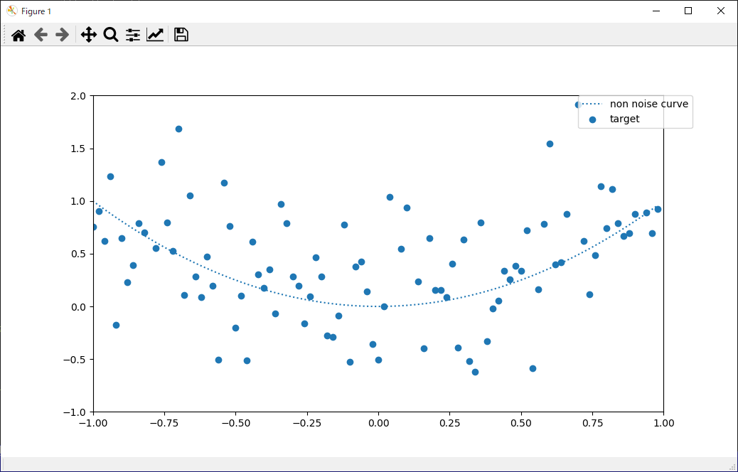
x = np.arange(x_min, x_max, 1 / float(SCALE)).reshape(-1, 1)
# xの2乗
y = x ** 2
y_noise = y + np.random.randn(len(y), 1) * 0.5 # ノイズを乗せる
# 学習データとテストデータに分割(分類問題、回帰問題で使用)
def split_train_test(array):
length = len(array)
n = int(length * (1 - TEST_RATE))
indices = list(range(length))
np.random.shuffle(indices)
idx_train = indices[:n]
idx_test = indices[n:]
return sorted(array[idx_train]), sorted(array[idx_test])
# インデックスリストを分割
indices = np.arange(len(x)) # インデックス値のリスト
idx_train, idx_test = split_train_test(indices)
# 学習データ
x_train = x[idx_train]
y_train = y_noise[idx_train] # ノイズが乗ったデータ
# テストデータ
x_test = x[idx_test]
y_test = y_noise[idx_test] # ノイズが乗ったデータ
# クラスの閾値。原点からの半径
CLASS_RADIUS = 0.6
labels = (x ** 2 + y_noise ** 2) < CLASS_RADIUS ** 2
# 学習データとテストデータに分割
label_train = labels[idx_train] # 学習データ
label_test = labels[idx_test] # テストデータ
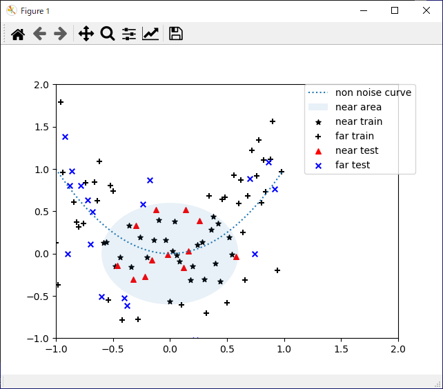
## グラフ描画
# 近いか遠いかで2種類に分け、さらに学習データとテストデータに分ける。全部で3種類。
# 学習データ(近い)散布図
plt.scatter(x_train[label_train], y_train[label_train], c='black', s=30, marker='*', label='near train')
# テストデータ(遠い)散布図
plt.scatter(x_train[label_train != True], y_train[label_train != True], c='black', s=30, marker='+', label='far train')
# テストデータ(近い)散布図
plt.scatter(x_test[label_test], y_test[label_test], c='red', s=30, marker='^', label='near test')
# テストデータ(遠い)散布図
plt.scatter(x_test[label_test != True], y_test[label_test != True], c='blue', s=30, marker='x', label='far test')
# 元の線を点線スタイルで表示
plt.plot(x, y, linestyle=':', label='non noise curve')
# クラスの分離円
circle = plt.Circle((0, 0), CLASS_RADIUS, alpha=0.1, label='near area')
ax = plt.gca()
ax.add_patch(circle)
# x軸とy軸の範囲を設定
plt.xlim(x_min, y_max)
plt.ylim(y_min, y_max)
# 凡例の表示位置を指定
plt.legend(bbox_to_anchor=(1.05, 1), loc='uppder left', borderaxespad=0)
# グラフを表示
plt.show()
|