Python - 機械学習③ クラスタリング

機械学習によるクラスタリングを行ってみます。

クラスタリング用のデータ準備

まずはクラスタリング用のデータを準備します。

クラスタリングでは学習データとテストデータという区別はありません。

ただデータを与えれば、データを種類ごとに分けてくれます。

[コード]

1
2
3
4
5
6
7
8
9
10
11
12
13
14
15
16
17
18
19
20
21
22
23
# matplotlibとnumpyをインポート
import matplotlib.pyplot as plt
import numpy as np

# x軸の範囲を定義
x_max = 1
x_min = -1

# y軸の範囲を定義
y_max = 2
y_min = -1

# スケールを定義(1単位に何点を使うか)
SCALE = 50

# テストデータの割り合い(全データに対してテストデータは30%)
TEST_RATE = 0.3

# データ生成
x = np.arange(x_min, x_max, 1 / float(SCALE)).reshape(-1, 1)
# xの2乗
y = x ** 2
y_noise = y + np.random.randn(len(y), 1) * 0.5 # ノイズを乗せる

クラスタリング

クラスタリングを行います。今回はデータを3つに分けてグラフに表示します。

7行目のn_clustersに分類数を設定します。

[コード]

1
2
3
4
5
6
7
8
9
10
11
12
13
14
15
16
17
18
19
20
21
22
23
24
25
26
27
28
29
30
from sklearn import cluster

# xデータとyデータを結合
data = np.c_[x, y_noise]

# 3つのクラスタに分割
model = cluster.KMeans(n_clusters=3)
model.fit(data)

# 分割結果
# 0から2の番号がつけられている
labels = model.labels_

### データの表示
plt.scatter(x[labels == 0], y_noise[labels == 0], c='blue', s=30, marker='^', label='cluster 0')
plt.scatter(x[labels == 1], y_noise[labels == 1], c='black', s=30, marker='x', label='cluster 1')
plt.scatter(x[labels == 2], y_noise[labels == 2], c='red', s=30, marker='*', label='cluster 2')

# 元の線を点線スタイルで表示
plt.plot(x, y, linestyle='-', label='non noise curve')

# x軸とy軸の範囲を設定
plt.xlim(x_min, y_max)
plt.ylim(y_min, y_max)

# 凡例の表示位置を指定
plt.legend()

# グラフを表示
plt.show()

実行結果は下記の通りです。

[実行結果]

結果

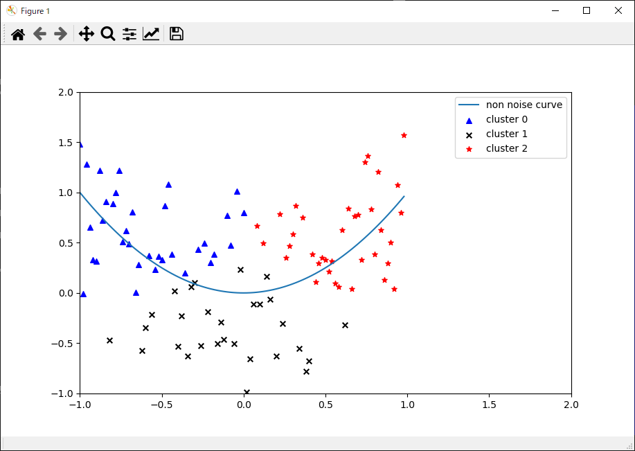
データが青の▲マーク、黒の×マーク、赤の★マークの3つに分類されていることが分かります。