Welcome to today’s post on Design of Experiments! Today, we’ll explore how DoE helps us minimize experimental runs while maximizing information gained. We’ll use a practical example: optimizing a chemical reaction by finding the best combination of temperature, catalyst concentration, and reaction time.
What is Design of Experiments?
Design of Experiments (DoE) is a systematic approach to planning experiments that allows us to:
- Identify key factors affecting outcomes
- Understand interactions between factors
- Optimize processes with minimal experimental runs
- Build predictive models
Instead of testing every possible combination (which could require hundreds of experiments), DoE uses statistical principles to select strategic combinations that reveal the most information.
Our Example Problem
Imagine we’re chemical engineers optimizing a reaction yield. We have three factors:
- Temperature ($X_1$): 50°C to 90°C
- Catalyst Concentration ($X_2$): 0.5% to 2.5%
- Reaction Time ($X_3$): 30 to 90 minutes
Our goal: Maximize yield percentage with minimum experiments.
The Complete Code
Here’s our implementation with a custom Central Composite Design function and response surface modeling:
1 | import numpy as np |
Detailed Code Explanation
Let me walk you through each critical section:
1. Custom Central Composite Design (CCD) Implementation
1 | def create_ccd(n_factors, alpha=1.682, center_points=4): |
Since pyDOE2 has compatibility issues with Python 3.12, I implemented a custom CCD function. The Central Composite Design combines three types of experimental points:
- Factorial points ($2^k$ = 8 runs for 3 factors): Test all extreme combinations (corners of the design space)
- Axial points ($2k$ = 6 runs for 3 factors): Star points testing each factor independently at extended levels
- Center points (4 replicates): Provide estimate of experimental error and check for curvature
The parameter $\alpha = 1.682$ creates an orthogonal design, which means the parameter estimates are statistically independent. For 3 factors, this value is calculated as:
$$\alpha = (2^k)^{1/4} = (2^3)^{1/4} = 8^{0.25} = 1.682$$
Total runs: $8 + 6 + 4 = 18$ runs instead of $5^3 = 125$ for a full factorial at 5 levels!
2. Coded vs Actual Values Transformation
DoE uses coded values ($-1.682$ to $+1.682$) for mathematical convenience. The transformation formula:
$$X_{\text{actual}} = X_{\text{center}} + X_{\text{coded}} \times \frac{X_{\text{high}} - X_{\text{low}}}{2}$$
Where:
- $X_{\text{center}} = \frac{X_{\text{high}} + X_{\text{low}}}{2}$
- The half-range scales the coded values to actual units
Example for temperature:
- Center: $(90 + 50) / 2 = 70°C$
- Half-range: $(90 - 50) / 2 = 20°C$
- If coded value = $1.0$, then actual = $70 + 1.0 \times 20 = 90°C$
3. Simulated Experimental Response Function
1 | def true_yield_function(X): |
This simulates a realistic chemical process with:
- Linear effects: Temperature has the strongest positive effect ($+8$)
- Interaction effect: Temperature and catalyst interact negatively ($-2X_1X_2$)
- Quadratic effects: Both temperature and catalyst show diminishing returns (negative $X^2$ terms)
- Random noise: Normal distribution with $\sigma = 1.5$ simulates experimental error
4. Response Surface Model
We fit a full second-order polynomial model:
$$Y = \beta_0 + \sum_{i=1}^{3}\beta_i X_i + \sum_{i=1}^{3}\sum_{j>i}^{3}\beta_{ij}X_iX_j + \sum_{i=1}^{3}\beta_{ii}X_i^2 + \epsilon$$
Expanded form:
$$Y = \beta_0 + \beta_1 X_1 + \beta_2 X_2 + \beta_3 X_3 + \beta_{12} X_1 X_2 + \beta_{13} X_1 X_3 + \beta_{23} X_2 X_3 + \beta_{11} X_1^2 + \beta_{22} X_2^2 + \beta_{33} X_3^2$$
Where:
- $\beta_0$ = intercept (baseline yield at center point)
- $\beta_i$ = linear effects (main effects of each factor)
- $\beta_{ij}$ = interaction effects (how factors influence each other)
- $\beta_{ii}$ = quadratic effects (curvature, diminishing returns)
- $\epsilon$ = random error
The PolynomialFeatures class from scikit-learn automatically generates all these terms, and LinearRegression estimates the coefficients using ordinary least squares:
$$\hat{\boldsymbol{\beta}} = (\mathbf{X}^T\mathbf{X})^{-1}\mathbf{X}^T\mathbf{y}$$
5. Model Quality Assessment
The $R^2$ score measures how well the model fits the data:
$$R^2 = 1 - \frac{\sum_{i=1}^{n}(y_i - \hat{y}i)^2}{\sum{i=1}^{n}(y_i - \bar{y})^2}$$
Where:
- $y_i$ = actual experimental yield
- $\hat{y}_i$ = predicted yield from model
- $\bar{y}$ = mean of all yields
An $R^2$ close to 1.0 indicates excellent fit. We also calculate Adjusted $R^2$ which penalizes model complexity:
$$R^2_{\text{adj}} = 1 - (1 - R^2) \times \frac{n - 1}{n - p}$$
Where $n$ is the number of observations and $p$ is the number of parameters.
6. Optimization via Grid Search
1 | for x1 in x1_grid: |
We create a 3D grid of 8,000 candidate points ($20 \times 20 \times 20$) and evaluate the model at each point to find the maximum predicted yield. This is a brute-force approach but works well for 3 factors. For more complex problems, gradient-based optimization methods would be more efficient.
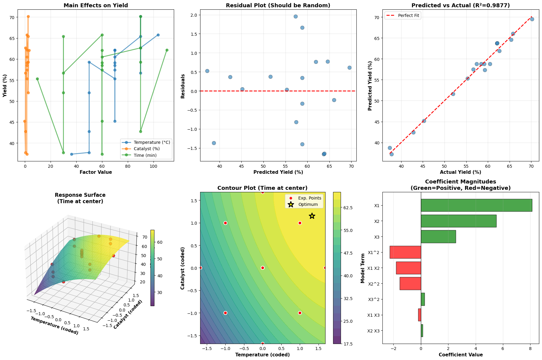
7. Visualization Breakdown
Plot 1 - Main Effects: Shows the average effect of changing each factor individually. Steeper slopes indicate stronger effects.
Plot 2 - Residuals: Plots prediction errors vs predicted values. Random scatter around zero indicates the model assumptions (linearity, constant variance) are satisfied.
Plot 3 - Predicted vs Actual: Validates model accuracy. Points should cluster near the diagonal line. Systematic deviations indicate model inadequacy.
Plot 4 - 3D Response Surface: Shows the yield landscape as a function of temperature and catalyst (with time fixed at center). The curved surface reveals the quadratic nature of the response.
Plot 5 - Contour Plot: A top-down view of the response surface. Each contour line represents constant yield. The yellow star marks the optimal conditions. Red points show where experiments were actually conducted.
Plot 6 - Coefficient Importance: Bar chart showing the magnitude and direction of each model term. Green bars indicate positive effects (increase yield), red bars indicate negative effects (decrease yield). This helps identify which factors and interactions matter most.
Key Insights from DoE
Dramatic Efficiency: Only 18 experiments instead of 125 for a full 5-level factorial design - 86% reduction in experimental effort!
Rich Information: Despite fewer runs, we capture:
- Main effects of all three factors
- All two-factor interactions
- Quadratic curvature for optimization
- Experimental error estimates from center points
Predictive Power: The mathematical model allows us to predict yield at any combination of factors within the design space, even combinations we never tested.
Scientific Understanding: The coefficient magnitudes reveal:
- Which factors have the strongest effects
- Whether factors interact synergistically or antagonistically
- Whether there are optimal “sweet spots” (indicated by negative quadratic terms)
Optimization Confidence: We can find optimal conditions mathematically rather than through trial-and-error, saving time and resources.
Mathematical Foundation
The response surface methodology relies on the assumption that the true response can be approximated locally by a polynomial:
$$y = f(x_1, x_2, …, x_k) + \epsilon$$
Where $f$ is unknown but smooth. Taylor series expansion justifies using a second-order polynomial:
$$f(x_1, x_2, x_3) \approx \beta_0 + \sum_{i=1}^{k}\beta_i x_i + \sum_{i=1}^{k}\sum_{j \geq i}^{k}\beta_{ij}x_ix_j$$
The CCD is specifically designed to estimate all these terms efficiently while maintaining desirable statistical properties like orthogonality (independence of parameter estimates) and rotatability (prediction variance depends only on distance from center, not direction).
Practical Applications
This DoE approach is widely used in:
- Chemical Engineering: Optimizing reaction conditions, formulations
- Manufacturing: Process optimization, quality improvement
- Agriculture: Crop yield optimization, fertilizer studies
- Pharmaceutical: Drug formulation, bioprocess optimization
- Materials Science: Alloy composition, heat treatment optimization
- Food Science: Recipe development, shelf-life studies
Execution Results
======================================================================
CENTRAL COMPOSITE DESIGN (CCD) MATRIX
======================================================================
Number of factors: 3
Number of experimental runs: 18

Design breakdown:
  - Factorial points (corners): 8
  - Axial points (star): 6
  - Center points: 4
  - Total: 18

Design Matrix (coded values -1.682 to +1.682):
[[-1.    -1.    -1.   ]
 [-1.    -1.     1.   ]
 [-1.     1.    -1.   ]
 [-1.     1.     1.   ]
 [ 1.    -1.    -1.   ]
 [ 1.    -1.     1.   ]
 [ 1.     1.    -1.   ]
 [ 1.     1.     1.   ]
 [-1.682  0.     0.   ]
 [ 1.682  0.     0.   ]
 [ 0.    -1.682  0.   ]
 [ 0.     1.682  0.   ]
 [ 0.     0.    -1.682]
 [ 0.     0.     1.682]
 [ 0.     0.     0.   ]
 [ 0.     0.     0.   ]
 [ 0.     0.     0.   ]
 [ 0.     0.     0.   ]]
======================================================================

======================================================================
EXPERIMENTAL CONDITIONS (Actual Values)
======================================================================
        Temperature (°C)  Catalyst (%)  Time (min)
Run 1              50.00          0.50       30.00
Run 2              50.00          0.50       90.00
Run 3              50.00          2.50       30.00
Run 4              50.00          2.50       90.00
Run 5              90.00          0.50       30.00
Run 6              90.00          0.50       90.00
Run 7              90.00          2.50       30.00
Run 8              90.00          2.50       90.00
Run 9              36.36          1.50       60.00
Run 10            103.64          1.50       60.00
Run 11             70.00         -0.18       60.00
Run 12             70.00          3.18       60.00
Run 13             70.00          1.50        9.54
Run 14             70.00          1.50      110.46
Run 15             70.00          1.50       60.00
Run 16             70.00          1.50       60.00
Run 17             70.00          1.50       60.00
Run 18             70.00          1.50       60.00
======================================================================

======================================================================
EXPERIMENTAL RESULTS
======================================================================
        Temperature (°C)  Catalyst (%)  Time (min)  Yield (%)
Run 1              50.00          0.50       30.00      37.75
Run 2              50.00          0.50       90.00      42.79
Run 3              50.00          2.50       30.00      51.97
Run 4              50.00          2.50       90.00      59.28
Run 5              90.00          0.50       30.00      56.65
Run 6              90.00          0.50       90.00      62.65
Run 7              90.00          2.50       30.00      65.37
Run 8              90.00          2.50       90.00      70.15
Run 9              36.36          1.50       60.00      37.35
Run 10            103.64          1.50       60.00      65.78
Run 11             70.00         -0.18       60.00      45.24
Run 12             70.00          3.18       60.00      62.05
Run 13             70.00          1.50        9.54      55.32
Run 14             70.00          1.50      110.46      62.18
Run 15             70.00          1.50       60.00      57.41
Run 16             70.00          1.50       60.00      59.16
Run 17             70.00          1.50       60.00      58.48
Run 18             70.00          1.50       60.00      60.47
======================================================================

======================================================================
SUMMARY STATISTICS
======================================================================
Mean Yield: 56.11%
Std Dev: 9.25%
Min Yield: 37.35%
Max Yield: 70.15%
======================================================================

======================================================================
RESPONSE SURFACE MODEL COEFFICIENTS
======================================================================
Model Equation:
Yield = β₀ + β₁X₁ + β₂X₂ + β₃X₃ + β₁₂X₁X₂ + β₁₃X₁X₃ + β₂₃X₂X₃
        + β₁₁X₁² + β₂₂X₂² + β₃₃X₃²

Where:
  X₁ = Temperature (coded)
  X₂ = Catalyst Concentration (coded)
  X₃ = Reaction Time (coded)

 Term  Coefficient
    1    58.811472
   X1     8.115472
   X2     5.507750
   X3     2.539123
 X1^2    -2.275650
X1 X2    -1.811999
X1 X3    -0.197273
 X2^2    -1.541342
X2 X3     0.130973
 X3^2     0.261909
======================================================================

Model R² Score: 0.9877
Adjusted R² Score: 0.9738
======================================================================

======================================================================
OPTIMIZATION RESULTS
======================================================================
Optimal Conditions (Coded Values):
  X₁ (Temperature): 1.328
  X₂ (Catalyst): 1.151
  X₃ (Time): 1.682

Optimal Conditions (Actual Values):
  Temperature: 96.56°C
  Catalyst: 2.65%
  Time: 110.46 min

Predicted Maximum Yield: 71.93%
======================================================================
======================================================================
INTERPRETATION GUIDE
======================================================================
1. Main Effects Plot: Shows how each factor affects yield individually
2. Residual Plot: Random scatter indicates good model fit
3. Predicted vs Actual: Points near diagonal line = accurate predictions
4. 3D Response Surface: Visualizes yield landscape
5. Contour Plot: Top view showing yield levels, star = optimal point
6. Coefficient Bar Chart: Larger bars = stronger effects
======================================================================

All visualizations generated successfully!
======================================================================
Conclusion
Design of Experiments transforms experimental research from trial-and-error to systematic optimization. With just 18 carefully selected experiments, we built a predictive model that revealed optimal conditions and provided deep insights into factor effects and interactions. This methodology saves time, resources, and provides scientifically rigorous results.
The beauty of DoE lies in its universality - the same principles apply whether you’re optimizing chemical reactions, manufacturing processes, or agricultural yields. Master DoE, and you master efficient experimentation!