院内感染の予測
医療データを使用して院内感染の予測や制御策の評価を行うためのサンプルを作成し、グラフ化します。
ここでは、以下の要素を考慮した仮想的なデータを使用します:
- 患者の日次入院数
- 感染症の発生数
- 院内感染対策の強化レベル(0から10までのスケール)
まず、適切なライブラリをインポートします。
1
2
3
4
| import numpy as np
import pandas as pd
import matplotlib.pyplot as plt
from sklearn.linear_model import LinearRegression
|
次に、仮想的なデータを作成します。
1
2
3
4
5
6
7
8
9
10
11
12
13
14
|
days = np.arange(1, 31)
admissions = np.random.randint(50, 150, size=len(days))
infections = np.random.randint(0, 10, size=len(days))
precautions = np.random.randint(0, 10, size=len(days))
data = pd.DataFrame({'Days': days, 'Admissions': admissions, 'Infections': infections, 'Precautions': precautions})
|
次に、線形回帰モデルを使用して、院内感染数と院内感染対策の強化レベルの関係を学習します。
1
2
3
4
5
6
7
8
9
10
|
X = data[['Precautions']]
y = data['Infections']
model = LinearRegression()
model.fit(X, y)
predictions = model.predict(X)
|
最後に、結果をグラフ化して可視化します。
1
2
3
4
5
6
7
8
9
|
plt.figure(figsize=(10, 6))
plt.scatter(data['Precautions'], data['Infections'], color='blue', label='Actual')
plt.plot(data['Precautions'], predictions, color='red', linewidth=3, label='Predicted')
plt.xlabel('Precautions')
plt.ylabel('Infections')
plt.title('Relationship between Precautions and Infections')
plt.legend()
plt.show()
|
このコードを実行すると、院内感染数と院内感染対策の強化レベルの関係を示すグラフが表示されます。
実際のデータポイントは青色で表示され、予測値は赤色の線で示されます。
[実行結果]
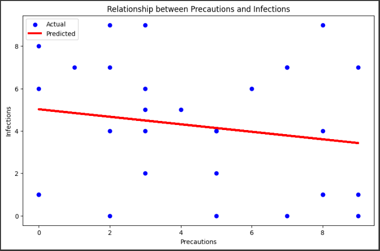
このグラフを通じて、院内感染対策の強化レベルが上がるにつれて、院内感染数が減少する傾向があるかどうかを確認することができます。