Dash Bio⑪(Clustergram)

Clustergram

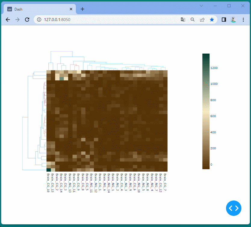
Clustergramコンポーネントを使うと、2次元のクラスター分析を可視化することができます。

クラスター分析とは、大きな集団の中から似たもの同士を集めてグループに分ける統計的な分析手法です。

Dash Enterprise - https://dash.plotly.com/dash-bio/clustergram

上記のDash Enterpriseにあるサンプルを参考にして、2次元のクラスター分析を視覚化します。

[ソースコード]

1
2
3
4
5
6
7
8
9
10
11
12
13
14
15
16
17
18
19
20
21
22
23
24
25
26
27
28
import pandas as pd
import dash
import dash_bio as dashbio
from dash import dcc

app = dash.Dash(__name__)

df = pd.read_csv('https://git.io/clustergram_brain_cancer.csv').set_index('ID_REF')

columns = list(df.columns.values)
rows = list(df.index)

app.layout = dcc.Graph(figure=dashbio.Clustergram(
data=df.loc[rows].values,
column_labels=columns,
row_labels=rows,
color_threshold={
'row': 250,
'col': 700
},
hidden_labels='row',
height=700,
width=1000
)
)

if __name__ == '__main__':
app.run_server(debug=True)

[ブラウザで表示]

2次元のクラスター分析を可視化することができました。

ドラッグ操作により表示範囲を変えることができます。