今回は、Plotlyでバイオリン図を描画してみます。
データの読み込み
まずはデータを読み込みます。
準備するデータはtipsデータセット(レストランの支払金額とチップの金額)です。
tipsデータセットから曜日ごとのデータを取り出しています。(7~10行目)
[Google Colaboratory]
1 | import plotly |
[実行結果(金曜を抽出したデータ)]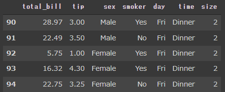
バイオリン図
Plotlyでバイオリン図を描画するにはViolinクラスを使います。
Violinクラスの引数 yにはリストなどのデータを設定します。
次のコードでは、1列目のサブプロットでバイオリン図に箱ひげ図を重ねて描画し、2列目のサブプロットではsmoker列のデータを左右に分けて描画しています。
[Google Colaboratory]
1 | from plotly.subplots import make_subplots |
[実行結果]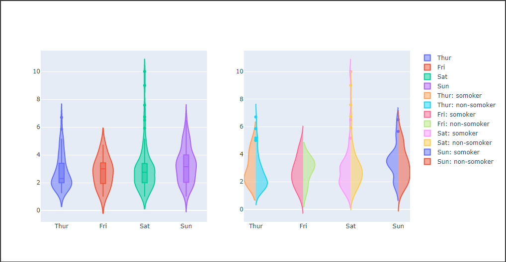
Violinクラスの引数 box_visibleにTrueを渡すとバイオリン図に箱ひげ図を重ねて描画します。(9,15,18,21行目)
引数 sideに“negative”を渡すと左側に描画(33行目)し、“positive”を渡すと右側に描画(43行目)します。