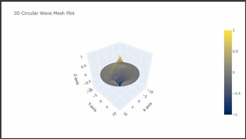
This plot simulates circular waves radiating outward from the origin.
The amplitude decays as the waves spread, creating a visually dynamic $3D$ $mesh$.
1. Import Required Libraries
First, import the necessary libraries:
1
2
import numpy as np
import plotly.graph_objects as go
2. Define the Circular Wave Grid
To create circular waves, we define a grid in polar coordinates (r for radial distance and theta for angle) and convert it to Cartesian coordinates (x and y).
This grid will form a circular, ripple-like structure.
# Create the mesh plot for the circular wave fig = go.Figure( data=[go.Mesh3d( x=X, y=Y, z=Z, color='blue', opacity=0.7, intensity=Z, colorscale="Cividis", alphahull=5 )] )
# Set layout options for a better view fig.update_layout( title="3D Circular Wave Mesh Plot", scene=dict( xaxis_title='X-axis', yaxis_title='Y-axis', zaxis_title='Z-axis', camera=dict( eye=dict(x=1.5, y=1.5, z=1.5) ) ) )
6. Display the Plot
To display the circular wave plot, use:
1
fig.show()
Explanation of Key Parameters
Wave Equation: The function np.sin(3 * r - theta) * np.exp(-0.3 * r) simulates oscillations with amplitude decay, creating a wave pattern that radiates outward.
Colorscale: The Cividis scale adds contrast, highlighting the wave peaks and valleys for a dramatic effect.
Opacity: Lower opacity adds depth to the plot, making the wave’s radial decay easier to perceive.
This creates a visually engaging $3D$ $mesh$ that mimics ripples in water, showcasing the decaying wave amplitude as it moves outward from the origin.
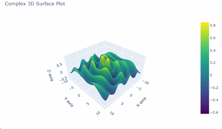
Intricate 3D Surface Plot with Sine and Exponential Decay
To create a complex 3D surface plot in $Python$ using $Plotly$, we can generate a dataset that defines a surface over a grid of $x$ and $y$ values.
One common approach is to base this on mathematical functions to make the surface appear intricate, such as sinusoidal functions or $Gaussian$ surfaces, which add visually interesting layers of complexity.
Let’s walk through the steps to create a detailed 3D surface plot using $Plotly$.
1. Set Up the Libraries
First, import the required libraries:
1 2
import numpy as np import plotly.graph_objects as go
2. Define the X and Y Grid
To create a surface, we need a grid of points for the $x$ and $y$ dimensions.
These will serve as the base coordinates for each point on our surface.
1 2 3 4
# Define the grid size x = np.linspace(-10, 10, 100) y = np.linspace(-10, 10, 100) X, Y = np.meshgrid(x, y)
3. Define the Complex Function for Z Values
For a more intricate plot, we can use a combination of functions, like a $Gaussian$ function multiplied by a sine or cosine function.
This creates peaks and valleys that look complex and engaging.
1 2
# Complex function for Z Z = np.sin(np.sqrt(X**2 + Y**2)) * np.cos(X) * np.exp(-0.1 * np.sqrt(X**2 + Y**2))
This function combines a radial sine function with a decaying exponential, adding oscillations and smooth curvature.
4. Create the Surface Plot
With the X, Y, and Z values prepared, we use $Plotly$ to create the 3D surface plot:
# Set additional plot parameters for enhanced aesthetics fig.update_layout( title="Complex 3D Surface Plot", scene=dict( xaxis_title='X-axis', yaxis_title='Y-axis', zaxis_title='Z-axis', camera=dict( eye=dict(x=1.25, y=1.25, z=1.25) ), aspectratio=dict(x=1, y=1, z=0.5) ) )
5. Display the Plot
Finally, display the plot with:
1
fig.show()
Explanation of the Parameters
Colorscale: Viridis is chosen for its high-contrast, which enhances the readability of peaks and valleys. You can try others like Plasma or Cividis.
Scene settings: This includes axis titles for clarity and a custom camera position to provide a good viewing angle.
Aspect ratio: Adjusts the scaling of the axes, so the plot is not distorted.
This script generates a 3D surface that features smooth transitions, sharp peaks, and interesting valleys, making it a complex and visually appealing 3D plot.
Adjusting the function or grid size can add further complexity if desired.
$Plotly$’s 3D scatter plot capabilities allow us to visualize complex, multi-dimensional data interactively.
We’ll create a detailed 3D scatter plot with customizations such as color-coding, sizing, and axis labels.
This example demonstrates how to plot complex data with customized markers, informative labels, and meaningful axes, all designed to enhance clarity and interaction with the data.
We’ll use synthetic data that includes three main dimensions, X, Y, and Z, representing each axis in the 3D space, and additional features that determine point colors and sizes.
Step-by-Step Explanation and Code
Generate Data: We’ll create synthetic data using $NumPy$ to represent our 3D points, with values for each axis (X, Y, Z) and two additional variables (category for color and size for marker size).
Set Up the Plotly 3D Scatter Plot: Using $Plotly$’s go.Scatter3d, we’ll customize our 3D plot to visualize:
Point Colors: Categorical values will be represented by different colors.
Point Sizes: A continuous variable will determine the size of each point.
Axis Titles: Labels for each axis to provide clear context.
Customize Layout: We’ll adjust the layout to add titles, background, and enhance interactivity.
# Customize the layout fig.update_layout( title="3D Scatter Plot with Color and Size Encoding", scene=dict( xaxis=dict(title="X Axis (e.g., Feature 1)"), yaxis=dict(title="Y Axis (e.g., Feature 2)"), zaxis=dict(title="Z Axis (e.g., Feature 3)"), bgcolor="rgba(240,240,240,0.95)" ), width=800, height=600, showlegend=False )
fig.show()
Detailed Explanation
Data Generation:
We use $NumPy$’s np.random.uniform to generate random values for X, Y, and Z coordinates within a specified range. We also define category (with values like Category A, Category B, Category C) and size, which affects the marker sizes.
We assign colors using color_map, where each category has a different color (e.g., red, blue, green).
Creating the Scatter Plot:
Scatter3d: This $Plotly$ function is used to create 3D scatter plots. x, y, and z are assigned to the respective coordinate values.
Marker Customization:
size=size adjusts the size of each marker based on the size variable.
color=colors assigns colors based on the category.
opacity=0.8 provides transparency, making overlapping points more distinguishable.
line=dict(width=1, color='DarkSlateGrey') adds a border to each marker, improving visibility.
Hover Information: We provide custom hover text to display values for X, Y, Z, and size when hovering over points.
Layout Customization:
title provides a clear title for the plot.
Axis Titles: Each axis is labeled to describe the corresponding feature.
Background Color: scene.bgcolor is set to a light grey, which enhances the visibility of the colored points.
Dimensions: We specify width and height for consistent display.
Interpretation
This interactive 3D scatter plot allows us to observe:
Distribution: The spread of points across the three dimensions reveals clustering patterns and possible outliers.
Category Comparison: Colors represent different categories, allowing us to compare distributions between them.
Point Emphasis: Size variation highlights differences in another variable, helping us to see patterns across categories or regions of the 3D space.
Output
The resulting plot will display a 3D scatter plot with different colors for each category, sizes reflecting a separate feature, and axis titles.
This interactive view lets you rotate, zoom, and hover over points for detailed insights.
Conclusion
The 3D scatter plot with $Plotly$ provides a powerful way to explore complex, multi-variable relationships in data.
By encoding multiple variables in position, color, and size, we can convey a rich amount of information in a single, interactive plot, ideal for data science, research, and presentation purposes.
A Versatile Visualization for Multi-Variable Analysis/span>
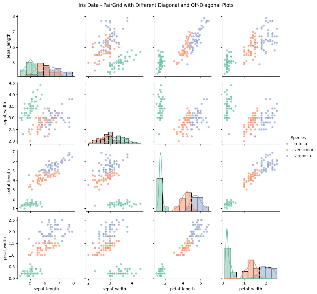
PairGrid in $Seaborn$ is a powerful tool for visualizing relationships across multiple variables in a single, customizable grid.
By using different plots on the diagonal and off-diagonal sections, we can present complex data in a format that highlights distribution and correlation simultaneously.
This method is particularly useful for exploratory data analysis, allowing us to examine each pair of variables with tailored visualizations that make it easier to identify patterns, outliers, and correlations.
In this example, we’ll use the iris dataset, which contains measurements for petal and sepal length and width for different iris flower species.
We’ll create a grid where the diagonal shows each variable’s distribution, while the off-diagonal displays scatter plots to visualize relationships between variable pairs.
Step-by-Step Explanation and Code
Load the Data: The iris dataset has four numerical features (sepal_length, sepal_width, petal_length, petal_width) and a categorical species feature.
Set Up the PairGrid: We’ll create a grid where:
The diagonal displays histograms to show distributions of each variable.
The off-diagonal cells show scatter plots, comparing each pair of variables and adding color to distinguish the species.
Customize the Plot: We’ll add color palettes, improve the legend, and customize titles for better readability.
Here’s the full implementation:
1 2 3 4 5 6 7 8 9 10 11 12 13 14 15 16 17
import seaborn as sns import matplotlib.pyplot as plt
# Load the iris dataset df = sns.load_dataset("iris")
# Set up the PairGrid g = sns.PairGrid(df, hue="species", palette="Set2")
# Map different plots to the diagonal and off-diagonal g.map_diag(sns.histplot, kde=True) # Histogram with KDE for the diagonal g.map_offdiag(sns.scatterplot, s=30, alpha=0.7) # Scatter plot for the off-diagonal
# Add customizations g.add_legend(title="Species") g.fig.suptitle("Iris Data - PairGrid with Different Diagonal and Off-Diagonal Plots", y=1.02) plt.show()
Detailed Explanation
Data Preparation:
We load the iris dataset, which includes four continuous features (sepal_length, sepal_width, petal_length, and petal_width) and one categorical feature, species, which represents three types of iris flowers: setosa, versicolor, and virginica.
PairGrid Setup:
sns.PairGrid(df, hue="species", palette="Set2"): Sets up a PairGrid using the iris dataset. We specify species as the hue to color-code each species in the plot, and we use the Set2 color palette for aesthetic differentiation.
Plot Mapping:
Diagonal Plot (map_diag): sns.histplot with kde=True displays histograms with kernel density estimation (KDE) on the diagonal, showing each variable’s distribution. The KDE line smooths out the histogram, giving a clear view of each variable’s distribution.
Off-Diagonal Plot (map_offdiag): sns.scatterplot displays scatter plots on the off-diagonal cells, showing pairwise relationships. With s=30 and alpha=0.7, we adjust the marker size and transparency to avoid overlap and make the scatter plots clearer.
Adding Customizations:
g.add_legend(title="Species"): Adds a legend to distinguish between species.
g.fig.suptitle(...): Sets a title for the entire grid, positioned slightly above the grid with y=1.02 for clarity.
Interpretation
The resulting grid provides insights into both individual distributions and pairwise relationships:
Diagonals (Distributions): Each diagonal cell shows the distribution of a single variable, allowing us to assess each species’ range and typical values for petal and sepal measurements.
Off-Diagonals (Pairwise Relationships): The scatter plots in the off-diagonal cells show relationships between variable pairs. For example:
A strong linear relationship between petal_length and petal_width is observed, especially for the virginica species.
Overlaps or separations between species in scatter plots reveal which pairs of variables can differentiate species, aiding classification.
Output
The output grid will have:
Histograms along the diagonal, showing each variable’s distribution by species.
Scatter plots in the off-diagonal, showing pairwise relationships between features, with color-coding for each species.
Conclusion
The PairGrid with different diagonal and off-diagonal plots in $Seaborn$ allows for a multi-faceted analysis of relationships and distributions within a dataset.
By customizing the plots, we can leverage both distributional and relational insights, making it a valuable visualization tool in data science for complex, multi-variable datasets.
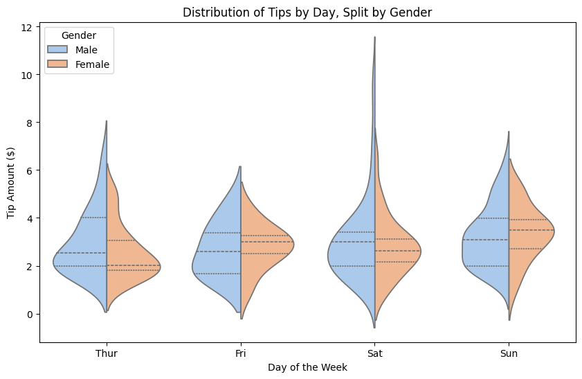
The violinplot function in $Seaborn$ is a versatile tool for visualizing the distribution of data and comparing multiple groups.
By adding the split parameter, we can create a split $violin$ $plot$, which provides a powerful way to compare distributions within each category side-by-side in one plot.
This type of visualization is especially useful for examining how a categorical variable affects the distribution of a continuous variable, with an additional split for another category.
In this example, we’ll use the tips dataset from $Seaborn$, which includes data on restaurant bills and tips, as well as the gender and smoking preferences of customers.
We’ll create a split $violin$ $plot$ to analyze how the distribution of tips differs between genders, while also examining the effect of smoking status.
Step-by-Step Explanation and Code
Load the Data: The tips dataset includes information on variables like total_bill, tip, sex, and smoker. We will focus on tip as our main variable, split by sex and smoker.
Create the Split Violin Plot: We’ll use sex to split the plot into two halves, one for each gender, and smoker to show the distribution within each half.
Customize the Plot: We’ll add labels, adjust colors, and enhance readability with an informative title.
Here’s the code to create the plot:
1 2 3 4 5 6 7 8 9 10 11 12 13 14 15 16
import seaborn as sns import matplotlib.pyplot as plt
# Load the tips dataset df = sns.load_dataset("tips")
# Customize the plot plt.title("Distribution of Tips by Day, Split by Gender") plt.xlabel("Day of the Week") plt.ylabel("Tip Amount ($)") plt.legend(title="Gender", loc="upper left") plt.show()
Detailed Explanation
Data Preparation:
We load the tips dataset, which includes the columns day (day of the week), tip (tip amount), sex (gender), and smoker (smoking status). In this case, we use day as the x-axis, tip as the y-axis, and sex to split each $violin$ $plot$.
Creating the Violin Plot:
sns.violinplot(...) creates the main visualization.
x="day": We set the x-axis to represent the day of the week, grouping tips by each day.
y="tip": We plot the tip amount on the y-axis.
hue="sex": We use sex to color the violins, allowing for comparison between genders.
split=True: This parameter splits each violin in half, showing one half for each gender. This provides a side-by-side view of the tip distribution for each gender within each day.
inner="quart": Adds inner lines to the violins representing the quartiles, giving more information about the spread of the data within each group.
palette="pastel": The pastel color palette makes the plot visually appealing and easy to interpret.
Customizing the Plot:
plt.title(...): Adds a title to clarify the purpose of the plot.
plt.xlabel(...) and plt.ylabel(...): Labels the axes for clarity.
plt.legend(...): Adjusts the legend title and placement, enhancing readability.
Interpretation
This split $violin$ $plot$ provides insights into the distribution of tips by day, separated by gender:
Distribution Shape: The width of each violin shows the frequency of tips within different ranges. For example, wider sections indicate a higher concentration of tip amounts.
Gender Comparison: Each half of the violin represents a different gender, allowing us to see differences in tip distribution within each day. For instance, if one half is significantly wider than the other, it suggests that one gender tips differently on that day.
Day-Specific Insights: The plot is grouped by day, so we can observe if there are particular days when tips are higher or more variable.
Output
The resulting plot will show two halves for each day of the week, with each half representing the distribution of tips by gender.
This layout allows us to easily compare how tips differ between genders on different days, as well as to see general distribution patterns.
Conclusion
The split $violin$ $plot$ in $Seaborn$ is an effective way to explore and compare distributions within categorical groups.
By using a split based on gender and day in this example, we gain insights into how tipping behavior varies both by gender and across different days of the week, making it a valuable tool for complex exploratory data analysis in various fields.
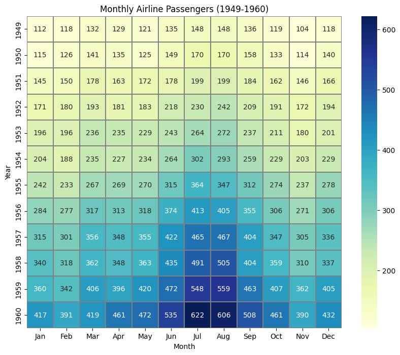
Seaborn Heatmap for Multiple Variables: A Comprehensive Visualization Example
A $heatmap$ is an effective way to visualize relationships or correlations between multiple variables, with colors representing values in a grid-like structure.
$Seaborn$’s heatmap function is particularly well-suited for this task, providing flexible options for visualizing correlation matrices, pivot tables, or any tabular data in a grid format.
In this example, we’ll use the flights dataset, which contains monthly airline passenger data over several years.
We’ll use a $heatmap$ to visualize passenger volume trends across different years and months, which will help us identify seasonal patterns or yearly changes.
Step-by-Step Explanation and Code
Load the Data: The flights dataset contains year, month, and passengers columns, which represent the number of airline passengers for each month over several years.
Transform the Data: To use the data in a $heatmap$, we’ll convert it into a pivot table, with year as rows, month as columns, and passengers as values.
Generate the Heatmap: We’ll plot the pivot table as a $heatmap$, using colors to represent passenger numbers, so we can easily identify patterns.
Here’s the full implementation:
1 2 3 4 5 6 7 8 9 10 11 12 13 14 15 16 17 18
import seaborn as sns import matplotlib.pyplot as plt
# Load the flights dataset df = sns.load_dataset("flights")
# Pivot the data with 'year' as rows, 'month' as columns, and 'passengers' as values flights_pivot = df.pivot(index="year", columns="month", values="passengers")
df.pivot("year", "month", "passengers"): The pivot function organizes data with year as rows, month as columns, and passengers as cell values. This format is ideal for the $heatmap$, with each cell representing passenger counts for a particular month and year.
Heatmap Creation:
sns.heatmap(flights_pivot, ...): This function generates the $heatmap$.
annot=True: Displays the exact passenger numbers in each cell.
fmt="d": Formats the annotation values as integers.
cmap="YlGnBu": Specifies the color map, where lower values are yellow-green and higher values are blue, creating a visual gradient from lower to higher values.
linewidths=0.3, linecolor="gray": Adds thin gray lines between cells for clarity.
Plot Customization:
plt.title("Monthly Airline Passengers (1949-1960)"): Adds a title to the $heatmap$ for context.
plt.xlabel("Month") and plt.ylabel("Year"): Labels the x-axis and y-axis for clear interpretation.
Interpretation
The $heatmap$ provides insights into monthly passenger trends over the years:
Seasonal Patterns: Darker blue cells typically appear in the middle of each year, indicating higher passenger volumes in summer months.
Yearly Trends: The passenger counts increase over time, as seen by the darker blues becoming more frequent toward the later years.
This makes the $heatmap$ especially useful for quickly identifying both seasonal and long-term trends in the dataset.
Output
The $heatmap$ effectively visualizes how airline passenger numbers vary across months and years.
It shows both seasonal fluctuations and growth trends, giving a clear picture of passenger volume changes over time.
Conclusion
Using $Seaborn$’s heatmap function with a pivoted dataset allows you to visualize complex, multi-variable data in an intuitive and meaningful way.
The combination of color gradients and annotated values makes it easy to interpret patterns, especially in time series data, and is commonly used in fields like finance, sales analysis, and operations management to identify trends or anomalies.
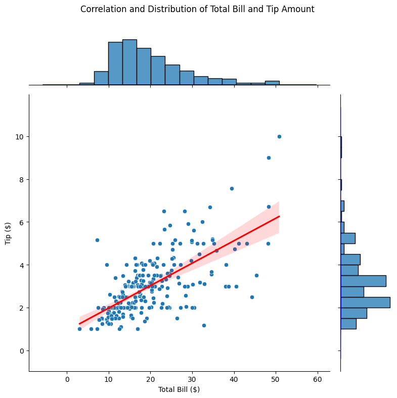
Seaborn JointGrid:Displaying Correlation and Distribution in a Complex Plot
The JointGrid function in $Seaborn$ provides a powerful way to explore both the distribution and the correlation between two variables simultaneously.
This complex visualization overlays a scatter plot showing correlation between two variables and adds marginal histograms or density plots to show the distribution of each variable.
It’s a valuable tool for examining how variables interact in a dataset and understanding the nature of their relationship.
In this example, we will use the tips dataset, which contains data on restaurant tips, including variables like total_bill and tip.
By using JointGrid, we can visualize the relationship between total_bill and tip, along with the distribution of each.
Step-by-Step Explanation and Code
Load the Data: The tips dataset is a popular dataset in $Seaborn$ that includes information about meal bills, tips, and other attributes.
Define a JointGrid: We create a JointGrid specifying total_bill and tip as the $x$ and $y$ axes, respectively. We then map different plot types onto this grid to examine both correlation and distribution.
Map Different Plots: We add a scatter plot in the center to visualize the correlation between total_bill and tip. We also add marginal histograms and a regression line to examine the strength of the correlation.
Customize the Plot: We will add labels, a title, and adjust the size of the grid to enhance readability.
import seaborn as sns import matplotlib.pyplot as plt
# Load the tips dataset df = sns.load_dataset("tips")
# Create a JointGrid with 'total_bill' and 'tip' g = sns.JointGrid(data=df, x="total_bill", y="tip", height=8)
# Map a scatter plot with a regression line onto the main plot g = g.plot(sns.scatterplot, sns.histplot) sns.regplot(data=df, x="total_bill", y="tip", ax=g.ax_joint, scatter=False, color="red")
# Add KDE plots to the marginal axes g.plot_marginals(sns.kdeplot, fill=True, color="blue", alpha=0.3)
# Customize the layout g.set_axis_labels("Total Bill ($)", "Tip ($)") plt.subplots_adjust(top=0.9) g.fig.suptitle("Correlation and Distribution of Total Bill and Tip Amount")
# Show the plot plt.show()
Detailed Explanation
JointGrid Setup: The JointGrid function initializes a grid with total_bill on the $x$-axis and tip on the $y$-axis. We set height=8 to make the plot larger for better visibility.
Main Plot (Scatter Plot with Regression Line):
g.plot(sns.scatterplot, sns.histplot): This function plots a scatter plot of total_bill vs. tip, with additional marginal histograms on the $x$ and $y$ axes.
sns.regplot(..., ax=g.ax_joint): We add a regression line to the scatter plot to show the linear relationship between total_bill and tip, which gives a sense of the strength and direction of their correlation.
scatter=False: This option hides the scatter points in the regression plot, avoiding overlap with the scatter plot points.
Marginal Distribution Plots:
g.plot_marginals(sns.kdeplot, fill=True): This command adds kernel density estimation ($KDE$) plots to the $x$ and $y$ axes, giving a smooth distribution of both total_bill and tip.
fill=True: This option fills the $KDE$ plot areas with color for a more visually appealing look.
color="blue", alpha=0.3: The color and transparency (alpha) of the $KDE$ plots are customized for clarity.
Customization:
g.set_axis_labels(...): We label the $x$ and $y$ axes with clear descriptions.
plt.subplots_adjust(top=0.9): This command adjusts the layout to accommodate the title without overlapping.
g.fig.suptitle(...): Adds an overall title to the figure to summarize the plot.
Interpretation
Scatter Plot with Regression: The scatter plot in the center shows how total_bill and tip are related. The regression line shows a positive relationship, indicating that as the total bill increases, the tip tends to increase as well.
Marginal $KDE$ Plots: The $KDE$ plots on the $x$ and $y$ axes reveal the distribution of total_bill and tip individually. For instance, the $KDE$ plot on the $x$-axis shows that most total_bill values cluster around $$10$–$$20$, while tip values are typically between $$2$ and $$4$.
Combined Analysis: This plot layout allows you to explore both the distribution and the correlation in one view. It’s clear that while there’s a trend of higher tips with higher bills, tips also vary widely, suggesting other factors (such as service quality) might play a role.
Output
The resulting visualization gives a comprehensive view of both the correlation and individual distributions.
This type of plot is extremely useful in data analysis, especially in fields like finance and business, where understanding correlations and distributions is essential for decision-making.
Conclusion
The JointGrid function in $Seaborn$, especially with a combination of scatter, regression, and $KDE$ plots, is an effective way to investigate complex relationships in data.
This visualization enables you to explore multiple dimensions at once and gain insights into both correlation and distribution, making it a valuable tool for exploratory data analysis ($EDA$) and data presentation.
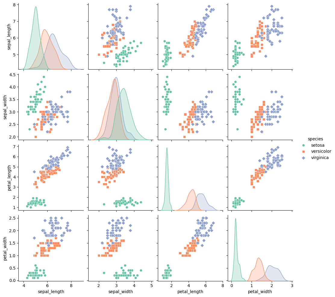
The pairplot function in $Seaborn$ is a powerful way to visualize relationships between multiple variables in a dataset.
It creates a grid of scatter plots for each pair of variables, and if you use the hue parameter, you can add color to the plots based on a categorical variable, making it easier to explore relationships within subgroups of the data.
Here’s how to create a complex pairplot using the iris dataset, which contains data on the dimensions of different species of flowers.
We’ll use hue to differentiate between species, and this will help us observe patterns and relationships across multiple dimensions in a visually rich way.
Step-by-step Explanation and Code
Load the Data: We’ll use the built-in iris dataset, which contains measurements like sepal_length, sepal_width, petal_length, and petal_width for three species of flowers.
Create a PairPlot: The pairplot function will automatically generate scatter plots for each combination of these variables, along with diagonal plots showing the distribution of each variable.
Use Hue for Differentiation: By setting the hue parameter to the species column, each species will be plotted with a different color, making it easy to visually compare relationships across species.
Customizing the Appearance: We’ll also customize the appearance by adding markers and adjusting the plot size for better readability.
Here’s the full implementation:
1 2 3 4 5 6 7 8 9 10 11 12
import seaborn as sns
import matplotlib.pyplot as plt

# Load the iris dataset
df = sns.load_dataset('iris')

# Create a pairplot with hue based on the species column
sns.pairplot(df, hue="species", palette="Set2", markers=["o", "s", "D"],
             diag_kind="kde", height=2.5)

# Display the plot
plt.show()
Detailed Explanation:
PairPlot Creation: The pairplot function automatically creates a grid of scatter plots that show pairwise relationships between the numerical variables in the dataset. Here, it will create scatter plots for sepal_length, sepal_width, petal_length, and petal_width. On the diagonal, it will display the distribution of each variable using kernel density estimation (kde).
hue="species": This colors the points by the species of the flower (setosa, versicolor, and virginica), which allows us to see how the relationships between the variables differ by species.
palette="Set2": This specifies the color palette to use, giving each species a distinct color.
markers=["o", "s", "D"]: This assigns different marker shapes to each species (o for circles, s for squares, and D for diamonds). This further differentiates the species, especially useful when printing in grayscale.
diag_kind="kde": This tells the diagonal plots to use kernel density estimation, providing smooth probability distributions for each variable, rather than simple histograms.
height=2.5: This adjusts the size of the plots for better visibility.
Visualization:
Scatter plots: The off-diagonal plots show scatter plots for each pair of variables (sepal_length vs. sepal_width, petal_length vs. sepal_length, etc.). These plots help to identify relationships or correlations between variables for each species.
Diagonal plots: The diagonal plots show the distribution of individual variables for each species using kernel density estimation. For example, you can see how sepal_length is distributed across the three species.
Colors and markers: Each species is represented by a different color and marker, making it easier to see how the species are distributed in the feature space.
Interpretation: The pairplot allows us to observe how different species of flowers separate in terms of their dimensions. For example:
Setosa (green): The setosa species tends to be well-separated from the others, especially when looking at petal_length and petal_width. This suggests that these two variables are good at distinguishing setosa from the other species.
Versicolor (purple) and Virginica (orange): These two species overlap more in some dimensions but show clear separation in others. This is particularly visible in the pairwise plots of petal_length vs. sepal_length or petal_width vs. sepal_width.
By visualizing the relationships between multiple variables and using color to differentiate between species, you can quickly identify which features are most useful for distinguishing between species.
Output:
The pairplot will display a matrix of scatter plots and density plots that provide a comprehensive view of the relationships between variables across different species.
This kind of plot is incredibly useful for exploratory data analysis, especially when trying to understand multivariate relationships and patterns within subsets of the data.
Conclusion:
The $Seaborn$ pairplot function, combined with the hue parameter, is a powerful tool for visualizing pairwise relationships between variables and understanding how different groups (in this case, species) differ from one another.
By color-coding the species and visualizing all combinations of variables, you can uncover hidden patterns and gain insights into the structure of the data.
This method is widely used in exploratory data analysis ($EDA$), machine learning, and statistical modeling to identify potential features for classification or regression tasks.
The FacetGrid in $Seaborn$ is a powerful tool for visualizing data across multiple subsets.
It allows you to map different plots onto a grid based on the values of multiple variables.
This is useful when you want to explore relationships between variables across different categories, making it perfect for complex data visualizations.
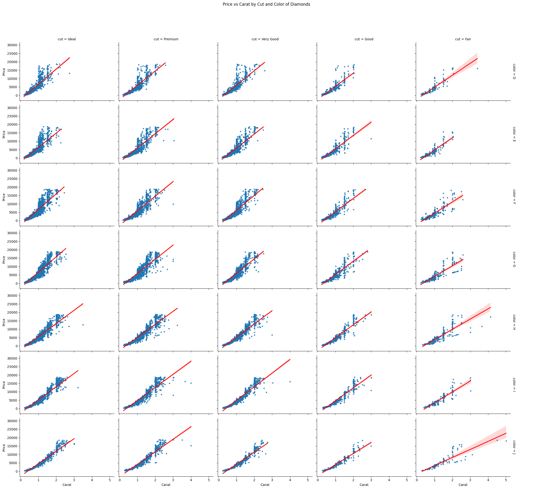
Here’s an example using the diamonds dataset in $Seaborn$.
We’ll create a grid of scatter plots showing the relationship between carat (size of a diamond) and price, split by the cut and color of the diamonds.
We’ll also overlay a regression line for each subset to examine trends within each category.
Step-by-step Explanation and Code
Load Data and Libraries: First, we import the necessary libraries and load the diamonds dataset, which contains information about diamond prices and attributes like cut, color, and carat weight.
Define the FacetGrid: We create a FacetGrid where each plot will represent diamonds of a specific cut and color. We’ll use the carat size as the x-axis and price as the y-axis to visualize the relationship.
Map a Regression Plot: We use sns.regplot to add both scatter plots and regression lines to visualize the relationship between carat and price for each facet. This helps us understand trends within each category.
Customize the Plot: We’ll add a legend, adjust the size and aspect of the grid, and customize some elements for a more refined look.
import seaborn as sns
import matplotlib.pyplot as plt

# Load the 'diamonds' dataset from seaborn
df = sns.load_dataset('diamonds')

# Create a FacetGrid object with 'cut' as columns and 'color' as rows
g = sns.FacetGrid(df, col="cut", row="color", margin_titles=True, height=3, aspect=1.5)

# Map a scatterplot with regression lines onto the grid
g.map(sns.regplot, "carat", "price", scatter_kws={"s": 10}, line_kws={"color": "red"})

# Add titles and customize the layout
g.set_axis_labels("Carat", "Price")
g.add_legend()
plt.subplots_adjust(top=0.9)
g.fig.suptitle('Price vs Carat by Cut and Color of Diamonds')

# Show the plot
plt.show()
Detailed Explanation:
FacetGrid Object: We create a FacetGrid that divides the data into facets (subplots) according to two categorical variables: cut and color. Each facet will show the relationship between the carat and price.
col="cut": Each column corresponds to a different cut quality of the diamond.
row="color": Each row corresponds to a different diamond color.
margin_titles=True: This enables titles on the margins, improving readability.
height=3 and aspect=1.5: These parameters adjust the size and aspect ratio of each subplot.
Mapping the Plot:
g.map(): This function maps the desired plot type onto the grid. Here, we use sns.regplot to create scatter plots with regression lines for each combination of cut and color.
scatter_kws={"s": 10}: Adjusts the size of scatter plot points.
line_kws={"color": "red"}: Adds a red regression line to each plot, helping us see trends more clearly.
Customizations:
set_axis_labels("Carat", "Price"): Labels the x and y axes for better understanding.
g.add_legend(): Adds a legend to indicate different subsets of the data (in this case, color and cut).
g.fig.suptitle(): Sets the main title of the entire figure.
Interpretation: Each subplot represents a different combination of cut and color for the diamonds. You can examine how the price of diamonds changes with carat size across different cut and color values. For example, diamonds with a better cut (like “Ideal”) might show a steeper price increase as carat size grows, compared to diamonds with lower-quality cuts.
Output:
The resulting grid will display multiple subplots, allowing for an easy comparison of trends across various diamond cuts and colors.
You can observe how the relationship between carat and price differs based on the cut and color of the diamond.
Regression lines in each subplot give a sense of how well the carat size predicts price in each subset.
This visualization is helpful in complex scenarios like product pricing, where several categorical factors (like quality and features) influence a continuous outcome (like price).
Optimizing Infrastructure Development with NetworkX
In this example, we will use $NetworkX$ to model and optimize an infrastructure development plan.
Specifically, we’ll simulate a road network where the goal is to improve connectivity between cities while minimizing costs.
We will represent cities as nodes and roads as edges, each with an associated cost (e.g., construction expense, distance).
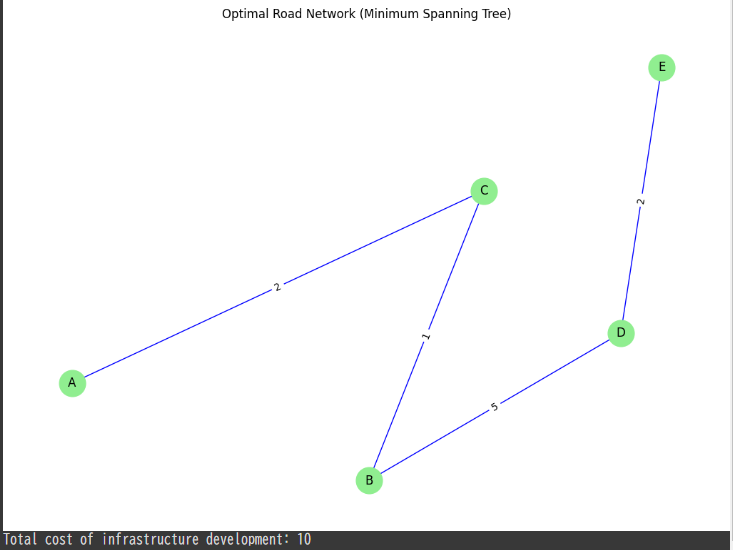
Using $NetworkX$, we can analyze the optimal road network to connect all cities at the lowest cost, using graph theory concepts like Minimum Spanning Tree ($MST$).
Problem Description:
Nodes: Cities (A, B, C, D, E)
Edges: Roads between the cities, each with a specific construction cost.
Goal: Develop an efficient infrastructure that connects all cities at the minimum construction cost.
Steps:
Graph Setup: Create a weighted graph where nodes represent cities and edges represent the roads, with weights corresponding to the construction costs.
Use Prim’s Algorithm (Minimum Spanning Tree): Apply the $MST$ algorithm to find the optimal road network, ensuring all cities are connected at the minimum cost.
Analysis: Identify which roads should be constructed and calculate the total cost of the infrastructure development.
# Compute the Minimum Spanning Tree (MST) using Prim's Algorithm mst = nx.minimum_spanning_tree(G)
# Draw the original graph with road construction costs pos = nx.spring_layout(G) plt.figure(figsize=(10, 7)) nx.draw(G, pos, with_labels=True, node_size=700, node_color='lightblue', font_size=12) nx.draw_networkx_edge_labels(G, pos, edge_labels={(u, v): d['weight'] for u, v, d in G.edges(data=True)}) plt.title("Original Road Network with Construction Costs") plt.show()
# Draw the Minimum Spanning Tree plt.figure(figsize=(10, 7)) nx.draw(mst, pos, with_labels=True, node_size=700, node_color='lightgreen', font_size=12, edge_color='blue') nx.draw_networkx_edge_labels(mst, pos, edge_labels={(u, v): d['weight'] for u, v, d in mst.edges(data=True)}) plt.title("Optimal Road Network (Minimum Spanning Tree)") plt.show()
# Print the total cost of the infrastructure development total_cost = sum(d['weight'] for u, v, d in mst.edges(data=True)) print(f"Total cost of infrastructure development: {total_cost}")
Explanation:
Graph Setup: The cities (A, B, C, D, E) are nodes, and the roads between them are edges with weights representing construction costs.
Minimum Spanning Tree ($MST$): NetworkX’s minimum_spanning_tree function is used to find the set of roads that connect all cities with the minimum total construction cost.
Visualization: The original road network is visualized with construction costs, followed by the optimal network ($MST$) that minimizes the total cost.
Cost Calculation: The total cost of the infrastructure development is computed based on the edges included in the $MST$.
Results:
The original graph represents the entire set of possible roads and their construction costs.
The $MST$ identifies the optimal subset of roads that minimizes the total cost while ensuring all cities are connected.
The total cost of the infrastructure development is printed, showing the efficiency of the optimized network.
This method can be scaled to larger, more complex infrastructure networks, providing a powerful tool for urban planners and engineers to design cost-efficient infrastructure projects.