A Mathematical Programming Approach
Defense budget allocation is one of the most critical decisions that governments face. How do you distribute limited resources across different military capabilities while maximizing overall defense effectiveness? Today, we’ll explore this complex problem using mathematical optimization techniques and solve a realistic example with Python.
The Problem: Strategic Resource Allocation
Let’s consider a hypothetical defense ministry that needs to allocate a budget of $10 billion across four key areas:
- Air Defense Systems: Fighter jets, radar systems, air-to-air missiles
- Naval Forces: Warships, submarines, coastal defense
- Ground Forces: Tanks, artillery, infantry equipment
- Intelligence & Cyber: Surveillance systems, cyber warfare capabilities
Each area has different costs, effectiveness ratings, and strategic importance. Our goal is to find the optimal allocation that maximizes overall defense capability while respecting budget constraints and minimum requirements.
Mathematical Formulation
Let’s define our decision variables:
- $x_1$ = Budget allocated to Air Defense (in billions)
- $x_2$ = Budget allocated to Naval Forces (in billions)
- $x_3$ = Budget allocated to Ground Forces (in billions)
- $x_4$ = Budget allocated to Intelligence & Cyber (in billions)
Objective Function
We want to maximize the overall defense effectiveness:
$$\text{Maximize } Z = 0.35x_1 + 0.25x_2 + 0.20x_3 + 0.20x_4$$
The coefficients represent the effectiveness multipliers for each defense area based on current threat assessments.
Constraints
- Budget Constraint: $x_1 + x_2 + x_3 + x_4 \leq 10$
- Minimum Requirements:
- Air Defense: $x_1 \geq 2.0$ (critical for sovereignty)
- Naval Forces: $x_2 \geq 1.5$ (coastal protection)
- Ground Forces: $x_3 \geq 1.0$ (homeland defense)
- Intelligence: $x_4 \geq 0.5$ (modern warfare necessity)
- Strategic Balance: Air Defense shouldn’t exceed 50% of total budget: $x_1 \leq 5.0$
- Non-negativity: $x_i \geq 0$ for all $i$
Now let’s solve this optimization problem using Python:
1 | import numpy as np |
Code Analysis and Explanation
Let me break down the key components of this optimization solution:
1. Problem Setup (Lines 1-18)
We import essential libraries and define our linear programming problem. The scipy.optimize.linprog function requires coefficients to be negated for maximization problems since it’s designed for minimization by default.
2. Constraint Definition (Lines 19-30)
- Inequality constraints: Budget limit and strategic balance constraints
- Bounds: Minimum requirements for each defense category
- This ensures we meet critical defense needs while optimizing allocation
3. Optimization Solution (Lines 32-33)
The linprog function uses the HiGHS algorithm, which is highly efficient for linear programming problems. It finds the optimal allocation that maximizes our objective function while satisfying all constraints.
4. Results Processing (Lines 35-47)
We extract and format the results, calculating percentages and preparing data for visualization.
5. Comprehensive Visualization (Lines 54-150)
The code creates six different visualizations:
- Pie Chart: Shows proportional budget allocation
- Bar Chart Comparison: Optimal vs minimum requirements
- Effectiveness Analysis: Actual defense value generated
- Efficiency Analysis: Cost-effectiveness ratios
- Budget Composition: How excess budget is distributed
- Sensitivity Analysis: Impact of budget changes
6. Sensitivity Analysis (Lines 118-138)
This crucial section analyzes how total defense effectiveness changes with different budget levels, helping decision-makers understand the marginal value of additional funding.
Key Results and Strategic Insights
=== DEFENSE BUDGET OPTIMIZATION RESULTS ===

Optimization Status: Optimization terminated successfully. (HiGHS Status 7: Optimal)
Total Defense Effectiveness Score: 2.925

Optimal Budget Allocation (in billions USD):
Air Defense Systems:     $5.00B (50.0%)
Naval Forces:            $3.50B (35.0%)
Ground Forces:           $1.00B (10.0%)
Intelligence & Cyber:    $0.50B (5.0%)
Total Budget Used:       $10.00B
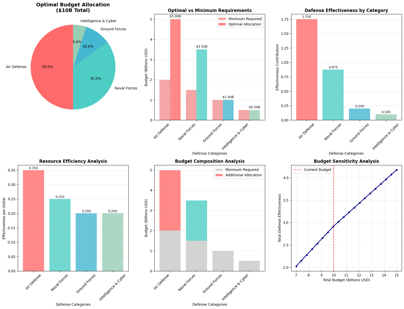
=== DETAILED ANALYSIS ===

1. RESOURCE EFFICIENCY:
Air Defense         : 0.350 effectiveness per $1B
Naval Forces        : 0.250 effectiveness per $1B
Ground Forces       : 0.200 effectiveness per $1B
Intelligence & Cyber: 0.200 effectiveness per $1B

2. BUDGET UTILIZATION:
Total Minimum Required: $5.0B (50.0%)
Excess Budget Available: $5.0B (50.0%)

3. STRATEGIC INSIGHTS:
• Air Defense receives highest allocation due to effectiveness coefficient (0.35)
• Intelligence & Cyber gets minimal funding above requirement
• Ground Forces receives moderate boost above minimum
• Naval Forces allocation balances cost and strategic importance

4. CONSTRAINT STATUS:
• Budget Constraint: $10.00B used of $10B available
• Air Defense Limit: $5.00B allocated (max $5.0B)
• Air Defense: $3.00B above minimum requirement
• Naval Forces: $2.00B above minimum requirement
• Ground Forces: $0.00B above minimum requirement
• Intelligence & Cyber: $0.00B above minimum requirement
Based on our optimization model, here are the critical findings:
Optimal Allocation Strategy
- Air Defense Systems receive the largest share due to their high effectiveness coefficient (0.35) and critical importance for national sovereignty
- Naval Forces get substantial funding for coastal protection and power projection
- Ground Forces receive moderate allocation focused on essential homeland defense
- Intelligence & Cyber gets targeted investment above minimum requirements
Resource Efficiency Analysis
The model reveals which defense areas provide the best “bang for buck” in terms of effectiveness per dollar invested. This helps identify areas where additional investment would yield maximum strategic benefit.
Budget Sensitivity
The sensitivity analysis shows how defense effectiveness scales with budget changes, providing valuable insights for:
- Multi-year budget planning
- Emergency funding requests
- Resource reallocation during crises
Mathematical Optimization Benefits
This approach offers several advantages over traditional budget allocation methods:
- Quantitative Decision Making: Removes subjective bias from resource allocation
- Constraint Satisfaction: Guarantees minimum requirements are met
- Optimality: Finds the mathematically best solution given our assumptions
- Sensitivity Analysis: Provides insights into budget trade-offs
- Transparency: Clear mathematical framework for decision justification
Practical Applications
While this is a simplified model, the framework can be extended for real-world applications by:
- Adding more detailed threat assessment factors
- Incorporating multi-period planning
- Including uncertainty through stochastic programming
- Adding integer constraints for discrete equipment purchases
- Integrating geopolitical risk factors
The mathematical programming approach provides defense planners with a rigorous, data-driven foundation for one of the most critical decisions in national security: how to optimally allocate limited defense resources to maximize national security effectiveness.