Bessel Functions Overview
Bessel functions arise as solutions to Bessel’s differential equation, which frequently appears in problems with cylindrical or spherical symmetry in physics, such as heat conduction, wave propagation, and fluid dynamics.
The standard form of Bessel’s differential equation is:
$$
x^2 \frac{d^2 y}{dx^2} + x \frac{d y}{dx} + (x^2 - \nu^2) y = 0
$$
where $( \nu )$ is the order of the Bessel function.
Bessel functions come in different types, such as the Bessel function of the first kind $( J_\nu(x) )$ and the second kind $( Y_\nu(x) )$.
Example Problem
Consider a scenario where we want to solve the following:
Problem
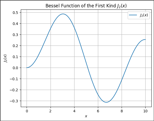
Evaluate the Bessel function of the first kind, $( J_2(x) )$, for $( x )$ values ranging from $0$ to $10$.
Visualize the result.
Approach
We will use scipy.special.jv to compute the Bessel function of the first kind $( J_\nu(x) )$.
Here, the order $( \nu = 2 )$, and we will plot the Bessel function for $( x )$ from $0$ to $10$.
Code Implementation
Let’s solve this example using $SciPy$ and visualize it using $Matplotlib$.
1 | import numpy as np |
Output
Explanation
Imports:
numpyis used to generate the array of $x$-$values$ between $0$ and $10$.matplotlib.pyplotis used for plotting the results.scipy.special.jvis used to compute the Bessel function of the first kind $( J_\nu(x) )$.
Variables:
nu = 2: This sets the order of the Bessel function to $2$.x = np.linspace(0, 10, 400): This generates $400$ points linearly spaced between $0$ and $10$ for the x-axis.
Bessel Function Calculation:
jv(nu, x): This computes the values of $( J_2(x) )$ for all $x$-$values$.
Plotting:
- A $2D$ plot is generated with $( x )$ on the $x$-$axis$ and $( J_2(x) )$ on the $y$-$axis$.
This code outputs a smooth curve of the Bessel function $( J_2(x) )$ over the range $( x \in [0, 10] )$, displaying the oscillatory nature of the function.
The Bessel function exhibits damping behavior as $( x )$ increases.