import random import math from deap import base, creator, tools, algorithms
# Define the number of dimensions (variables) N_DIMENSIONS = 2 BOUND_LOW, BOUND_UP = -5.12, 5.12# Boundaries for variables
# Define the Rastrigin function defrastrigin(individual): n = len(individual) return10 * n + sum([(x**2 - 10 * math.cos(2 * math.pi * x)) for x in individual]),
# DEAP setup creator.create("FitnessMin", base.Fitness, weights=(-1.0,)) # We aim to minimize the function creator.create("Individual", list, fitness=creator.FitnessMin)
We are working with the Rastrigin function in $2$ dimensions (though you can extend this to more dimensions).
The decision variables $( x_1 )$ and $( x_2 )$ are initialized randomly within the range $([-5.12, 5.12])$.
Fitness Function:
The fitness function is the Rastrigin function, which calculates the fitness (objective value) for each individual. We want to minimize this value.
Genetic Operators:
Crossover (mate): We use the blend crossover (cxBlend) to combine two individuals. This mixes the variable values from two parents to create offspring.
Mutation (mutate): We use Gaussian mutation (mutGaussian) to introduce small changes in the individuals by adding noise.
Selection: Tournament selection (selTournament) is used to select the best individuals from the population to continue to the next generation.
Algorithm Execution:
The algorithm runs for $50$ generations, evolving the population by applying crossover, mutation, and selection.
At the end of the process, the algorithm selects the best individual (solution) with the minimum Rastrigin value.
Sample Output:
1
2
Best individual: [-0.9949586383085709, -1.964404107504631e-09]
Best fitness (Rastrigin value): 0.9949590570932934
Interpretation of Results:
The best individual represents the values of $( x_1 )$ and $( x_2 )$ that minimize the Rastrigin function.
The best fitness is the minimum value of the Rastrigin function at that point, which should be close to zero (the global minimum of the Rastrigin function).
Conclusion:
This example demonstrates how to use $DEAP$ to optimize a mathematical function, specifically the Rastrigin function.
The genetic algorithm evolves a population of solutions, eventually finding the optimal values for the decision variables that minimize the function.
Problem Description: In job scheduling, we aim to assign jobs to machines or workers in such a way that the overall completion time (makespan) is minimized.
This is a common problem in manufacturing, project management, and computer systems where tasks need to be allocated efficiently to minimize delays and optimize resources.
Objective:
We have multiple jobs that need to be scheduled on different machines.
Each machine can only handle one job at a time, and jobs have different processing times.
The goal is to minimize the maximum time it takes to complete all jobs (i.e., the makespan).
We will solve this using the $DEAP$ (Distributed Evolutionary Algorithms in $Python$) library, leveraging a $Genetic$ $Algorithm$ ($GA$).
Steps for Solving Using DEAP
Define the Problem:
We have N jobs and M machines.
Each job has a specific processing time.
We want to assign jobs to machines such that the overall makespan is minimized.
Genetic Algorithm Setup:
Individuals: Each individual in the population represents a possible solution, i.e., a specific assignment of jobs to machines.
Fitness Function: The fitness function will evaluate the makespan of the solution. We aim to minimize this value.
Mutation: Swapping jobs between machines.
Crossover: Combining two individuals (solutions) by taking part of one solution and merging it with another.
Selection: Using tournament selection to choose the best solutions from the population.
import random from deap import base, creator, tools, algorithms import numpy as np
# Job scheduling problem parameters N_JOBS = 10# Number of jobs M_MACHINES = 3# Number of machines PROCESSING_TIMES = [random.randint(1, 20) for _ inrange(N_JOBS)] # Random processing times for each job
defcreate_individual(): """Create an individual where jobs are randomly assigned to machines.""" return [random.randint(0, M_MACHINES - 1) for _ inrange(N_JOBS)]
defevaluate(individual): """Evaluate the makespan of the current job allocation to machines.""" machine_times = [0] * M_MACHINES # Track processing time for each machine for i, machine inenumerate(individual): machine_times[machine] += PROCESSING_TIMES[i] returnmax(machine_times), # Minimize the maximum machine time (makespan)
We defined N_JOBS as $10$ jobs and M_MACHINES as $3$ machines. Each job has a randomly assigned processing time.
The create_individual function generates a random assignment of jobs to machines.
Fitness Function:
The fitness function (evaluate) calculates the makespan, which is the maximum time it takes any machine to complete its assigned jobs. We aim to minimize this makespan.
Evolutionary Process:
We use genetic operators such as crossover and mutation to evolve better solutions over generations.
Crossover: This combines parts of two individuals (job assignments).
Mutation: Randomly alters a small part of the individual (a job is moved to a different machine).
Selection: The algorithm uses tournament selection to choose the best individuals to evolve in the next generation.
Result:
After running for $50$ generations, the algorithm returns the best job assignment and the minimum makespan.
Sample Output:
1
2
Best job allocation: [2, 1, 0, 0, 2, 0, 1, 2, 1, 0]
Best makespan: 32
Interpretation of Results:
The best solution indicates which jobs should be assigned to which machines, represented by a list (e.g., [2, 1, 0, 0, 2, ...]).
The makespan is the total time taken by the machine that finishes last, which in this example is $32$ units of time.
This approach demonstrates how we can use $DEAP$ to optimize a complex scheduling problem by evolving solutions to find the best possible job assignments.
Evolutionary Development of a Robot Control Algorithm Using DEAP
In this example, we will develop an evolutionary algorithm to optimize the control logic for a simple robot navigating a $2D$ grid while avoiding obstacles.
The robot’s goal is to move from a start point to a goal point with the fewest steps while avoiding collisions with obstacles.
Problem Definition
The robot operates in a $2D$ grid environment, with the following characteristics:
Grid: A $10 \times 10$ matrix with obstacles randomly placed.
Start Position: The robot starts at a fixed position $(0, 0)$.
Goal Position: The goal is fixed at $(9, 9)$.
Actions: The robot has four possible movements:
Move Up
Move Down
Move Left
Move Right
The goal is to evolve a control algorithm that allows the robot to reach the goal while avoiding obstacles and minimizing the number of moves.
Evolutionary Algorithm Structure
We will use a Genetic Algorithm (GA) for this task:
Individuals: Each individual represents a sequence of actions (a potential control algorithm). These actions are chosen randomly from the four possible movements.
Fitness: The fitness function will measure:
The distance from the robot’s final position to the goal (minimized).
A penalty for hitting obstacles (higher penalties for more collisions).
A penalty for taking too many steps.
Selection: Tournament selection will be used.
Crossover: A one-point crossover will be applied between pairs of individuals.
Mutation: Randomly change some movements within the individual’s sequence.
DEAP Implementation
Below is a $Python$ implementation using the $DEAP$ library to evolve the robot’s control algorithm:
# Run the genetic algorithm defmain(): population = toolbox.population(n=100) ngen = 40 cxpb = 0.5# Crossover probability mutpb = 0.2# Mutation probability # Use algorithms.eaSimple to run the evolutionary algorithm result_pop, logbook = algorithms.eaSimple(population, toolbox, cxpb, mutpb, ngen, verbose=True) # Return the best solution found best_individual = tools.selBest(result_pop, 1)[0] return best_individual
if __name__ == "__main__": best_solution = main() print("Best control sequence:", best_solution) print("Fitness of the best solution:", evaluate(best_solution))
Explanation:
Grid Setup: A $10 \times 10$ grid is created with several obstacles randomly placed in it. The robot starts at $(0, 0)$ and needs to reach the goal at $(9, 9)$.
Actions: The robot can move up, down, left, or right. These movements are represented as vectors.
Individuals: Each individual represents a sequence of $50$ actions. Each action is a random move chosen from the $4$ possible movements.
Fitness Function: The fitness is calculated based on:
The Euclidean distance from the robot’s final position to the goal.
The number of obstacles the robot collides with (higher penalty for more collisions).
The total number of steps taken (fewer steps are preferable).
Genetic Operations:
Crossover: One-point crossover is used to combine parts of two parent individuals.
Mutation: A uniform mutation randomly changes some of the robot’s actions.
Execution: The evolutionary algorithm runs for $40$ generations, evolving the population of control sequences and optimizing the robot’s navigation strategy.
Example Output:
After running the genetic algorithm, the output might look like this:
The best control sequence represents a sequence of actions the robot should follow to minimize distance, avoid obstacles, and reduce the number of steps.
The fitness score indicates how well this sequence performs, with a lower score representing a better solution.
Summary:
This example demonstrates how to evolve a robot control algorithm using $DEAP$ to navigate a grid environment.
The genetic algorithm optimizes the robot’s movement to achieve the goal while minimizing collisions and steps.
The combination of evolutionary principles (selection, crossover, mutation) helps the robot learn an efficient navigation strategy.
Trade-off between Efficiency and Cost in Engineering Design using DEAP
In engineering design, balancing efficiency and cost is a common challenge.
Improving efficiency often leads to increased costs, and minimizing costs may reduce efficiency.
This is a typical multi-objective optimization problem where we aim to optimize both objectives simultaneously.
In this example, we’ll use the $DEAP$ library to solve a simplified engineering design problem where efficiency and cost conflict.
Problem Definition
Consider the design of a mechanical component, such as a turbine blade, where the goals are:
Efficiency: Maximizing the energy output (performance of the blade).
Cost: Minimizing the production cost of the blade.
These two objectives conflict because increasing efficiency may require using more expensive materials, more precise manufacturing, or complex design techniques, which increase costs.
Genetic Algorithm Approach
A multi-objective genetic algorithm (MOGA) can effectively handle this trade-off. MOGA aims to find a set of solutions called the Pareto front, where no single solution is clearly better than others in all objectives. Instead, it provides a set of “compromise” solutions that balance efficiency and cost.
Objective Functions
Efficiency (maximize): This could depend on factors such as material properties, shape, and operational parameters.
Cost (minimize): This could include material costs, manufacturing complexity, and maintenance expenses.
DEAP Implementation
We will represent the design as a vector of variables that affect both efficiency and cost, such as material thickness, blade curvature, and surface area. The fitness function will evaluate both objectives simultaneously.
import random import numpy as np from deap import base, creator, tools, algorithms
# Define the number of design variables NUM_DESIGN_VARIABLES = 3# For example, thickness, curvature, surface area
# Create individual as a list of design variables (continuous values) defgenerate_individual(): return [random.uniform(0.5, 5.0), # Thickness random.uniform(0, 90), # Curvature (in degrees) random.uniform(1.0, 10.0)] # Surface area
# Fitness function to optimize efficiency (maximize) and cost (minimize) defevaluate(individual): eff = efficiency(individual) cst = cost(individual) return eff, cst # Efficiency is to be maximized, cost minimized
# Set up DEAP framework for multi-objective optimization creator.create("FitnessMulti", base.Fitness, weights=(1.0, -1.0)) # Maximize efficiency, minimize cost creator.create("Individual", list, fitness=creator.FitnessMulti)
defmain(): # Create an initial population population = toolbox.population(n=POPULATION_SIZE) # Use Pareto front to store best individuals pareto_front = tools.ParetoFront() # Stats for tracking progress stats = tools.Statistics(lambda ind: ind.fitness.values) stats.register("avg", np.mean) stats.register("std", np.std) stats.register("min", np.min) stats.register("max", np.max) # Run the genetic algorithm algorithms.eaMuPlusLambda(population, toolbox, mu=POPULATION_SIZE, lambda_=POPULATION_SIZE, cxpb=CXPB, mutpb=MUTPB, ngen=NGEN, stats=stats, halloffame=pareto_front, verbose=True) # Output the Pareto front print("Pareto front:") for ind in pareto_front: print("Efficiency: {:.2f}, Cost: {:.2f}".format(ind.fitness.values[0], ind.fitness.values[1])) print("Design Variables: {}".format(ind))
if __name__ == "__main__": main()
Explanation of the Code
Design Variables: We model the component using three design variables:
Thickness: Influences both efficiency and cost.
Curvature: Affects the aerodynamics and energy efficiency.
Surface Area: Larger areas can improve performance but also increase production costs.
Efficiency Function: This function models the performance of the design based on the three variables. The function uses a simplified physical model where efficiency is a product of thickness, curvature (cosine factor), and surface area.
Cost Function: The cost increases with larger thickness, curvature, and surface area. This reflects the real-world trade-off where improving efficiency generally incurs higher production costs.
Fitness Function: The fitness function returns two objectives:
Maximize efficiency: We aim to maximize this value.
Minimize cost: This is the second objective, which we aim to minimize.
These objectives are optimized simultaneously using NSGA-II (Non-dominated Sorting Genetic Algorithm II), a well-known multi-objective algorithm.
Genetic Operators:
Crossover: A blend crossover operator (cxBlend) is used, which mixes the design variables between two parents to produce offspring.
Mutation: Gaussian mutation is applied to introduce randomness into the design variables, helping the algorithm explore new solutions.
Pareto Front: The algorithm tracks the Pareto front, a set of solutions where no individual is strictly better than another. These solutions represent different trade-offs between efficiency and cost.
Running the Code
When you run the code, the genetic algorithm will evolve a population of design solutions over $50$ generations. At the end of the process, it outputs the Pareto front – a set of designs that offer different trade-offs between efficiency and cost.
The results displayed represent the output of a genetic algorithm (GA) run for $50$ generations.
Here is a breakdown of what each column represents:
gen: The current generation number of the GA.
nevals: The number of evaluations performed in each generation (the number of individuals evaluated).
avg: The average fitness value of the population in that generation.
std: The standard deviation of the fitness values, indicating the variation in fitness among individuals.
min: The minimum fitness value in the population for that generation (the worst-performing individual).
max: The maximum fitness value in the population for that generation (the best-performing individual).
Key Insights:
Generation 0 starts with a population that has a wide range of fitness values, from very low (min = 0.0220808) to very high (max = 6106.97).
Over the first $20$ generations, both the average fitness and the best fitness (max) values decrease. This indicates that the algorithm is exploring lower-performing areas of the search space, which might be necessary to escape local optima.
Starting from around generation $25$, there is a noticeable increase in the max fitness, reaching higher values as the algorithm converges toward more optimal solutions.
By the final generation $(50)$, the fitness values exhibit a wide range with very negative average fitness (avg = -70360.9), indicating the exploration of regions with both very poor and very high efficiency-cost trade-offs. The best-performing individual has an efficiency of 298116.94 and a cost of -380538.01.
Pareto Front Result:
The algorithm has identified a Pareto optimal solution where the efficiency is $298116.94$, and the cost is highly negative $(-380538.01)$, reflecting an extreme trade-off.
The design variables that resulted in this efficiency-cost combination are [ -162.48, -40.56, -2415.08]. These variables likely represent an unconventional or extreme design in the context of the problem.
In summary, the GA has found a variety of trade-offs between efficiency and cost, with some solutions providing high efficiency at high costs, and others showing extreme variations.
The Pareto front solution reflects one of the best trade-offs found during the optimization process.
Conclusion
This example demonstrates how $DEAP$ and multi-objective genetic algorithms can be applied to solve trade-offs between efficiency and cost in engineering design.
The Pareto front provides a set of optimal solutions that reflect different compromises between the two objectives, allowing decision-makers to select the design that best fits their specific requirements.
Drone Path Optimization with DEAP (Genetic Algorithm Example)
Drone path optimization is an essential problem in various applications, including delivery systems, surveillance, and agricultural monitoring.
One common problem is to find the shortest or most efficient path for a drone to travel between several waypoints (points of interest), which is a variation of the well-known Traveling Salesman Problem (TSP).
This example demonstrates how to solve a simplified version of the drone path optimization problem using the DEAP (Distributed Evolutionary Algorithms in $Python$) library with a genetic algorithm.
Problem Definition
We will solve the problem of a drone needing to visit a set of predefined waypoints and return to the starting point.
The goal is to minimize the total travel distance while visiting each waypoint exactly once.
This is equivalent to solving the TSP but applied in a drone context, where each waypoint is a geographical coordinate (x, y).
Genetic Algorithm Approach
A genetic algorithm ($GA$) is suitable for this type of optimization because of its ability to explore large search spaces.
In GA, we represent the possible solutions (paths) as individuals in a population.
The individuals evolve over generations based on their fitness, which in this case is the total travel distance of the path.
Steps
Representation: Each individual in the population is a list of integers representing the order in which the drone visits the waypoints.
Fitness Function: The fitness function calculates the total distance traveled by the drone. The shorter the total distance, the better the solution.
Selection: Use tournament selection to choose the best individuals from the population.
Crossover: Implement ordered crossover to combine two parent solutions and produce offspring.
Mutation: Use a swap mutation to randomly change the order of the waypoints in an individual.
Evolution: Repeat the selection, crossover, and mutation processes for multiple generations to evolve better solutions.
import random import numpy as np from deap import base, creator, tools, algorithms
# Generate random coordinates for waypoints NUM_WAYPOINTS = 10 waypoints = np.random.rand(NUM_WAYPOINTS, 2) * 100# Waypoints in 2D space (x, y)
# Calculate the distance between two points defdistance(p1, p2): return np.sqrt(np.sum((p1 - p2) ** 2))
# Fitness function: Total distance for the drone to visit all waypoints and return to start defevaluate(individual): total_distance = 0 for i inrange(len(individual) - 1): total_distance += distance(waypoints[individual[i]], waypoints[individual[i + 1]]) # Return to starting point total_distance += distance(waypoints[individual[-1]], waypoints[individual[0]]) return (total_distance,)
# Set up the DEAP framework creator.create("FitnessMin", base.Fitness, weights=(-1.0,)) # Minimize total distance creator.create("Individual", list, fitness=creator.FitnessMin)
# Main function defmain(): # Create an initial population population = toolbox.population(n=POPULATION_SIZE) # Run the genetic algorithm halloffame = tools.HallOfFame(1) stats = tools.Statistics(lambda ind: ind.fitness.values) stats.register("min", np.min) stats.register("avg", np.mean) algorithms.eaSimple(population, toolbox, cxpb=CXPB, mutpb=MUTPB, ngen=NGEN, stats=stats, halloffame=halloffame, verbose=True) # Best solution best_individual = halloffame[0] print("Best individual (path):", best_individual) print("Best fitness (total distance):", evaluate(best_individual)[0])
if __name__ == "__main__": main()
Explanation of the Code
Waypoints: We generate random waypoints in a $2D$ space using np.random.rand(). These represent the locations the drone needs to visit.
Distance Calculation: The function distance() computes the Euclidean distance between two waypoints.
Fitness Function: The evaluate() function computes the total travel distance for a given order of waypoints (represented by an individual). The individual starts at the first waypoint, visits all other waypoints, and returns to the starting point.
Genetic Algorithm Setup:
Individuals: Each individual represents a possible order in which the drone visits the waypoints.
Selection: Tournament selection is used to choose individuals for crossover.
Crossover: Ordered crossover (cxOrdered) is used to combine two parents while maintaining valid waypoint orders.
Mutation: The mutation function randomly swaps two waypoints in the path to introduce variation.
Evolution: The population evolves over $100$ generations, with crossover occurring $70$% of the time and mutation $20$% of the time.
Best Solution: After the evolution, the best individual (path) is displayed, along with its total travel distance (fitness).
Running the Code
When you run the code, the genetic algorithm evolves the population over generations, and you will see output showing the best and average fitness values for each generation. After the evolution completes, the best path and its corresponding total distance will be printed.
The genetic algorithm ($GA$) has successfully found an optimized solution for the drone path optimization problem. Let’s break down the results in detail:
Generational Summary
Generations (gen): The algorithm ran for a total of $100$ generations. Each generation represents one iteration of the genetic algorithm, where the population of potential solutions evolves through selection, crossover, and mutation.
Evaluations (nevals): This column represents how many individuals were evaluated in each generation. The typical number is around $220$-$250$ evaluations per generation.
Minimum Fitness (min): The “min” column represents the fitness of the best individual in each generation. Fitness in this context is the total travel distance for the drone’s path (lower is better since we are minimizing distance). The best fitness starts at $370.117$ in generation $0$ and improves steadily, eventually reaching the optimal value of $279.178$ around generation $11$.
Average Fitness (avg): The “avg” column shows the average fitness of all individuals in the population for that generation. This provides an indication of the overall quality of the population. Initially, the average fitness starts around $613.888$, and as the generations progress, it improves significantly to about $318.160$ by the end.
Key Observations
Initial Population: In the first generation, the best individual has a total distance of $370.117$, and the average distance of the population is much higher at $613.888$. This suggests that the initial population was quite far from the optimal solution, which is typical in $GA$.
Rapid Improvement: By generation $9$, the best individual already achieves a total distance of $280.492$. From generation $11$ onwards, the best solution achieves a total distance of 279.178, which remains the minimum for the rest of the evolution process. This shows that the algorithm found an optimal or near-optimal solution early in the process.
Stabilization: After generation $11$, the best individual does not improve further, and the population’s average fitness continues to improve but stabilizes. This means that while many individuals in the population are becoming closer to the optimal solution, the algorithm is no longer finding a significantly better path.
Best Path: The final result gives the best path found by the algorithm:
1
[5, 9, 0, 2, 6, 1, 7, 4, 8, 3]
This is the sequence of waypoints the drone should visit to minimize its travel distance. The total distance traveled for this path is 279.178 units.
Conclusion
The genetic algorithm performed well in solving the drone path optimization problem. After $100$ generations, it found an optimal path with a total travel distance of 279.178.
The algorithm quickly converged to this solution within the first $10$-$20$ generations, indicating efficient exploration of the solution space.
The result demonstrates how $GA$s can be an effective method for solving complex optimization problems like the Traveling Salesman Problem ($TSP$) applied to drone navigation.
If needed, this process can be extended to include additional constraints such as energy usage, obstacles, or even dynamic weather conditions, which would further challenge the optimization.
Extensions
Wind and Battery Constraints: In more realistic drone optimization problems, you might need to incorporate constraints like wind speed, battery life, and no-fly zones. These can be added as part of the fitness function or as additional constraints in the GA.
3D Coordinates: If the drone operates in $3D$ space, the waypoints can be extended to include altitude $(x, y, z)$, and the distance function would need to account for this.
This example showcases how genetic algorithms, through $DEAP$, can be effectively applied to optimize complex path-planning problems such as drone navigation.
Optimizing Resource Allocation for Maximum Profit Using a Genetic Algorithm
Resource allocation is an optimization problem where limited resources must be distributed efficiently across competing activities or tasks.
Let’s consider an example, and we will solve it using DEAP (Distributed Evolutionary Algorithms in Python).
Problem Example:
You are running a factory that produces two products, $A$ and $B$. You want to determine how to allocate your limited resources—labor hours and raw materials—such that you maximize profit.
Here are the constraints:
Labor hours: You have $100$ hours of labor available.
Raw materials: You have $80$ units of raw material available.
Profit: Product $A$ gives a profit of $$30$ per unit, and product $B$ gives a profit of $$20$ per unit.
Production requirements:
Each unit of Product A requires $4$ hours of labor and $2$ units of raw material.
Each unit of Product B requires $2$ hours of labor and $4$ units of raw material.
Objective:
Maximize profit while staying within the resource constraints.
Problem Formulation:
Let $( x_A )$ represent the number of units of Product $A$ and $( x_B )$ represent the number of units of Product $B$ produced.
We aim to maximize the total profit:
$$ \text{Profit} = 30x_A + 20x_B $$
Subject to:
Labor constraint: $( 4x_A + 2x_B \leq 100 )$
Raw material constraint: $( 2x_A + 4x_B \leq 80 )$
Non-negativity: $( x_A, x_B \geq 0 )$
Solving with DEAP:
$DEAP$ uses evolutionary algorithms to solve optimization problems. Here, we will use a genetic algorithm (GA) approach.
Step-by-Step Solution:
Define the problem:
Maximize profit.
Satisfy labor and raw material constraints.
Define the genetic representation:
Each individual (chromosome) will represent a solution as two integers: $( x_A )$ (units of Product A) and $( x_B )$ (units of Product B).
Fitness function: The fitness function calculates the profit but applies penalties if constraints are violated.
Genetic operations:
Selection: Choose parents based on their fitness (higher fitness means higher profit).
Crossover: Combine two parents to create offspring.
Mutation: Randomly change some values to maintain diversity.
import random from deap import base, creator, tools, algorithms
# Define the problem as a maximization (fitness is profit) creator.create("FitnessMax", base.Fitness, weights=(1.0,)) creator.create("Individual", list, fitness=creator.FitnessMax)
# Define the population size IND_SIZE = 2
toolbox = base.Toolbox() toolbox.register("attr_int", random.randint, 0, 25) # Boundaries for products A and B toolbox.register("individual", tools.initRepeat, creator.Individual, toolbox.attr_int, n=IND_SIZE) toolbox.register("population", tools.initRepeat, list, toolbox.individual)
# Define the fitness function defevalProfit(individual): x_A = individual[0] x_B = individual[1] # Calculate profit profit = 30 * x_A + 20 * x_B # Apply constraints (penalty if violated) labor_used = 4 * x_A + 2 * x_B material_used = 2 * x_A + 4 * x_B if labor_used > 100or material_used > 80: return -1000, # Return a large negative value if constraints are violated return profit, # Return profit if constraints are satisfied
defmain(): random.seed(42) # Create the population population = toolbox.population(n=100) # Define the algorithms and parameters NGEN = 40 CXPB = 0.7# Crossover probability MUTPB = 0.2# Mutation probability # Run the algorithm for gen inrange(NGEN): offspring = algorithms.varAnd(population, toolbox, cxpb=CXPB, mutpb=MUTPB) # Evaluate the fitness of the offspring fits = toolbox.map(toolbox.evaluate, offspring) for fit, ind inzip(fits, offspring): ind.fitness.values = fit # Select the next generation population = toolbox.select(offspring, k=len(population)) # Get the best solution best_individual = tools.selBest(population, 1)[0] print("Best individual:", best_individual) print("Best fitness (profit):", best_individual.fitness.values[0])
if __name__ == "__main__": main()
Explanation:
Genetic Representation: The individuals in the population represent a possible solution, where the two variables (number of units of Product $A$ and Product $B$) are integers between $0$ and $25$.
Fitness Function: The evalProfit function computes the profit from producing $( x_A )$ and $( x_B )$. If the resource constraints (labor or material) are violated, a large negative penalty is returned to discourage those solutions.
Genetic Operators:
Crossover: The cxBlend function combines two parents, blending their solutions to create a child.
Mutation: The mutGaussian function randomly adjusts the values of the individual’s genes, providing diversity.
Algorithm: We use the varAnd function to create offspring by performing crossover and mutation. After that, the best individuals are selected to move to the next generation.
Selection: The algorithm uses tournament selection, where a group of individuals competes, and the best one is selected.
Expected Outcome:
The algorithm will evolve a population of solutions, aiming to maximize profit while satisfying the resource constraints.
After $40$ generations, it will print the best solution and its profit.
Output
Best individual: [20.009397203717523, 9.980617162752154]
Best fitness (profit): 799.8942593665688
The output shows the best solution found by the genetic algorithm for the resource allocation problem.
Interpretation:
Best individual: [20.009397203717523, 9.980617162752154]
This means the algorithm suggests producing approximately 20 units of Product A and about 10 units of Product B to maximize profit.
Although these values are not strictly integers (due to mutation and crossover processes), in practical terms, you would round them to whole numbers, meaning 20 units of Product A and 10 units of Product B.
Best fitness (profit): 799.8942593665688
This represents the maximum profit calculated by the fitness function based on the production of $20$ units of Product $A$ and $10$ units of Product $B$.
The profit is approximately $799.89, which is close to the theoretical maximum achievable under the resource constraints.
Why are the values non-integer?
In this genetic algorithm, mutation and crossover operations sometimes produce non-integer values for the number of products (due to floating-point arithmetic).
However, in real-world production, you would round these values to integers.
$DEAP$ (Distributed Evolutionary Algorithms in $Python$) is a flexible library for implementing evolutionary algorithms. It’s widely used for optimization problems, where traditional methods struggle with non-linearity, high dimensionality, or noisy functions.
In this example, we’ll solve a numerical optimization problem using a genetic algorithm ($GA$) implemented with $DEAP$. Specifically, we’ll minimize the Rastrigin function, a common benchmark in optimization problems that is highly multimodal and presents many local minima, making it challenging for classical optimization techniques.
import random import numpy as np from deap import base, creator, tools, algorithms
# Define the fitness function (Rastrigin function) defrastrigin(individual): n = len(individual) return10 * n + sum([(x**2 - 10 * np.cos(2 * np.pi * x)) for x in individual]),
# Genetic Algorithm parameters toolbox.register("map", map) # For parallelization (optional)
# Evolutionary Algorithm parameters population_size = 300 prob_crossover = 0.7# Crossover probability prob_mutation = 0.2# Mutation probability generations = 50# Number of generations
# Create the population population = toolbox.population(n=population_size)
# Run the Genetic Algorithm result_pop, log = algorithms.eaSimple(population, toolbox, cxpb=prob_crossover, mutpb=prob_mutation, ngen=generations, verbose=False)
# Get the best individual best_individual = tools.selBest(result_pop, k=1)[0] print("Best individual is:", best_individual) print("Best fitness is:", best_individual.fitness.values[0])
Explanation
Fitness Function (Rastrigin):
The rastrigin function evaluates the fitness of an individual, which is a vector of decision variables. The smaller the value of this function, the better the individual (since we are minimizing).
The function returns a tuple because $DEAP$ expects the fitness to be returned in this format.
Individual and Population:
We define an “Individual” as a list of floats (decision variables). Each individual has a fitness attribute associated with it.
A “population” is a list of individuals.
Genetic Operators:
cxBlend: A blending crossover is used where genes from two parents are combined.
mutGaussian: This applies $Gaussian$ mutation, where a random value sampled from a normal distribution is added to the gene.
selTournament: Tournament selection selects individuals based on their fitness for crossover and mutation.
Genetic Algorithm Parameters:
Population size: $300$ individuals in the population.
Crossover probability (cxpb): $0.7$, meaning $70$% of the population undergoes crossover.
Mutation probability (mutpb): $0.2$, meaning $20$% of the population undergoes mutation.
Generations: The algorithm runs for $50$ generations.
Algorithm Execution:
algorithms.eaSimple runs the evolutionary algorithm using simple evolutionary strategies. It returns the final population and the log of evolution.
tools.selBest selects the best individual from the population.
Result:
The best individual found by the GA and its fitness value are printed. The fitness value should be close to $0$ for the Rastrigin function‘s global minimum.
Output
The genetic algorithm will print the best individual and its corresponding fitness:
1
2
Best individual is: [-1.0333568778912494e-09, 1.0226956450775647e-09] Best fitness is: 0.0
In this case, the algorithm finds an individual close to the global minimum $( [0, 0] )$, with a fitness value near zero, indicating that the solution is very close to the true minimum of the Rastrigin function.
Applications
$Genetic$ $algorithms$, as implemented in $DEAP$, are widely used in optimization problems such as:
Engineering design: Optimizing structures or systems with complex constraints.
Machine learning: Feature selection, hyperparameter tuning, and architecture search.
Operations research: Scheduling, resource allocation, and routing problems.
$Genetic$ $algorithms$ are particularly useful in cases where the objective function is non-convex, noisy, or discontinuous, making traditional gradient-based methods less effective.
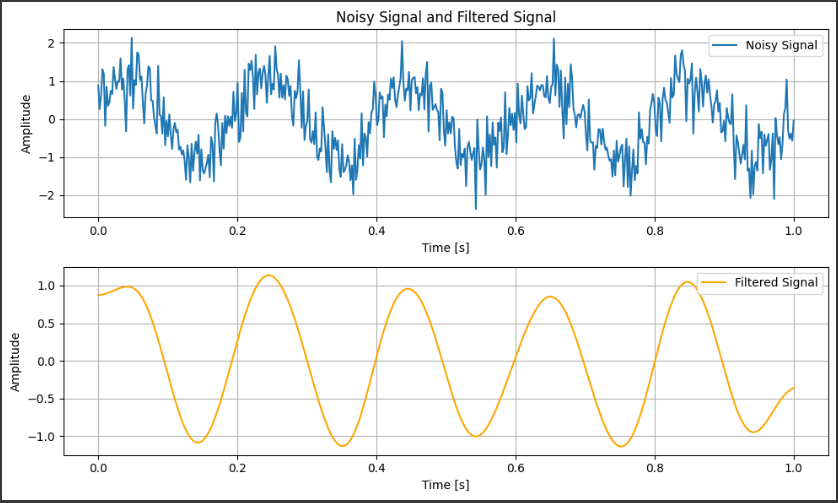
import numpy as np import matplotlib.pyplot as plt from scipy.signal import butter, filtfilt
# Generate a noisy signal: sine wave + random noise np.random.seed(0) fs = 500# Sampling frequency (Hz) t = np.linspace(0, 1.0, fs) # Time vector (1 second duration) freq = 5# Frequency of the sine wave (Hz) signal = np.sin(2 * np.pi * freq * t) # Clean sine wave noise = 0.5 * np.random.randn(len(t)) # Additive white Gaussian noise noisy_signal = signal + noise # Noisy signal
# Design a low-pass Butterworth filter cutoff_freq = 10# Cutoff frequency (Hz) order = 4# Filter order nyquist = 0.5 * fs # Nyquist frequency normal_cutoff = cutoff_freq / nyquist # Normalized cutoff frequency b, a = butter(order, normal_cutoff, btype='low', analog=False)
# Apply the filter to the noisy signal filtered_signal = filtfilt(b, a, noisy_signal)
# Plot the original noisy signal and the filtered signal plt.figure(figsize=(10, 6))
# Noisy signal plot plt.subplot(2, 1, 1) plt.plot(t, noisy_signal, label="Noisy Signal") plt.title("Noisy Signal and Filtered Signal") plt.xlabel("Time [s]") plt.ylabel("Amplitude") plt.legend() plt.grid(True)
We create a sine wave with a frequency of $5$ $Hz$ and add random $Gaussian$ noise to it to simulate a noisy signal. The sampling frequency is set to $500$ $Hz$, and the time vector covers $1$ second.
Butterworth Low-Pass Filter:
The butter function is used to design a low-pass Butterworth filter. This filter has a cutoff frequency of $10$ $Hz$, meaning that it allows frequencies below $10$ $Hz$ to pass and attenuates higher frequencies.
The filter order is set to $4$, meaning it has a relatively sharp cutoff.
Filtering:
The filtfilt function applies the filter to the noisy signal. This function applies the filter twice (forward and backward) to eliminate any phase shift introduced by the filtering process, ensuring the signal remains aligned with the original.
Visualization:
Two plots are generated: the first shows the original noisy signal, and the second shows the filtered signal, where much of the high-frequency noise has been removed.
Output
Noisy Signal: The first plot displays a noisy sine wave with high-frequency random fluctuations (noise) added to the underlying clean sine wave.
Filtered Signal: The second plot shows the result of applying the low-pass filter. The high-frequency noise is significantly reduced, leaving the smooth sine wave intact.
Applications
Audio Processing: Removing noise from audio recordings.
Communications: Filtering out unwanted frequency components from signals in wireless communication systems.
Control Systems: Smoothing sensor data to improve system stability.
Low-pass filters are widely used to enhance signal quality in numerous real-world applications, and the Butterworth filter provides a good balance between performance and simplicity.
$SciPy$ provides powerful optimization routines in the scipy.optimize module to solve various optimization problems.
These include finding the minimum of a function, solving equations, and linear programming.
One commonly used method is constrained optimization, where the goal is to minimize or maximize a function subject to constraints.
Example Problem: Constrained Optimization (Minimizing a Nonlinear Function)
Let’s consider an example of a constrained optimization problem, where we minimize a nonlinear function subject to some constraints.
Problem
Minimize the following objective function:
$$ f(x, y) = x^2 + y^2 $$
subject to the constraints:
$( x + y = 1 )$ (Equality constraint)
$( x \geq 0 )$ and $( y \geq 0 )$ (Inequality constraints)
This is a simple quadratic function, and the constraints limit the feasible region to part of the first quadrant where the variables are non-negative and sum to $1$.
Approach
We will use $SciPy$’s minimize function from the optimize module, specifying the constraints and bounds.
import numpy as np from scipy.optimize import minimize
# Objective function to minimize defobjective(x): return x[0]**2 + x[1]**2# f(x, y) = x^2 + y^2
# Equality constraint: x + y = 1 defconstraint_eq(x): return x[0] + x[1] - 1
# Initial guess for x and y x0 = [0.5, 0.5]
# Define the constraints in the format required by minimize() constraints = {'type': 'eq', 'fun': constraint_eq}
# Define bounds for each variable: 0 <= x <= inf, 0 <= y <= inf bounds = [(0, None), (0, None)]
# Perform the minimization result = minimize(objective, x0, method='SLSQP', bounds=bounds, constraints=constraints)
# Print the result print("Optimal solution:", result.x) print("Objective function value at the optimal solution:", result.fun)
Explanation
Objective Function:
The function we want to minimize is $( f(x, y) = x^2 + y^2 )$, which is a quadratic function. This is represented in Python as objective(x), where x[0] is $( x )$ and x[1] is $( y )$.
Constraints:
The equality constraint is $( x + y = 1 )$, which is enforced by constraint_eq(x). This function must return $0$ for the constraint to be satisfied (i.e., $( x + y - 1 = 0 )$).
Bounds:
The variables $( x )$ and $( y )$ must be non-negative, represented by the bounds [(0, None), (0, None)].
Initial Guess:
The solver needs an initial guess for the variables. We use $( x_0 = [0.5, 0.5] )$, which is a reasonable starting point for the algorithm.
Optimization Method:
We use the Sequential Least Squares Programming (SLSQP) algorithm, which is appropriate for constrained optimization problems.
Result:
The result includes the optimal values for $( x )$ and $( y )$ that minimize the objective function while satisfying the constraints.
Output
1
2
Optimal solution: [0.5 0.5]
Objective function value at the optimal solution: 0.5
Optimal solution: The solver will provide the optimal values for $( x )$ and $( y )$, which should satisfy both the constraint $( x + y = 1 )$ and the non-negativity conditions $( x \geq 0 )$ and $( y \geq 0 )$.
Objective function value: The value of $( f(x, y) = x^2 + y^2 )$ at the optimal solution.
For this specific problem, the optimal solution is expected to be $( x = 0.5 )$ and $( y = 0.5 )$, with an objective function value of:
$$ f(0.5, 0.5) = 0.5^2 + 0.5^2 = 0.5 $$
Applications
This type of constrained optimization is widely used in areas such as:
Resource allocation: Optimizing the allocation of limited resources (e.g., time, money, materials).
Engineering design: Minimizing energy consumption, costs, or weight while ensuring the design meets all performance constraints.
Economics: Finding optimal production quantities subject to cost or budget constraints.
$SciPy$ provides robust tools for processing multidimensional image data through its scipy.ndimage module, which supports a wide range of image processing tasks such as filtering, morphology, interpolation, and transformations.
These tools are useful in various applications like medical imaging, computer vision, and machine learning.
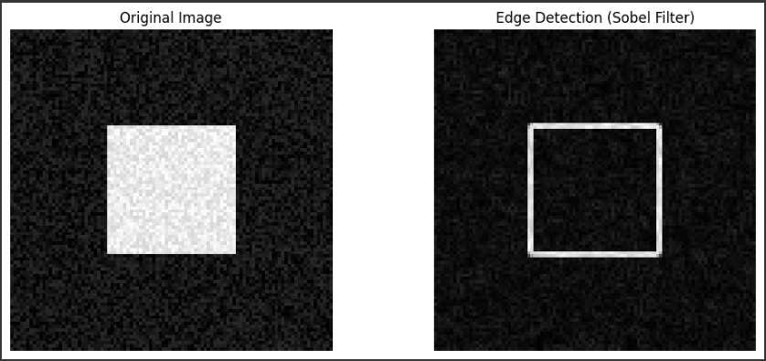
Example Problem: Edge Detection Using Sobel Filter
Let’s consider an example of edge detection in a $2D$ image using the Sobel filter, which computes the gradient magnitude of the image, highlighting regions where pixel intensity changes sharply (edges).
Problem
Given a grayscale image, apply a Sobel filter in both horizontal $(x)$ and vertical $(y)$ directions, then compute the gradient magnitude to detect the edges.
Approach
We will use $SciPy$’s sobel filter from the ndimage module to compute the gradients in both directions.
Then, we will combine these gradients to get the magnitude of the gradient (i.e., the edge strength).
Steps
Load the Image: We’ll load a sample image (a $2D$ array).
Apply the Sobel Filter: Apply the Sobel filter in both $x$ and $y$ directions.
Compute the Gradient Magnitude: Combine the results from both directions.
Visualize the Output: Plot the original image and the edge-detected image.
import numpy as np import matplotlib.pyplot as plt from scipy import ndimage from scipy.ndimage import sobel
# Example: Generating a synthetic image with a square and some noise # A real-world image could also be used instead of this synthetic one image = np.zeros((100, 100)) image[30:70, 30:70] = 1# Create a square in the center
# Add some random noise np.random.seed(0) image += 0.2 * np.random.random(image.shape)
We generate a simple $2D$ image of size $100 \times 100$ pixels with a white square (with intensity value $1$) in the center. Noise is added to simulate real-world conditions.
You can replace this synthetic image with a real grayscale image for practical applications.
Sobel Filter:
sobel(image, axis=0): This applies the Sobel filter in the horizontal direction (detecting vertical edges).
sobel(image, axis=1): This applies the Sobel filter in the vertical direction (detecting horizontal edges).
Gradient Magnitude:
np.hypot(sobel_x, sobel_y): This function computes the Euclidean norm of the gradient vectors at each point. It combines the horizontal and vertical gradients to get the overall gradient magnitude, which gives us the strength of edges in the image.
Visualization:
Two images are displayed: the original noisy image and the edge-detected image using the Sobel filter.
Output
The original image displays a square in the center with added noise.
The second image highlights the edges of the square using the Sobel filter. The edges are more prominent where there is a sharp intensity change between pixels.
Applications
Edge detection is a crucial step in image processing pipelines, commonly used in tasks like object detection, image segmentation, and feature extraction.
Multidimensional processing in $SciPy$ can be extended to $3D$ or higher dimensions, often used in fields like medical imaging (CT or MRI scans) or analyzing volumetric data in scientific research.