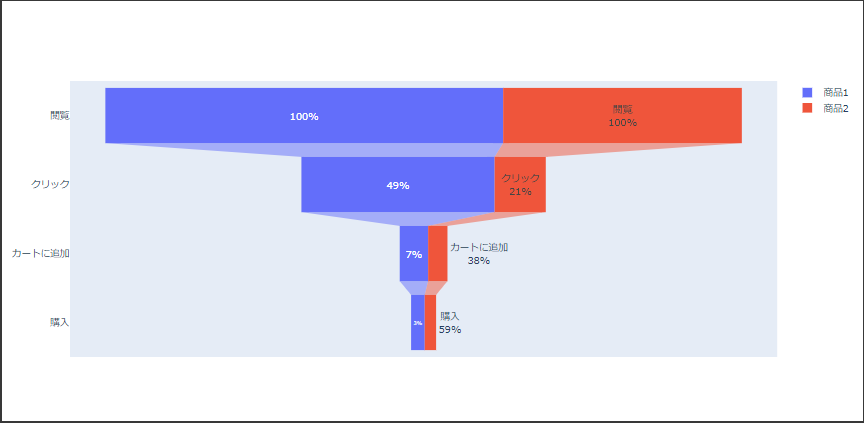
ファンネル図は値が絞り込まれる様子を漏斗(ろうと)の形で表現します。
値は長方形の長さで表現され、次の要素は初期値からの変化または前の値からの変化が描画されます。
ファンネル図
Plotlyでファンネル図を表示するにはFunnelクラスを使用します。
引数 xに各段階の値、引数 yに各段階のラベルを設定します。(7~8行目、16~17行目)
引数 textinfoには要素の表示形式と基準値をスペース区切りで設定します。(9行目、18行目)
基準値とは百分率を表示する場合の基準となる値で、次の3つのいずれかを指定します。
- initial
初期値 - previous
前の値 - total
合計値
[Google Colaboratory]
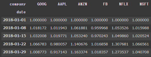
1 | import plotly.graph_objects as go |
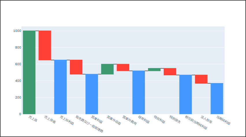
[実行結果]