Dash⑧(グラフの配置/plotly.py)

plotly.py

plotly.pyを使って、散布図を表示してみます。

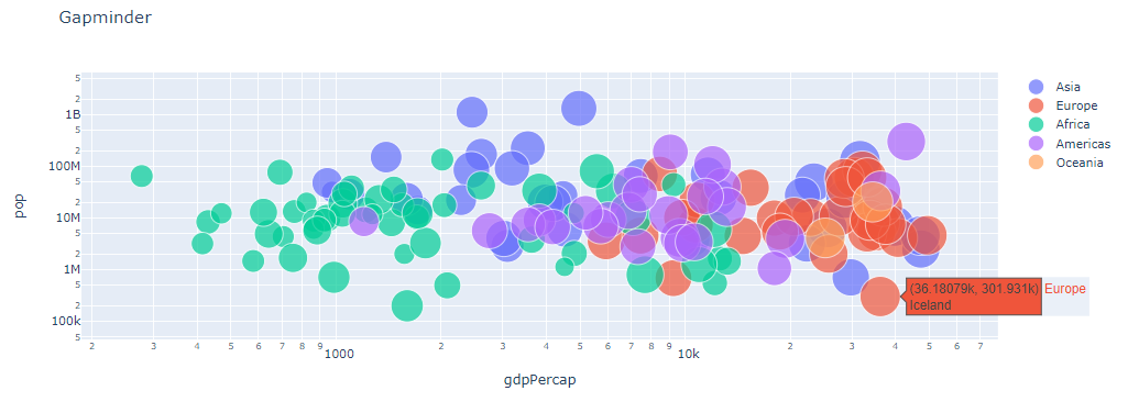
前回記事同様、gapminderデータセットの2007年分データを利用します。

plotly.pyのFigureオブジェクトを作成し(10~28行目)、Graphコンポーネントの引数 figureに設定しています。

大陸ごとにScatter関数を実行し、グループ化しています。(凡例の大陸を選択することで表示/非表示を切替可能です)

[ソースコード]

1
2
3
4
5
6
7
8
9
10
11
12
13
14
15
16
17
18
19
20
21
22
23
24
25
26
27
28
29
30
31
32
33
34
35
36
37
import dash
import dash_core_components as dcc
import plotly
import plotly.graph_objects as go

gapminder = plotly.data.gapminder()
gapminder2007 = gapminder[gapminder["year"] == 2007]

# figureの作成
fig = go.Figure()
for c in gapminder2007.continent.unique():
fig.add_trace(
go.Scatter(
x=gapminder2007.loc[gapminder2007['continent'] == c, 'gdpPercap'],
y=gapminder2007.loc[gapminder2007['continent'] == c, 'pop'],
name=c,
mode='markers',
marker={
'size': gapminder2007.loc[gapminder2007['continent'] == c, 'lifeExp'] / 2
},
text=gapminder2007.loc[gapminder2007['continent'] == c, 'country']
)
)
fig.update_layout(
xaxis={'type': 'log', 'title': 'gdpPercap'},
yaxis={'type': 'log', 'title': 'pop'},
title='Gapminder'
)

app = dash.Dash(__name__) # Dashインスタンスを生成

app.layout = dcc.Graph(
figure=fig
)

if __name__ == '__main__':
app.run_server(debug=True) # アプリケーションを起動

上記ソースを実行すると、コンソールにURLが表示されるのでブラウザで表示します。

[ブラウザで表示]

Dashアプリケーションで、plotly.pyを使い散布図を表示することができました。