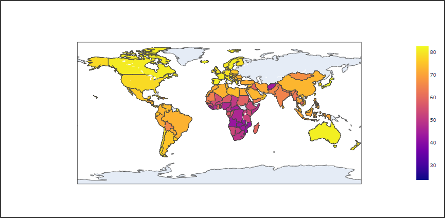
階級区分図(コロプレスマップ)は、国民所得や人口密度などの統計数値に合わせて色調を塗り分けた地図です。
地域ごとに数値を比較し可視化する際に利用します。
階級区分図
Plotlyで階級区分図を表示するにはChoroplethクラスを使用します。
Choroplethクラスの引数は下記の通りです。
- locations
locationmodeに従った地域データ - locationmode
地域データの定義を文字列で指定 - z
地域ごとの値となるデータ(リスト型など)
以下のコードではgapminderデータセットのcountry列を位置データとして指定し、lifeExp列の値を階級区分図で表示しています。
[Google Colaboratory]
1 | import plotly |
[実行結果]