散布図
Plotlyで散布図を描画するには折れ線グラフと同じようにScatterクラスを使います。
Scatterクラスの引数 modeに“markers”を指定すると散布図が表示できます。
正規分布に従う乱数を生成し、散布図を描画してみます。
[Google Colaboratory]
1
2
3
4
5
6
7
8
9
10
11
12
| import plotly.graph_objects as go
import numpy as np
np.random.seed(1)
scatter_x, scatter_y = np.random.randn(2, 100)
go.Figure(
go.Scatter(x=scatter_x,
y=scatter_y,
name="standard normal distribution",
mode="markers"
)
).show()
|
[実行結果]
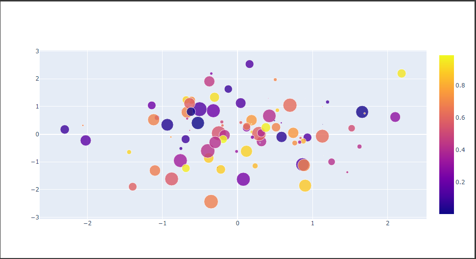
散布図(バブルチャート)
バブルチャートは散布図の要素の大きさで値を表現したグラフです。
散布図の要素の大きさを設定するにはmarker.size属性にリストデータを設定します。(10行目)
また、marker.color属性にリストデータを設定するとカラースケールで表示することができます。(11行目)
[Google Colaboratory]
1
2
3
4
5
6
7
8
9
10
11
12
13
14
15
16
17
| np.random.seed(1)
scatter_color = np.random.rand(100)
scatter_size = np.random.rand(100) * 30
go.Figure(
go.Scatter(x=scatter_x,
y=scatter_y,
name="4d",
mode="markers",
marker={
"size": scatter_size,
"color": scatter_color,
"sizemode": "diameter",
"opacity": 0.8,
"showscale": True
}
)
).show()
|
[実行結果]
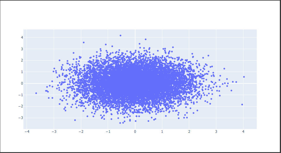
散布図(高速描画)
大きなデータを扱う場合、WebGLで実装されたScatterglクラスを使用することで高速に描画できます。
下記のコードでは、1万個の乱数を散布図に描画しています。
[Google Colaboratory]
1
2
3
| np.random.seed(1)
large_x, large_y = np.random.randn(2, 10000)
go.Figure([go.Scattergl(x=large_x, y=large_y, mode="markers")]).show()
|
[実行結果]