PR曲線
PR曲線(Precision-Recall Curve)は、モデルの評価精度に使用されるとともに、最適な閾値を調べる時にも用いられる手法です。
PR曲線は縦軸に適合率、横軸に再現率の値をとり、閾値の変化による適合率と再現率のトレードオフ関係を表現します。
[トレードオフ関係]
- 閾値を上げる
陽性の判定をより厳しく行う。
予測の正確性が上がる。 - 閾値を下げる
偽陽性が増える。
予測の網羅性は上がる。
PR曲線の算出
PR曲線を引くためには適合率、再現率、閾値をそれぞれ取得する必要があります。
precision_recall_curveを使うとそれらの算出値をまとめて取得することができます。(4行目)
[Google Colaboratory]
1 | from sklearn.metrics import precision_recall_curve |
[実行結果]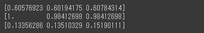
各閾値(thresholds)における適合率(precision)と再現率(recall)を算出することができました。
PR曲線の可視化
matplotlibを使って、PR曲線の可視化を行います。(1行目)
参考として、3点閾値(30%、50%、80%)をプロットしています。(3~6行目)
[Google Colaboratory]
1 | plt.plot(recall, precision,label="PR Curve") |
[実行結果]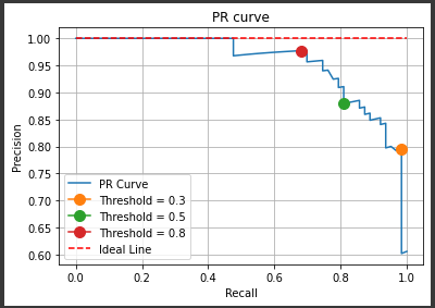
閾値が上がるほど適合率が上がり、再現率が下がっていることが確認できます。