Phillips Curve
The Phillips Curve illustrates the inverse relationship between the rate of unemployment and the rate of inflation within an economy.
Let’s create a simple example where we model this relationship using synthetic data.
We’ll use Python to perform the calculations and visualize the results.
Step 1: Create Synthetic Data
First, we’ll generate some synthetic data for unemployment rates and corresponding inflation rates.
Step 2: Analyze and Plot the Data
We’ll analyze this data to see the relationship and plot the Phillips Curve.
Here is the Python code for generating the data, analyzing it, and plotting the curve:
1 | import numpy as np |
Explanation
- Data Generation:
We create synthetic data for the unemployment and inflation rates.
The relationship is modeled with some random noise to simulate real-world data. - Regression Analysis:
We use linear regression to find the best-fit line that describes the relationship between unemployment and inflation rates. - Plotting:
We plot the data points and the regression line to visualize the Phillips Curve.
Graph Interpretation

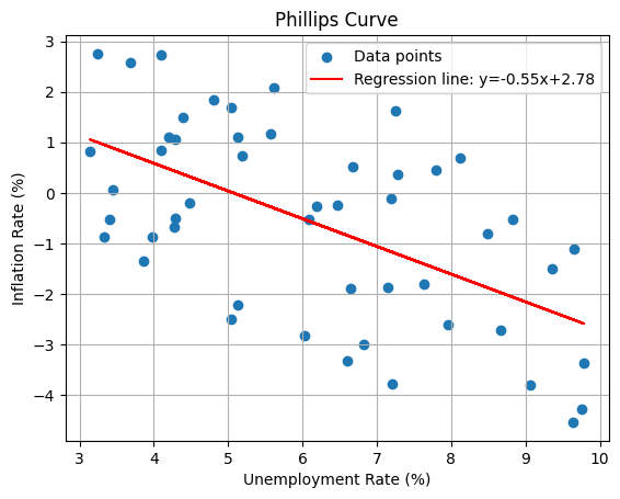
- The scatter plot shows individual data points representing different unemployment and inflation rate pairs.
- The red line is the regression line, indicating the trend or the average relationship between unemployment and inflation rates.
According to the Phillips Curve, as the unemployment rate decreases, the inflation rate tends to increase, and this inverse relationship is depicted by the slope of the line.