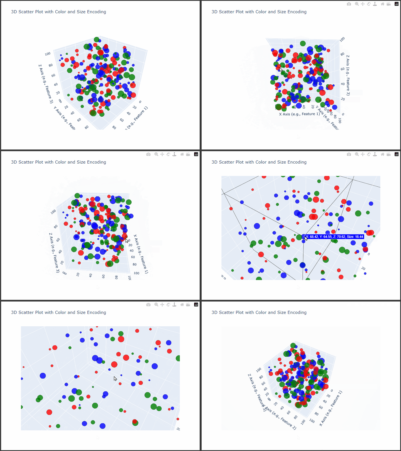
Plotly’s 3D scatter plot capabilities allow us to visualize complex, multi-dimensional data interactively.
We’ll create a detailed 3D scatter plot with customizations such as color-coding, sizing, and axis labels.
This example demonstrates how to plot complex data with customized markers, informative labels, and meaningful axes, all designed to enhance clarity and interaction with the data.
We’ll use synthetic data that includes three main dimensions, X, Y, and Z, representing each axis in the 3D space, and additional features that determine point colors and sizes.
Step-by-Step Explanation and Code
Generate Data:
We’ll create synthetic data using NumPy to represent our 3D points, with values for each axis (X,Y,Z) and two additional variables (categoryfor color andsizefor marker size).Set Up the Plotly 3D Scatter Plot:
Using Plotly’sgo.Scatter3d, we’ll customize our 3D plot to visualize:- Point Colors: Categorical values will be represented by different colors.
- Point Sizes: A continuous variable will determine the size of each point.
- Axis Titles: Labels for each axis to provide clear context.
Customize Layout:
We’ll adjust the layout to add titles, background, and enhance interactivity.
Here’s the Python code:
1 | import plotly.graph_objects as go |
Detailed Explanation
Data Generation:
- We use NumPy’s
np.random.uniformto generate random values forX,Y, andZcoordinates within a specified range.
We also definecategory(with values like Category A, Category B, Category C) andsize, which affects the marker sizes. - We assign colors using
color_map, where each category has a different color (e.g., red, blue, green).
- We use NumPy’s
Creating the Scatter Plot:
- Scatter3d: This Plotly function is used to create 3D scatter plots.
x,y, andzare assigned to the respective coordinate values. - Marker Customization:
size=sizeadjusts the size of each marker based on thesizevariable.color=colorsassigns colors based on thecategory.opacity=0.8provides transparency, making overlapping points more distinguishable.line=dict(width=1, color='DarkSlateGrey')adds a border to each marker, improving visibility.
- Hover Information: We provide custom hover text to display values for
X,Y,Z, andsizewhen hovering over points.
- Scatter3d: This Plotly function is used to create 3D scatter plots.
Layout Customization:
titleprovides a clear title for the plot.- Axis Titles: Each axis is labeled to describe the corresponding feature.
- Background Color:
scene.bgcoloris set to a light grey, which enhances the visibility of the colored points. - Dimensions: We specify
widthandheightfor consistent display.
Interpretation
This interactive 3D scatter plot allows us to observe:
- Distribution: The spread of points across the three dimensions reveals clustering patterns and possible outliers.
- Category Comparison: Colors represent different categories, allowing us to compare distributions between them.
- Point Emphasis: Size variation highlights differences in another variable, helping us to see patterns across categories or regions of the 3D space.
Output
The resulting plot will display a 3D scatter plot with different colors for each category, sizes reflecting a separate feature, and axis titles.
This interactive view lets you rotate, zoom, and hover over points for detailed insights.
Conclusion
The 3D scatter plot with Plotly provides a powerful way to explore complex, multi-variable relationships in data.
By encoding multiple variables in position, color, and size, we can convey a rich amount of information in a single, interactive plot, ideal for data science, research, and presentation purposes.
