A Practical Example with Python
Anomaly detection in time series data is a powerful technique used across industries to identify unusual patterns that deviate from expected behavior. Whether it’s spotting fraudulent transactions, detecting equipment failures, or monitoring system performance, anomaly detection helps us catch issues before they escalate. In this blog post, we’ll walk through a realistic example of detecting anomalies in time series data using Python on Google Colaboratory. We’ll use a synthetic dataset representing hourly server CPU usage, implement a simple yet effective anomaly detection method, and visualize the results with clear explanations.
Problem Statement: Monitoring Server CPU Usage
Imagine you’re a system administrator monitoring the CPU usage of a server over time. The server typically operates within a predictable range, but sudden spikes or drops could indicate issues like overloads, hardware failures, or cyberattacks. Our goal is to detect these anomalies using a statistical approach based on a moving average and standard deviation.
We’ll generate synthetic CPU usage data with some intentional anomalies, apply a z-score-based anomaly detection method, and visualize the results using Matplotlib. Let’s dive into the code and break it down step by step.
1 | import numpy as np |
Code Explanation
Let’s break down the Python code to understand how it detects anomalies and visualizes the results.
Import Libraries:
numpyandpandasare used for numerical operations and data handling.matplotlib.pyplotis used for plotting.datetimeandtimedeltahelp create a time series of hourly timestamps.
Generate Synthetic Data:
- We create a week’s worth of hourly data (168 hours) starting from June 1, 2025.
- CPU usage is modeled as a normal distribution with mean $(\mu = 50)$ and standard deviation $(\sigma = 10)$, i.e., $( \text{cpu_usage} \sim \mathcal{N}(50, 10) )$.
- We introduce deliberate anomalies:
- At hours 50–51, we set CPU usage to 90% and 95% to simulate spikes.
- At hours 120–121, we set CPU usage to 10% and 5% to simulate drops.
- The data is stored in a Pandas DataFrame with
timestampandcpu_usagecolumns.
Anomaly Detection Function:
The
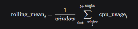
detect_anomaliesfunction uses a rolling window approach to compute the moving average and standard deviation.Rolling Mean: We calculate the mean over a window of 24 hours (centered) to capture the typical CPU usage trend:
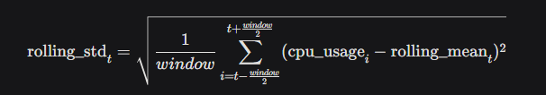
Rolling Standard Deviation: We compute the standard deviation over the same window to measure variability:
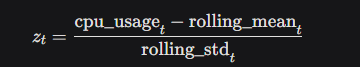
Z-Score: For each data point, we calculate the z-score to measure how far it deviates from the mean in terms of standard deviations:
Anomaly Detection: A point is flagged as an anomaly if
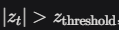 , where we set
  This corresponds to points outside approximately 99% of the data under a normal distribution.
- Plotting:
- We create a plot with:
- The CPU usage time series (blue line).
- The rolling mean (orange dashed line).
- A shaded band representing the “normal” range $(( \text{rolling_mean} \pm 2.5 \cdot \text{rolling_std} )$).
- Red dots marking detected anomalies.
- The plot is saved as
cpu_usage_anomaly_detection.png.
- We create a plot with:
Visualizing and Interpreting the Results
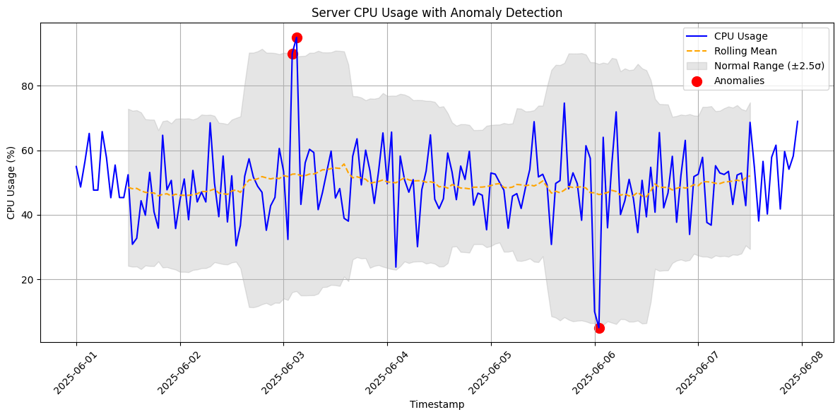
The plot generated by the code provides a clear view of the CPU usage over time and highlights anomalies. Here’s what you’ll see:
- CPU Usage (Blue Line): This shows the hourly CPU usage, fluctuating around 50% with some visible spikes and drops.
- Rolling Mean (Orange Dashed Line): This represents the average CPU usage over a 24-hour window, smoothing out short-term fluctuations.
- Normal Range (Gray Band): The shaded area shows the expected range of CPU usage $(( \mu \pm 2.5\sigma )$). Most data points should fall within this band.
- Anomalies (Red Dots): Points outside the gray band (where $( |z_t| > 2.5 )$) are marked as anomalies. You’ll notice red dots at hours 50–51 (spikes to 90% and 95%) and hours 120–121 (drops to 10% and 5%).
Interpretation:
- The spikes at hours 50–51 could indicate a server overload, perhaps due to a sudden surge in traffic or a resource-intensive process.
- The drops at hours 120–121 might suggest a system failure or a period of inactivity, warranting investigation.
- The z-score threshold of 2.5 ensures we only flag significant deviations, reducing false positives while catching critical anomalies.
Why This Approach Works
Using a rolling mean and standard deviation is a simple yet effective method for anomaly detection in time series data. It’s robust for data with stable patterns and can adapt to gradual changes in the mean or variance. The z-score provides a standardized way to measure deviations, making it easy to set a threshold (e.g., 2.5σ) based on the desired sensitivity.
However, this method assumes the data is roughly normally distributed within the window. For more complex time series with seasonality or trends, you might consider advanced techniques like ARIMA, Prophet, or machine learning models like Isolation Forest. For our server CPU usage scenario, this approach is practical and computationally efficient.
Running the Code
To try this yourself, copy the code into a Google Colaboratory notebook and run it. The plot will be saved as cpu_usage_anomaly_detection.png in your Colab environment. You can download it to inspect the results or modify parameters like the window size (window) or z-score threshold (z_threshold) to experiment with sensitivity.
This example demonstrates how anomaly detection can be applied to real-world problems with minimal code. Whether you’re monitoring servers, financial transactions, or sensor data, this approach is a great starting point for identifying outliers in time series data.
Happy coding, and stay vigilant for those anomalies! 🚨