Altair
Here’s a advanced and useful sample code using Altair, which demonstrates how to create a layered chart with interactivity, such as tooltips and selection, along with custom encoding:
1 | import altair as alt |
Result
Explanation
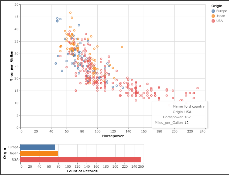
- Brush Selection:
An interactive selection that allows users to drag over the scatter plot to select a region. - Scatter Plot:
A basic plot where points are colored by their origin, and the color changes based on the selection. - Bar Chart:
Shows the distribution of car origins, updated based on the selection made in the scatter plot. - Interactivity:
Tooltips provide detailed information when hovering over the points, and the chart updates dynamically based on the user’s selection.
This example combines interactivity with advanced encoding and layout, making it useful for exploratory data analysis.