三角図
Plotlyで三角図を表示するにはScatterternaryクラスを使用します。
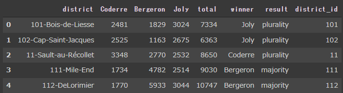
まず、election(選挙)データセットを読み込みます。
[Google Colaboratory]
1
2
3
4
| import plotly
election = plotly.data.election()
election.head()
|
[実行結果]
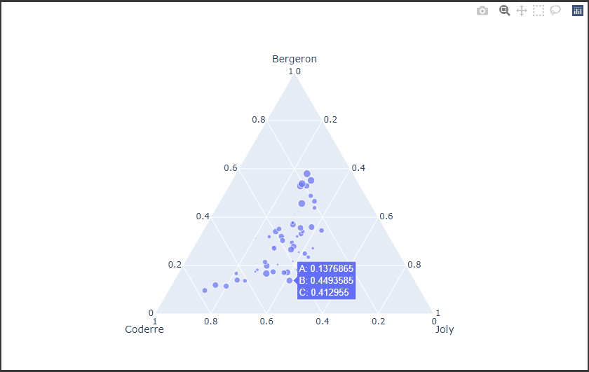
読み込んだデータセットのBergeron列、Coderre列、Joly列を、Scatterternaryクラスのa、b、cに設定し三角図を描画します。(4~6行目)
引数 modeには描画モードを設定します。(7行目)
また、三角図の軸のスタイルを設定するにはLayoutクラスの引数 ternaryに辞書型データを設定します。(10~16行目)
[Google Colaboratory]
1
2
3
4
5
6
7
8
9
10
11
12
13
14
15
16
17
| import plotly.graph_objects as go
scatterternary_trace = go.Scatterternary(
a=election["Bergeron"],
b=election["Coderre"],
c=election["Joly"],
mode="markers",
marker={"size": election["total"] * 1e-3}
)
scatterternary_layout = go.Layout(
ternary={
"aaxis": {"title": "Bergeron"},
"baxis": {"title": "Coderre"},
"caxis": {"title": "Joly"}
}
)
go.Figure(scatterternary_trace, layout=scatterternary_layout)
|
[実行結果]