1
2
3
4
5
6
7
8
9
10
11
12
13
14
15
16
17
18
19
20
21
22
23
24
25
26
27
28
29
30
31
32
33
34
35
36
37
38
39
40
41
42
43
44
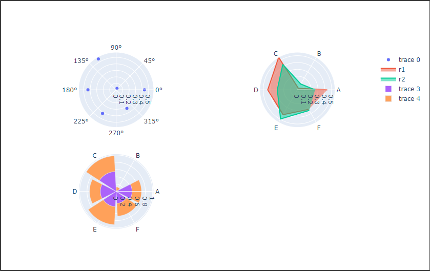
| import numpy as np
import plotly.graph_objects as go
from plotly.subplots import make_subplots
np.random.seed(2)
r1 = np.random.rand(6)
theta = np.linspace(0, 360, 7)[:-1]
r1_close = np.hstack([r1, np.array(r1[0])])
r2 = r1 + np.random.uniform(-0.3, 0.3, 6)
r2_close = np.hstack([r2, np.array(r2[0])])
label = list("ABCDEF")
polar_fig = make_subplots(
rows=2,
cols=2,
specs=[
[{"type": "polar"}, {"type": "polar"}],
[{"type": "polar"}, {"type": "polar"}]
]
)
polar_fig.add_trace(
go.Scatterpolar(r=r1, theta=theta, mode="markers"), row=1, col=1
)
polar_fig.add_trace(
go.Scatterpolar(
r=r1_close, theta=label, mode="lines", fill="toself", name="r1"
),
row=1,
col=2
)
polar_fig.add_trace(
go.Scatterpolar(
r=r2_close, theta=label, mode="lines", fill="toself", name="r2"
),
row=1,
col=2
)
polar_fig.add_trace(go.Barpolar(r=r1, theta=label), row=2, col=1)
polar_fig.add_trace(go.Barpolar(r=r2, theta=label), row=2, col=1)
polar_fig.show()
|